Blog

  • Construction site banners Irvine: fence, scaffold, ID

    Construction site banners Irvine: fence, scaffold, ID

    Construction site banners in Irvine are printed vinyl or mesh hung on fence, scaffold, or a project ID frame so the public can name the GC, trucks can find the gate, and a posting board can be read. Spec the hang first — fence, scaffold, or trailer — then mesh, grommets, and whether City or Cal/OSHA will look at it.

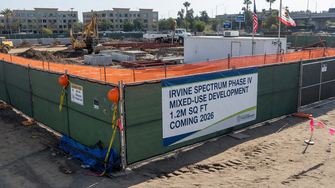
    Construction site project banner on an Irvine jobsite fence

    The catalog shot is always a clean chain-link run with a perfectly tensioned 4-by-20 and a skyline. Your site is more likely a 6-foot rented panel fence on an Irvine infill lot, a scaffold elevation over a sidewalk on Jamboree, a trailer whose posters bleached into pink, and a superintendent who needs the GC name readable from the street before the inspector parks. That is why we quote construction banners as a hang: where it ties, what the wind will do, who has to read it, and whether anyone in a city or safety hat will treat it as a sign. Avanti Printing at 15321 Barranca Pkwy, Irvine, CA 92618 prints the vinyl and the mesh. Call (949) 788-6100 if you already measured the fence panels and only need us to match last month’s spec.

    This is the estimator version of that conversation. It is written for Irvine and Orange County jobsites that will still be dusty on Friday. It covers fence banners, scaffold banners, project identification, and posting boards as print jobs. It is not a legal opinion on OSHA, Cal/OSHA, CSLB, or the City of Irvine Sign Ordinance. Confirm those rules with your safety person, your permit runner, and the agency that wrote them. It is not a mesh-versus-solid catalog, not an outdoor-lifespan essay, and not a tour of indoor pull-up stands. Quotes still confirm size, material, quantity, finish, and date.

    Who hangs construction site banners in Irvine and Orange County

    If you are building, wrapping, or leasing anything from the Irvine Business Complex to Great Park to a Tustin Legacy block, the fence is already a billboard. Neighbors, city staff, truck drivers, and the owner’s lender all read it whether you designed it or not. Construction fence and scaffold banner printing is how you control that read: company ID, project name, a safety reminder, a leasing teaser, or a printed screen so the public is not staring into a hole.

    Typical buyers from Irvine, Tustin, Santa Ana, Costa Mesa, Newport Beach, Lake Forest, Laguna Hills, Anaheim, and Huntington Beach are not shopping a retail sale banner. They are shopping a hang that has to survive Orange County sun, a Santa Ana, a rented fence that will be moved twice, and a permit conversation they hoped to skip. General contractors want the company name and license on the street face. Developers want a coming-soon panel that does not accidentally become a prohibited advertisement. Scaffold contractors want mesh that the PE will not throw off the elevation. Safety managers want posting boards that still exist after the first rain. Leasing teams want a fence run that looks like architecture, not a swap-meet sail. Superintendents want a gate banner the concrete truck can actually see at 6 a.m.

    This is for you if the graphic will live on a temporary perimeter, a scaffold, a k-rail, or a jobsite trailer, and you can send a vector logo instead of a screenshot from the website header. It is also for you if last quarter’s vinyl is a shredded flag on the 405-facing run. It is the wrong spec if you need an indoor retractable, a vehicle wrap, or a permanent monument. We print those too under large format printing in Irvine, but the vinyl, the finishing, and the failure modes are different jobs.

    California buyers outside Orange County use the same mesh and the same outdoor scrim. The local twist is the climate and the paperwork: west-facing UV, dry canyon winds, Irvine Company and village HOA opinions about what a construction fence may look like, City of Irvine sign programs for decorative construction fences, UCI-adjacent vendor rules, and infill lots where the only street frontage is also a sight triangle. Those conditions change material, size, copy, and whether you should be on vinyl at all. They do not change the fact that a construction banner is a flexible printed panel you hang, not a painted wall and not a legal posting just because you put the word SAFETY on it.

    • GCs and construction managers on Irvine and Tustin infill, podium apartments, and office TIs who need readable company ID on a rented fence.
    • Scaffold companies wrapping elevations over sidewalks on Jamboree, Barranca, and Spectrum-area retail.
    • Developers and owners who want a project ID that planning will not treat as a rogue billboard.
    • Safety leads who need Cal/OSHA-style posting boards in the trailer and at the gate, printed so they survive handling.
    • Leasing and marketing teams covering a long fence during a multi-year build without turning every panel into a sail.
    • Trade partners — fence, demo, grading — who get told Friday that the street face has to look like a company on Monday.

    Pick the banner from the hang, not from a rendering

    Coverage is the decision. Mesh, grommets, copy, and price all follow it. “We need construction banners” is not a hang map. Neither is a marketing elevation that ignores the 6-foot rented panels, the rolling gate, the hydrant, and the sight triangle at the corner. Start with what has to be read, from where, for how long, and on what structure. Then stop. Extra vinyl across a driveway opening is not branding. It is a kite you will reprint after the first blow.

    Use the table as a shop filter, not a menu you must climb. Typical industry practice on Orange County jobsites is fence-first for company ID, mesh on long or high hangs, rigid or laminated boards for postings that an inspector will actually look for, and a separate conversation for anything the City will treat as a sign. Your ticket will lock size, material, quantity, finish, and date — and it should also lock the hang.

    Hang Typical print Typical size conversation Wind Who actually reads it Where it fails
    Chain-link or panel fence Mesh; 13 oz vinyl only on short, low panels Height about 2–4 in short of the rails; length in fence-panel modules Mesh is the default on long OC runs Neighbors, city staff, lenders, passing traffic Solid vinyl on a 405-facing run; four corner ties
    Scaffold elevation Mesh, often with pole pockets on tubes Bay width by lift height; seamed panels Scaffold engineer owns the load; mesh reduces sail, does not erase it Street, brand, dust and view screen Solid vinyl as a building wrap; hanging on incomplete scaffold
    Project ID / coming soon 13 oz or 18 oz vinyl, or a rigid board Often 4×8, 4×6, or a size the city already described Smaller sail if it is a board; still a sail if it is a long vinyl Planning, owner, CSLB, the public Copy the ordinance forbids; vinyl where the city wants wood or metal
    Cal/OSHA and safety posting Laminated print on rigid board, not a flogging banner Poster sizes, 18×24, 24×36, trailer-door kits Keep it off the windward fence if you want it to exist next month Crew, inspector A brand banner labeled SAFETY; paper in a poly sleeve that cooks
    Gate and wayfinding 13 oz vinyl or coroplast 2×4 to 4×8, high contrast Short hang, still use every grommet Trucks, inspectors, new subs Script logos; phone numbers in the hem
    Decorative construction fence Printed mesh or vinyl to a sign program Elevation-driven; panelized to the fence Program plus wind, not instead of wind Planning, neighbors, the owner’s brand team Printing the rendering before the program exists

    Fence banners are the workhorse. Most Orange County perimeters we print for are 6-foot chain-link or 6-foot panelized temp fence in 10-foot or 12-foot modules. A graphic that ignores those modules will fight the posts, bunch at the gates, and leave a bald stretch where the rolling gate lives. Design in panels. Leave the gate a gate. Leave the hydrant a hydrant.

    Scaffold banners are a different structure and a different liability. The printed mesh is a wind area on someone else’s engineered elevation. We will finish pole pockets and grommets to the tube and the tie pattern you give us. We will not certify the scaffold. If the scaffold contractor or the PE says the elevation cannot take a printed face, that is the end of the banner conversation, not the start of a thicker vinyl.

    Project ID is the board at the street that names the job. It is also the panel that most often collides with a city sign type. In Irvine that collision is real: a “future facility” sign in the zoning text is not automatically a grommeted vinyl, and a decorative construction fence can require a sign program. Read that section later. Do not order a 4-by-16 “NOW LEASING” because a rendering looked busy.

    Posting boards are not decoration. If the job is to put the Cal/OSHA poster, the Code of Safe Practices, and the emergency numbers where employees can actually read them, you want a rigid, laminated face in the trailer or under a shelter — not a 13-ounce flag on the windward fence. We will print both. We will still tell you which one will be there in March.

    A construction banner is a hang on a temporary structure. Name the structure. Name who has to read it. Then pick mesh, vinyl, or a board. Do not pick a rendering and ask the fence to behave like a billboard.

    Get pricing for this project

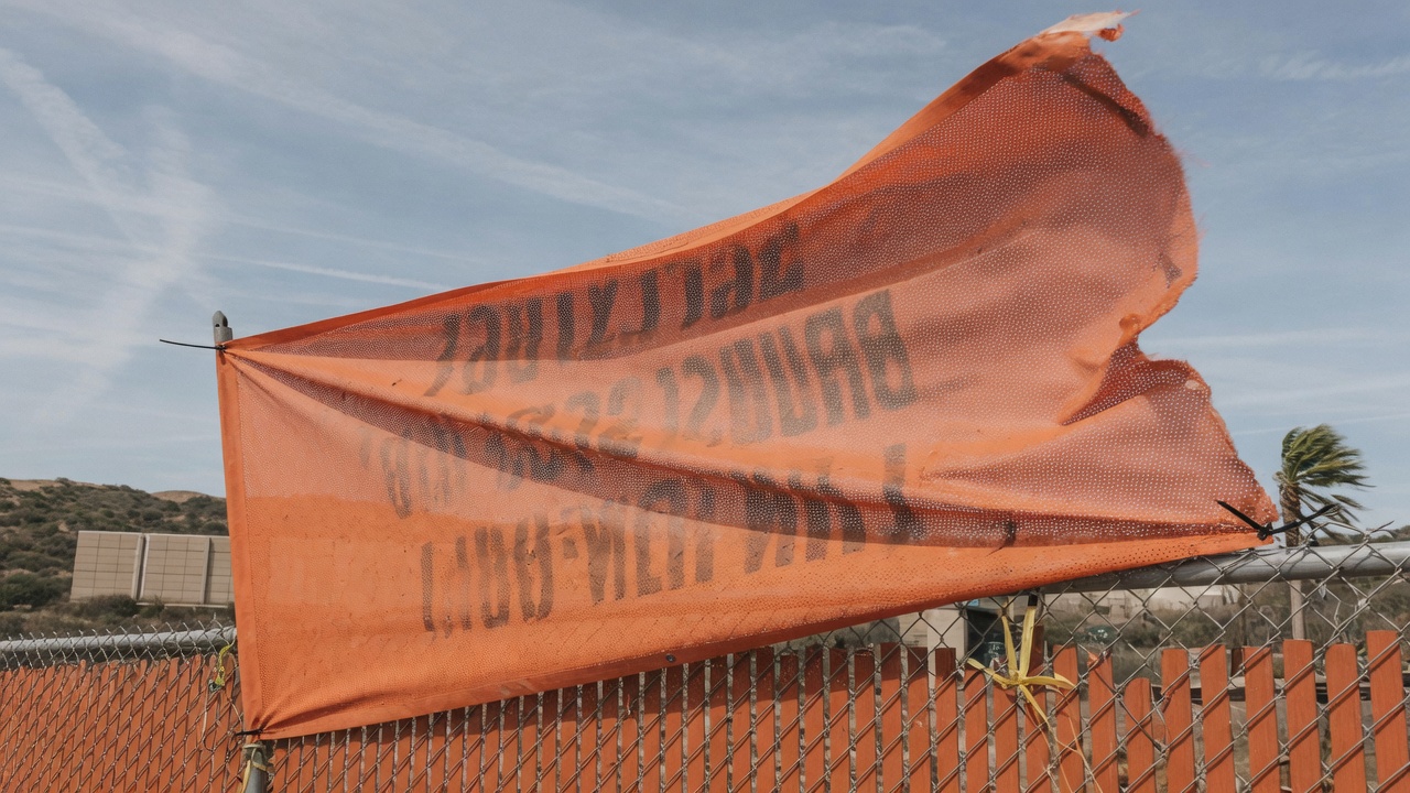
    Mesh fence banner in Orange County wind

    Wind is the first spec on an Orange County jobsite

    A solid vinyl banner is a sail. A long mesh banner is a smaller sail. A scaffold face with printed mesh is still an added wind area on a temporary structure. Orange County does not need a hurricane for that to matter. It needs a Santa Ana, a west-facing lot, and a fence that was tied at the corners because Friday was payday.

    Santa Ana winds are dry downslope events, most common in the cooler months, and they get squeezed in canyons and passes. Fremont Canyon, the Santa Ana River corridor, and open pads with nothing upwind are where we see fence banners unzip. You do not need the peak gust on your particular panel. You need enough cyclic loading to egg out a grommet, then a zipper down the hem. Inland Irvine, Tustin, and Anaheim Hills often see the harder inland version. Coastal Newport and Costa Mesa add a daily onshore slap that is lower drama and still enough to scuff a slack panel every afternoon.

    Geometry beats ounce-weight. An 18-ounce banner with four corner zip ties will still start a tear at a corner. A mesh panel on bungees at every grommet, close to the fence so air cannot balloon behind it, will often ride out a blow that destroys the “heavier” job. Put the panel on the fence, not in front of a hole in the fence, when you can. If you must span a gate opening or a scaffold access, say so on the quote. We may talk about a heavier spec, more attachment points, a removable panel, or not hanging there. We will not pretend 13-ounce on four zip ties is an engineered wind design.

    Scaffold is the grown-up version of the same sentence. Printed mesh reduces pressure compared with a solid PVC face of the same size. It does not make the load zero, and it does not make us the scaffold engineer. Debris netting, printed mesh, and solid sheeting are different wind stories. If your PE already designed the elevation for a particular netting, do not surprise them with a printed banner of a different open area. Send the finish and the size to the person who owns the scaffold. If they say no, we print a fence run instead.

    Wind slits cut into solid vinyl are a religious argument in this trade. Holes you add after printing are also the start of a tear, and they punch the graphic. We do not treat slits as a default on construction vinyl in Orange County. If the site is that windy, the grown-up options are mesh, more attachment points, a closer mount, a pipe in a pole pocket, or a smaller panel. Do not DIY a row of holes with a hole saw on a finished print and then call us when it unzips from the first hole.

    After a named wind event, walk the install before you schedule a reprint. Look at corners, elongated grommet holes, hem lift, and whether the panel now has a memory wave. A slightly stretched fence banner can still name the GC. A corner that has started to unzip will not make it through the next event. Repair is rarely honest on outdoor vinyl once a tear leaves the hem. Budget a reprint, and this time use every grommet.

    West and south faces still add the slow clock. This article is not a lifespan catalog, but you should not ignore facing. A west fence along Barranca or Jamboree takes afternoon sun on already-warm PVC. Magenta and yellow tire first. A navy field chalks. High-contrast type still reads when a photograph has gone dusty. If the job is a two-year fence wrap, say the duration so we spec mesh, ink, and hardware for a long hang, not for a grand-opening weekend.

    Mesh on the fence and scaffold — without turning this into a catalog

    Mesh exists on construction sites because air has to go somewhere. Typical industry fence and scaffold meshes are in the neighborhood of 7 to 9 ounces per square yard, PVC-coated polyester with an open weave, printed so the graphic still reads at street distance. Those weights are typical ranges, not a micrometer reading of the roll on our printer this morning. The open area is why a 4-by-50-foot fence run is a construction product instead of a kite. The holes are also why small type and hairline logos look dotted at arm’s length.

    Use mesh when the hang is long, high, or on a structure that already has a wind conversation: full fence fronts on Irvine infill, scaffold elevations, anything facing an open lot or a canyon, anything that will stay up through Santa Ana season. Use solid 13-ounce or 18-ounce vinyl when the panel is small, close-read, short-term, or a project ID that has to look like a sign at ten feet — and when the hang is not a sail. A 2-by-4 gate sign can be solid vinyl. A 4-by-20 street face on rented panels should not be, unless you have a frame, a lot of ties, and a reason.

    This is not the mesh-versus-solid essay. That is a different page and a different argument. On a jobsite the decision is usually boring: mesh on the perimeter and the scaffold, solid vinyl or a rigid board on the ID and the posting. Mixing them on purpose is professional. Mixing them because leftover 13-ounce was in the truck is how you get two failure modes on one street.

    Viewing distance is the other mesh rule. From the second lane on Jamboree, a well-printed mesh logo is a logo. From the sidewalk, you see the weave. Do not put a 2-inch license number, a QR code, or a script wordmark on mesh and expect it to survive at six feet. Put the legal line large, high-contrast, and in a mass that a hole pattern cannot eat. If the mark is legally small, put it on a solid panel or a rigid board, not on the fence weave.

    Black backing versus white mesh, blockout, and “window mesh” are different constructions. Construction fence mesh is usually a single-face outdoor print. You will see some light through it. That is not a defect. If you need the reverse to be a clean color because the crew is staring at the back of the fence all day, say so. A second face is a second print or a different build, not a checkbox.

    Flame certificates show up when a site, a city inspector, or a campus asks for a mill sheet. Many banner vinyls and some meshes are tested to NFPA 701. If someone will ask, tell us before we print so we pull a mill sheet that matches the roll. Do not hang leftover promotional vinyl on a public-assembly interior and hope. Construction exteriors are a different conversation from ballrooms, and the certificate still belongs on the quote if it was requested.

    Project ID boards: GC, license, and what actually belongs on the panel

    Project identification is the panel that names the job to the street. Typical copy — not a legal form, a print list — is the project name, the general contractor, a phone number that rings a human, the city or building permit number if you want it there, and, if you are a licensed California contractor advertising on the sign, the license number. Architects, owners, and lenders sometimes want a line. Safety headlines (“HARD HAT REQUIRED,” “ALL VISITORS CHECK IN”) earn their keep at the gate. Dates (“COMING 2027”) earn a reprint when 2027 arrives and the panel is still up.

    The California Contractors State License Board treats signs that identify you as a contractor as advertising. Licensed contractors are expected to include the license number on advertising, including signs. That is a board rule, not a printer rule. We are not your lawyer and this paragraph is not a compliance opinion. Send the business name exactly as it is licensed and the license number in the first file. We will print it at a size you can read from the street. Confirm current CSLB advertising rules yourself before you approve a beautiful fence with no number. A reprint to add “Lic. #” as a patch looks like a patch.

    Letter height is a viewing-distance problem. A typical industry rule of thumb — not a building code — is about one inch of letter height per ten feet of viewing distance for a high-contrast block letter. A driver on an Irvine arterial is not reading 2-inch type. A pedestrian at the fence is. Put the company name and the license in a mass that works from the lane you care about. Fine serifs, hairline scripts, and knockout type on a photograph of a sunset all die at 35 miles an hour. High contrast on a simple field beats a perfect brand-gray on dusty mesh.

    What does not belong on the ID panel: a paragraph of marketing, a QR code the driver cannot scan, a photo of a happy family that will look like a billboard to planning, and copy the city already told you not to use. “Now leasing,” “now available,” registered-brand flourishes, and off-site advertising are the lines that turn a project sign into a different sign type in some ordinances. If your civil set or your planning notes already restrict copy, send those notes. We will set type to the notes. We will not invent a loophole.

    Rigid versus vinyl for ID is a site decision. A 4-by-8 aluminum composite or painted wood panel in a frame is a sign. It sits still, it takes smaller type, and some city sign types describe wood or metal on purpose. A grommeted vinyl in the same size is cheaper, faster, and a sail. On a short, framed post it can be the right product. On a long fence it is a fence banner pretending to be a monument. If the city or the owner wants a board, we should be in rigid large-format boards, not in a 13-ounce hem.

    Multiple languages are a print versioning problem, not a translation service. If the gate has to work for a Spanish-speaking crew, say so and send the approved copy. Do not ask us to run a website through a browser translator and call it a safety sign. English/Spanish pairs are two layouts or one bilingual layout with a hierarchy. Put them on the quote as versions.

    Change-order copy is how ID boards die of embarrassment. The GC changes. The phone number is a cell that got recycled. The “opening fall” became spring. Tape-over letters on outdoor vinyl look like tape-over letters. Print a new panel. We can turn a replacement quickly when the template and the vector already exist. We cannot make a rolling error look intentional.

    OSHA and Cal/OSHA posting as a print job, not as legal advice

    Safety posting is a compliance job that happens to need a printer. We will make the board. We will not tell you that a board is sufficient, current, or in the right place. California is a state-plan state. Construction employers here live under Cal/OSHA, not a federal-poster-only world. Your safety person, your insurance advisor, and the Division of Occupational Safety and Health own the list. This section is practical print advice so the posting you already decided to display can still be read.

    The Department of Industrial Relations publishes a construction-oriented list of documents and postings that commonly belong on a jobsite. The Cal/OSHA Pocket Guide for the Construction Industry is a starting point you can hand to a superintendent; it is not a substitute for Title 8 or for counsel. In that guide’s administrative chapter you will see, among other items, the Cal/OSHA poster “Safety and Health Protection on the Job,” a Code of Safe Practices, emergency phone numbers, employee access to medical and exposure records, citations if you have them, and hazard warnings that depend on the work (asbestos, lead, confined space, controlled access zones, and so on). DIR also maintains a broader workplace-postings page. Download current official posters from the agency. We can print, enlarge, laminate, and mount. We cannot certify that last year’s PDF is still the official poster.

    Emergency numbers are a print layout with a legal parent. Title 8, section 1512, tells construction employers to post telephone numbers for a physician (and an alternate if available), hospitals, ambulance services, and fire-protection services near the job telephone or otherwise make them available where no jobsite phone exists. That is the agency’s rule, not ours. Practical print version: a high-contrast 11-by-17 or 18-by-24 laminated sheet inside the trailer, and a second copy at the gate if the trailer is not where people actually stand. Put the site address on it. A crew that cannot tell 911 which pad they are on has a posting problem that is also an emergency problem. We will typeset the list you send. We will not invent the hospital.

    Where the posting lives matters more than the laminate. A paper poster in a poly sleeve on the windward fence is a poster that will cook, fog, and fly. A laminated print on 3/16-inch foam board, PVC, or aluminum composite, mounted in the trailer or under the lunch fly, is a posting that can still be read in August. Outdoor-rated is not the same as “nail it to chain-link and forget it.” If you need a weather-facing safety banner (“HARD HAT AREA,” “AUTHORIZED PERSONNEL ONLY”), that can be vinyl or a rigid, and it is still not a substitute for the official Cal/OSHA poster.

    Danger, warning, and caution headers are specified by the site’s safety plan and by the standards that plan points at. ANSI Z535-style layouts use specific header colors and words. Send the file or the standard you are matching. Do not ask us to “make it look OSHA” from a brand palette. Safety orange, safety red, and black on yellow exist so a header is recognizable at a glance. If we print a fashion burgundy DANGER, we printed a brand poster. Your safety person will not thank us.

    Multi-employer sites are how postings get lost. The GC’s trailer is not automatically every sub’s poster wall. Each employer still has obligations; the details are theirs. Practical print version: if you are the controlling contractor and you want a common posting board, say how many boards, where they hang, and whether subs may add their own. We will kit identical boards. We will not referee who is the controlling employer.

    Do not treat a company brand banner as a required posting. A 3-by-8 with your logo and the words “SAFETY FIRST” is advertising with a slogan. It can still be useful at the gate. It does not replace the Cal/OSHA poster, the Code of Safe Practices, or the emergency numbers. Keep the brand on the fence. Keep the official postings on boards that do not flog.

    Spanish and other languages: if the crew needs them, the safety person decides. We print the approved translation at the same size as the English. We do not machine-translate a regulation poster and hope. Official bilingual versions, when the agency publishes them, beat a shop translation.

    Reprint the posting when the official poster changes, when the hospital routing changes, when the superintendent’s cell on the emergency sheet is no longer the superintendent, or when the board is faded, graffitied, or missing. Inspectors look for presence and readability, not for whether the photo of the trailer was pretty in the kickoff deck.

    City of Irvine, other OC cities, and the fence you cannot turn into a billboard

    A perfect print can still be the wrong sign. Check planning and the landlord before you hang a street-facing graphic, then us. That order saves reprints that are really removals.

    The City of Irvine publishes sign permit and sign-program rules and points at Division 7 of the Zoning Ordinance. Start there. Temporary banner permits in Irvine are their own family — grand openings and similar event banners with size and day-count rules — and they are not automatically the same thing as a construction fence graphic. Decorative construction fences are called out as a sign type that can require a sign program. Temporary “future facility” signs in the zoning exhibits have been written with limits on size, location, copy, illumination, and material (the exhibit language has described wood or metal, not “any vinyl you like”). Those details move. We will not quote the ordinance as if this blog were the municipal code. Have your permit runner read the current text, or email the Planning Counter (the City lists [email protected] and 949-724-6308 on its sign pages) and ask which sign type you are actually in.

    Practical print translation, not legal advice:

    • If planning says the street ID has to be a framed wood or metal sign of a maximum size, we should print a rigid panel, not a 4-by-20 vinyl.
    • If copy such as “for lease” or “now available” is prohibited on that sign type, do not put it in the file and hope the inspector likes the kerning.
    • If the fence graphic is a decorative construction fence, budget time for a sign program. Printing first and applying later is how you buy a second print.
    • If the property already has a sign program — Spectrum-area retail, IBC office, a village mixed-use, an apartment community — that program can be stricter than the citywide text. Ask for the PDF.
    • Do not install in the public right-of-way, in a sight triangle, or over a regulatory sign. A banner that hides a stop sign is not a branding win.

    Other Orange County cities are not Irvine with a different logo. Santa Ana, Tustin, Costa Mesa, Newport Beach, Lake Forest, Laguna Hills, Anaheim, and Huntington Beach each have their own temporary-sign and construction-fence habits. Coastal cities can be pickier about banners. Caltrans-adjacent frontage is a different animal again. If the job is outside Irvine, name the city on the quote. We will still print. We will still not pull the permit for you unless that is a separate, written request, and even then the applicant of record is usually you.

    Irvine Company, university, and HOA overlays sit on top of the city. University Research Park, IBC, Spectrum, and a lot of village-adjacent infill come with written criteria, vendor insurance, and opinions about how long a printed fence may look like a campaign. UCI-adjacent work can add campus vendor and brand rules if any of the hang is on university property. Village HOAs care about construction screening on streets that still have occupied homes. Send the packet. We can print to a drawing. We cannot argue with a committee.

    Temporary chain-link is often allowed around construction even where permanent chain-link is not. That does not mean every printed wrap on that chain-link is allowed. Screening the work is one intent. Turning the screen into a leasing supergraphic is another. If the owner wants the second one, they need the approval path for the second one. We will still tell you the wind story either way.

    Illumination is almost never part of a construction banner quote, and several temporary sign types in Irvine are written as unlit. Do not plan to uplight a vinyl fence at night unless someone in planning already said yes. We print the panel. We are not your electrician.

    Quote fence, scaffold, and project ID banners

    Materials, finishing, and the file that survives a jobsite

    Construction banners fail in finishing as often as they fail in wind. The print can be perfect. If the edge cannot take load, you own a poster with holes. If the file is a 400-pixel logo, you own a soft rumor of a GC name. Put material, hem, hardware, and art on the same ticket.

    Vinyl, mesh, and rigid cousins

    Thirteen-ounce scrim is the default solid outdoor banner in this shop: polyester scrim between PVC faces, flexible enough to roll, finished with a welded hem and grommets. Eighteen-ounce is heavier, stiffer, often with a blockout core, useful on a long hot hang or a double-sided pole sign — still a sail if you hang it as a sail. Mesh is the construction default on long fences and scaffold. Rigid boards (PVC, foam, coroplast, aluminum composite) are the posting and ID default when the panel should not flog. Matte faces read easier in afternoon Irvine glare than gloss, which becomes a mirror at 4 p.m. on a west fence. If brand guidelines demand gloss, we can print it. You will still have a mirror.

    We can share the mill sheet for the vinyl or mesh on your job. Those sheets often list tensile and tear using coated-fabric methods such as ASTM D751. We will not pretend a generic number off the internet is your roll. If a PE or a GC wants the sheet, ask. It is a better document than a blog paragraph, and it is still not a scaffold design.

    Hems, grommets, pole pockets, webbing

    A grommet is a metal ring set through a hem so a tie can load the hem, not a raw hole in the face. Shop practice on construction panels is typically corners plus every 18 to 24 inches along the edges, tighter on tall or windy hangs. That spacing is shop practice, not a building code. The rule you should not break: use all of them. Loading only the two top corners is how a 20-foot fence banner becomes a 20-foot tear.

    Ball bungees are the default we recommend for fences because they give. Banner tape (webbing with hooks) distributes load better than a single S-hook at each corner. Zip ties are a trap. They have no give, they cut vinyl when the panel moves, and they become brittle in UV. If you already zip-tied last year’s banner, look at the holes. They are ovals. That is the post-mortem. Rope works if you can keep even tension and you are not sawing the grommet with a thin, sharp line.

    Pole pockets earn their keep on scaffold tubes and on framed ID. A pocket is a welded or sewn tunnel, usually 2, 3, or 4 inches depending on the tube. Measure the outside diameter. A 1-inch pocket on a 1.25-inch tube is a wrestling match that peels the weld. Closed ends keep the tube from walking out; open ends are easier to feed; a center gap lets you bolt to a cleat. If you paid for a pocket, put a tube in it. Do not order grommets and then try to slide a scaffold tube through them.

    Large mesh runs often want webbing in the hem before the grommets, especially at corners. That is finishing time on the quote, not a free extra. If your last fence banner died at the top corners, say so. We will finish this one like we believe the wind. Bottom hems scrape gravel, get hit by weed trimmers, and collect irrigation grit. Leave a little daylight at the bottom of a fence. A panel that puddles on the sidewalk will look dirty in a month and torn in a season.

    Hardware metal is a coastal item even on inland jobs that move to Newport later. Brass or stainless beats bare steel if the hang is long. Rust stains on a white hem look like a print defect until you look closer. They are still a reason to reprint if the ring has crumbled.

    Files, type, seams, and color

    Logos, license numbers, and headlines belong as vectors: AI, EPS, PDF with outlines, or a packaged file we can actually open. A PNG from the website header will stair-step at fence size. We cannot invent a wordmark from a 600-pixel app icon the night before a groundbreaking.

    Photographs on a fence are judged from a parking lane, not from a 300 dpi poster standard. For construction-size print, about 100 to 150 dpi at final size is a typical industry target that holds at street distance. 72 dpi web heroes look like 72 dpi web heroes, even in traffic. A four-foot-high fence panel at 150 dpi is 7,200 pixels in that dimension. Phone shots of a rendering rarely have it. If the photo is the product, supply pixels. If the photo is atmosphere behind a vector headline, the headline is doing the work — put the work in vector.

    Build at finished size plus bleed that continues through the hem. Keep live matter inside a safe zone so phone numbers, license numbers, and URLs do not vanish into the fold or sit under a grommet. Outline fonts or package them. CMYK. RGB neon will dull. If a brand red is contractual, send the coated number and approve on the actual material, not only on a laptop in the trailer.

    Seams belong on fence posts and scaffold standards when the art allows it. A 10-foot or 12-foot module that matches the rented panels is easier to hang, easier to move, and easier to replace when one bay takes a forklift. A single 80-foot welded sheet looks seamless in a rendering and is a two-crew nightmare on a windy lot. Panelize unless you have a reason not to. Number the panels the way the elevation is numbered. Leave the rolling gate a separate, removable piece.

    White in a print file is unprinted white vinyl, not white ink, unless we spec a print-white construction. Do not send a file with a white box behind the logo and assume we will print a white panel on a white mesh. That panel is an extra rectangle you will see.

    Safety colors and brand colors are different jobs. If the same fence has a company ID and a DANGER header, do not force both through the brand palette. The safety header should look like a safety header. The company mark can live next to it on its own panel.

    How it actually hangs: fence, scaffold, k-rail, and the trailer

    Measure the hang, not the wish. Width and height of the opening you can actually cover, in feet and inches, and a photo with a tape. Note posts, gates, hydrants, sight triangles, scaffold bays, k-rail joints, and whether the fence will be relocated in two weeks. A 0.25-foot error on a gasket-tight board is a wrinkle. A 6-inch error on a fence run is a bald strip of chain-link under your phone number.

    On 6-foot chain-link or panel fence, a typical industry habit is to print about 2 to 4 inches short of the top and bottom rails so ties can wrap the rail and pull the panel flat. Print it to the full 72 inches and the ties have nothing to grab; the banner sits on the knuckle of the mesh and ripples for the rest of the job. Confirm whether your “6-foot fence” is fabric height, post height, or a 6-foot panel with a kick of gravel at the bottom. We would rather you be a little short of the rail than buried in the dirt.

    Mount close to the fence so wind cannot balloon the panel. A six-inch standoff turns a fence banner into a sail. Tie every grommet. Work in panel-length sections, top rail first, then bottom, then verticals, pulling even tension. Slack in the afternoon heat is normal on PVC; drum-tight at 8 a.m. can tear at 3 p.m. when a gust hits. The useful middle is even tension with a little travel.

    Scaffold hangs belong to the scaffold contractor’s method statement. Typical print finishes are grommets to lashing, or pole pockets that slide on a tube. Do not lash a banner to a guardrail in a way that defeats fall protection or blocks a required opening. Do not hang on an incomplete elevation. Do not ask a laborer on a stepladder in the street to tension a 20-foot panel in the afternoon wind. Access, closures, and a lift if you need one belong on the quote next to the square footage. Cheap mesh with an unbudgeted lift and a lane closure is not a cheap job.

    K-rail and jersey barrier are not a fence. There is no continuous knuckle to tie through. You need a frame, weights, or a grommet pattern that matches the hardware you actually have. A banner draped over k-rail and “secured” with two sandbags is a banner on the 5 by lunch. Say k-rail on the ticket so we do not finish it like chain-link.

    Jobsite trailers are mixed media. The posting wall inside wants rigid laminated boards. The exterior wants a small ID that can take a door slam. The windows, if you are covering them for privacy or for a graphic, want film, not a grommeted banner taped to glass. Heat between glass and vinyl, tape residue, and a graphic that will not last like film are why that is a window graphics conversation — perforated, opaque, or interior-applied film made to live on glass. Construction dust on trailer glass is a prep line. Say if we are installing.

    Installer access is why two identical 40-foot fence jobs are not the same quote. Empty lot, parking at the curb, weekday morning: that is the easy version. Occupied village street, school pickup, a boom in a fire lane, a property manager who wants Saturday 7 to 9 a.m. and a certificate of insurance naming extra insureds: that is the other version. Irvine wind in the afternoon on an open pad is a real limit on a large panel. We will not start a 4-by-40 in a Santa Ana because the superintendent is watching the clock.

    Do not block ADA paths, fire-department connections, hydrants, required egress, or traffic-control devices while we work or after we leave. Door hardware, lock boxes, and call boxes stay clear. If the rendering shows a seamless mural across a pedestrian gate, the rendering is lying about the gate.

    Pickup versus install: rolled mesh and vinyl can leave Barranca in a box if your labor has hung a fence banner before. Most first-time crews under-tie, over-tighten, or hang across the rolling gate. Tell us who is on the fence. We would rather send a simple panel map than reprint a wrinkled 4-by-20.

    Mistakes that turn into reprints, failed inspections, or both

    Most reprints we see on construction banners are not RIP errors. They are wind geometry, leftover copy, city-sign surprises, and posting boards that were treated like sale banners. This is the short list we would rather walk through before we print.

    1. Solid vinyl on a long, open fence or scaffold. You built a sail. Mesh on the long hang; solid on the small ID if you must.
    2. Four corner ties on a 20-foot panel. Wind loads the middle. The middle has nothing. Use the spacing we set.
    3. Zip ties, no give. Oval holes, then tears. Bungees or webbing, and a little travel.
    4. Hung across a gate, a driveway, or a scaffold access like a billboard. You built a kite, and you blocked the work. Panelize. Leave openings open.
    5. Printed to the full fence height with no rail to wrap. The banner sits loose and ripples until someone hates it. Short the rails on purpose.
    6. Web-resolution marks and 2-inch type on mesh. A 600-pixel PNG and a hairline license number are a dotted suggestion of a GC. Vector logos. Type with mass.
    7. Critical copy in the hem or under a grommet. Phone, license, URL, and “visitors check in” sitting in the last inch vanish. Safe zone.
    8. Missing CSLB name or number on a contractor ID. Then a patch. Then a fence that looks like a patch. Put the legal line in the first file.
    9. Copy the city already restricts. “Now leasing” on a sign type that forbids it, vinyl where the exhibit says wood or metal, a decorative fence printed before the program exists. Read planning, then print.
    10. A brand banner treated as a Cal/OSHA posting. Inspectors look for official posters and specific lists, not for a slogan. Boards in the trailer; brand on the fence.
    11. Paper posters in sleeves on the windward fence. They cook, fog, and fly. Laminate on rigid, under shelter.
    12. Old GC, old phone, old date. The vinyl is still physically fine. It is still lying. Reprint.
    13. One 80-foot sheet on a fence that moves in 10-foot panels. You cannot relocate it without a ceremony. Panelize to the modules.
    14. Hanging on scaffold without the scaffold contractor. Wind load and fall protection are not print settings. Get the yes first.
    15. A banner used as window film on the trailer. Tape residue and cooked vinyl. Use window graphics on glass.
    16. No access plan. The mesh is ready. The street is a school queue until 4 p.m., and the campaign launched at noon. Access is a spec.

    Heat-stretching and over-tensioning deserve their own paragraph because they get blamed on “cheap vinyl” when they are often an 8 a.m. drumhead on PVC that went limp at 3 p.m. and then tore at a grommet. Tension even. Recheck after the first hot afternoon. Orange County summer is the exam. A January morning in a shaded lot is not.

    Leftover subcontractor names deserve the other paragraph. Fences keep old vinyl because “it is still on there.” The vinyl is still on there and it is still the wrong company. When the GC, the dumpster vendor, or the crane company changes, reprint or take it down. A disconnected number on the street face is worse than chain-link.

    What to send so the quote is real

    A useful quote for construction site banners names the hang, the size, the material, the quantity, the finish, and the date it must be on the fence. “Need banners for the Irvine job” is a voicemail. Send the following to Avanti Printing and we can price without twenty questions. Walk-ins at 15321 Barranca Pkwy, Irvine, CA 92618 are fine if you bring the dead banner or a photo of the fence with a tape. Phone is (949) 788-6100.

    • Address and city: Irvine village / IBC / Spectrum / Tustin / Santa Ana / other. Street-facing or interior lot. Coastal or inland.
    • Hang map: fence (chain-link, panel, height, module length), scaffold (bay width, lift height, tube OD), k-rail, trailer, framed ID. Photos of all faces in daylight. Note gates, hydrants, sight triangles, and posts.
    • Finished size of each panel, and whether that number is the opening or the vinyl after hems. How many panels, and whether art is identical or versioned (English/Spanish, two gates, two GCs).
    • Material: mesh, 13 oz, 18 oz, rigid board, or “recommend from the hang.” Matte or gloss.
    • Finish: grommets (spacing), pole pockets (which edges, tube diameter, open or closed), webbing, or a mix. Laminate on posting boards.
    • Copy status: vector logo, CSLB name and number, phone, project name, safety headers, or a PNG and a groundbreaking date.
    • Permissions: city sign type if known, sign-program PDF, landlord or Irvine Company criteria, scaffold contractor sign-off, COI needs.
    • Access: who hangs it, hours we can work, lift or lane closure, whether the fence will move.
    • Date: first day it must be on the fence or scaffold, not “ASAP.” Duration you want it to look intentional.

    Quotes confirm size, material, quantity, finish, and date. On construction work, size means panels and hangs, material means mesh versus vinyl versus board, quantity means how many faces and versions, finish means grommets, pockets, and laminate, and date means both print-ready and hang-window. If any of those is missing, the number you see is a guess. Rush exists when the material is in house, the vector is clean, and someone can actually hang it. It does not exist when the logo is a screenshot and the scaffold is not up.

    If the same site also needs trailer window film, a rigid directory, or a leasing office graphic, put those on the request as separate lines. Different media, different files, different finishing. Mixing them into one “just brand the jobsite” instruction is how outdoor mesh gets specified like a poster, or a trailer window gets a grommeted banner taped to it. Start with banner printing in Irvine for the hanging vinyl and mesh, and keep the other products on their own specs under the same PrintBig Irvine roof.

    Pickup versus delivery: a rolled 4-by-40 mesh is a two-person carry and a van, not a back seat. Tell us the site contact and whether a forklift can meet a pallet. Do not ask us to leave a finished print against a fence on an unlocked pad.

    Send hang method, size, and files for a quote

    Frequently asked questions

    Do I need mesh or solid vinyl on an Irvine construction fence?

    Mesh on long fence runs, scaffold elevations, and anything that will see Santa Ana wind or an open pad. Solid 13-ounce or 18-ounce vinyl on small gate signs, short close-read panels, and some framed project IDs. Rigid boards for Cal/OSHA-style postings that have to survive handling. That split is typical shop practice, not a wind-tunnel certificate. If you only want one material for a whole street face, pick mesh. Do not pick leftover 13-ounce because it was on the shelf.

    What size should a fence or scaffold banner be?

    There is no single construction size. Fence banners should follow the modules you actually rented — often 6-foot height minus a couple of inches for the rails, by 10-foot or 12-foot panel lengths — and should stop at gates and posts. Scaffold banners should follow bay width and lift height the scaffold contractor gives you. Project ID often lands on 4-by-8 or 4-by-6 if a city size cap does not say otherwise. Send photos with a tape. Do not send “make it big.”

    Can you print Cal/OSHA and emergency-number boards?

    Yes. You supply the current official poster files and the phone list; we print, enlarge if you need a trailer-wall size, laminate, and mount on foam, PVC, or aluminum composite. We do not decide which posters you must display, and we do not treat a brand slogan as a substitute. Keep official postings under shelter. Keep weather-facing safety headlines as their own vinyl or rigid if the safety plan calls for them.

    Do I need a City of Irvine permit for a jobsite banner?

    Sometimes you need a sign permit, sometimes a sign program, sometimes a temporary-banner permit that is a different animal from a construction fence, and sometimes the landlord’s criteria are the real gate. Decorative construction fences and “future facility” ID signs are the usual collision points. Start with the City’s published sign pages and your planning notes. We print to an approved drawing. We do not issue the permit, and this article is not a determination that your fence wrap is exempt. Put the approval status on the quote so the date you want on the fence is a date you can actually hang.

    How do I hang a banner so Santa Ana winds do not shred it?

    Mesh on the long hang, close to the fence, every grommet, bungees or webbing with a little give, corners reinforced, no span across an opening unless you designed that span on purpose. Walk the fence after a blow. Replace a starting tear. Weight helps less than geometry. Scaffold hangs need the scaffold contractor in the conversation before the first grommet is tied. We will finish the panel for that hang. We will not pretend finishing is engineering.

    Should the project ID be vinyl or a rigid board?

    If the city or the owner described a framed wood or metal sign, or if the panel has to take smaller type at a sidewalk, use a rigid board. If the ID is a short, well-tied vinyl on a frame and nobody in planning asked for wood or metal, vinyl can be the right product. A long “project ID” that is really a fence wrap should be specced as a fence banner, usually mesh, not as a monument that happens to flop.

    Can you match fence banners to trailer window graphics and interior boards?

    We can print all three under the same roof. Treat them as three specs: mesh or vinyl for the fence, film for glass, rigid laminated prints for the posting wall. Color will be close, not a spectro match across mesh, film, and board under three different lights. Send sizes separately. Do not crop the fence file onto a window and hope.

    What if I need it on the fence this week?

    Call (949) 788-6100 with hang method, finished sizes, mesh versus vinyl versus board, a usable vector, and the date. A standard grommeted mesh panel with clean art is a different rush than a scaffold pocket job that still needs a PE to say yes. Quotes still confirm size, material, quantity, finish, and date — including a date that is soon, if we can meet it. We will say no if the honest answer is no.

    Hang it like the inspector and the wind are both coming

    Construction site banners in Irvine fail when you buy a retail sale-vinyl fantasy for a fence-and-scaffold problem, when you treat a slogan as a Cal/OSHA poster, or when you print a leasing mural before planning has a sign type for it. They work when you map the hang, pick mesh for the sail and a board for the posting, put the license where a driver can read it, and budget the ties as part of the graphic.

    Bring us the fence, the scaffold notes, the posting list, and the file. Avanti Printing, 15321 Barranca Pkwy, Irvine, CA 92618, will spec mesh, vinyl, or a rigid board against that site, leave the phone number out of the hem, and tell you when you should have ordered a sign instead of a sail. Call (949) 788-6100 or send the quote form with size, material, quantity, finish, and date. Most of the jobs on this page should still be a banner — just not a four-corner banner on an Irvine wind event.

  • Mesh vs vinyl banners for Orange County wind loads

    Mesh vs vinyl banners for Orange County wind loads

    Choose mesh vs vinyl banners by wind load and viewing distance. Mesh — typically about 8-ounce PVC-coated polyester with roughly 20 to 40 percent open area — lets Santa Ana air through a fence or construction run. Solid 13-ounce or 18-ounce scrim vinyl is the opaque, close-up print. Mesh is not fabric.

    Mesh construction fence banner in Orange County wind

    That last sentence is on purpose. This page is a material choice between two PVC banner constructions: an open weave made to leak wind, and a solid scrim made to hold ink and block the view. It is not a vinyl-versus-fabric essay, not an indoor pull-up catalog, and not a five-year fade warranty. Avanti Printing at 15321 Barranca Pkwy, Irvine, CA 92618 prints both mesh and solid vinyl for Orange County fences, storefronts, and jobsites. Call (949) 788-6100. Quotes confirm size, material, quantity, finish, and date. They should also confirm how the panel hangs, whether the site sees Santa Ana winds, and whether anyone needs to see through the graphic — or not see through it.

    If you need a hanging banner for a chain-link line, a construction rail, a parking-lot span, or a header that people will read from ten feet, stay on mesh and vinyl banner printing. If the job is a rigid board, a wall graphic, or a window film, that is a different product under large format printing in Irvine.

    Who is choosing mesh vs vinyl in Orange County

    If you run a jobsite, a leasing fence, a dealership lot, a school field, or a storefront anywhere from San Clemente to Brea, you already treat banners as temporary architecture. The question is not “do we need a banner.” The question is whether that rectangle should be a sail or a screen. Mesh vs vinyl banners is that decision. Get it wrong and the fence walks, the neighbors see the dumpsters anyway, or the logo looks like it was printed on a tennis net when a customer walks up to the tape.

    Typical buyers we talk to from Irvine, Tustin, Santa Ana, Anaheim Hills, Orange, Lake Forest, Costa Mesa, Newport Beach, Huntington Beach, Laguna Hills, and Foothill Ranch are not shopping décor. They are shopping a printed panel that has to live on chain-link through a Santa Ana, or a solid face that has to look like a poster at handshake distance. General contractors want perimeter screening that does not turn a rented fence into a kite. Developers want “now leasing” copy that still reads after a wind event. Retail and restaurant operators want a sale banner on a header or a sidewalk fence. Property teams want a construction wrap that keeps the brand visible without pretending the site is a blackout wall. Schools, churches, and civic groups want event dates on a playground fence and then leave them up because taking them down is nobody’s job.

    This is for you if the graphic will live on a fence, a scaffold-adjacent rail, a pair of posts in a parking lot, or a long construction run in Orange County air. It is also for you if last year’s solid vinyl unzipped at a corner in October and you are not eager to repeat the experiment. It is the wrong spec if you need an indoor aisle graphic, a photo wall, or a retractable stand. Indoor shows and booths are a trade show display conversation — mesh holes do not belong in a hotel foyer, and a solid outdoor scrim does not belong in a cassette.

    California buyers outside Orange County use the same two constructions. The local twist is the wind stack: named Santa Ana events that squeeze through canyons, open lots with nothing upwind, temporary fence that was never designed as a billboard frame, and west sun that still cooks whatever you hang. Those conditions change material more than they change ink. They do not change the fact that mesh is a perforated PVC weave and solid vinyl is a closed face with a polyester scrim inside it.

    • General contractors and developers hanging company ID, safety, and leasing copy on Irvine and Tustin jobsite fencing.
    • Retail and restaurant operators along Barranca, Jamboree, PCH, and the Spectrum who need a fence or header banner that will not take the posts with it.
    • Auto dealers and open lots in Santa Ana, Tustin, and Huntington where a 4-by-20-foot panel can see wind from the freeway.
    • Leasing and property teams who keep a construction graphic up longer than the original permit board implied.
    • Schools, parks, and churches tying event vinyl to chain-link, then leaving it through a weekend of canyon wind.
    • Coastal sites in Newport, Costa Mesa, and Huntington that get a daily onshore breeze even when the Santa Ana map is quiet.

    A working comparison, not a sample-book argument

    Ask five printers “mesh or vinyl” and you will hear five confident defaults. The honest answer is a site answer: how much air, how close the reader stands, and whether you need the panel to hide what is behind it. Use the table as a decision frame for Orange County hangs. Your quote still has to lock size, material, quantity, finish, and date — and we will still ask whether the banner sits on a fence, across a gap, or on a wall.

    Factor Mesh (typically ~8 oz open weave) 13 oz solid scrim vinyl 18 oz solid / blockout vinyl
    Wind load Air passes through; the grown-up fence and construction default Closed face; a sail if it can balloon Still a sail; heavier, not a mesh substitute
    Opacity Never opaque; fence, sky, and lights show through the holes Mostly opaque single-face; sky can still silhouette it True blockout available for two readable faces
    Print at arm’s length Dotted; fine type and faces suffer Sharp; the close-up outdoor default Sharp; same print class as 13 oz, tougher body
    Best viewing distance About 15–30+ feet; fence-line and roadway Handshake to parking-stall Handshake to parking-stall
    Typical hang Chain-link, construction rails, long windy runs Headers, walls, short events, close read Long hangs, pole pockets, double-sided poles
    Weight in the truck Lighter; easier on a long fence The familiar roll Stiffer; two-person on a 4-by-20
    Where it fails in OC Storefront close-ups, night blackout, small legal type Santa Ana on a gap or a long unbraced fence Same geometry problem; you paid more for a stronger kite

    Read the table as shop practice, not as a sealed engineering stamp. Mill sheets for mesh often advertise something in the neighborhood of 25 to 40 percent airflow. Ultraflex UltraMesh Premium 100, a typical industry mesh, is a 10-ounce PVC-coated polyester with a published 30 percent air-flow through the basket weave. Other rolls we see are lighter, around 7 to 8 ounces, with a similar open-area idea. Those percentages are manufacturer claims on a free panel, not a promise that your zip-tied fence run will see 30 percent less load after you cover a rented panel with graphics. Open area helps. Geometry, attachment spacing, and whether air can get behind the face still decide whether the posts stay in the dirt.

    Solid 13-ounce scrim is still the default outdoor banner in this shop when the hang is not a wind problem: a header on a wall, a weekend sale, a parking-lot A-frame face that is backed by a frame, a close-read “grand opening” that people will photograph. Eighteen-ounce is more vinyl and, usually, a denser scrim. It is tear insurance. It is not a permission slip to span a driveway with four corner grommets in October.

    Mesh vs vinyl banners is a wind-and-opacity decision. Mesh leaks air and leaks view. Solid vinyl holds view and holds air. Pick the leak you can live with.

    Get pricing for this project

    Solid outdoor vinyl banner after Orange County sun exposure

    Wind load is speed squared times area

    A solid vinyl banner is a rectangle that tries to stop moving air. The bigger the rectangle, the more air it tries to stop. Mesh punches holes in that rectangle on purpose so some of the air does not have to go around. That is the entire product, dressed up as a graphic.

    Sign shops and estimators use a simplified velocity-pressure idea that comes out of the same 0.00256 V² neighborhood you will see in ASCE 7 wind discussions: pressure in pounds per square foot scales with the square of wind speed in miles per hour. Multiply by area and you get a force. It is a back-of-the-ticket estimate, not a building calculation. We are not stamping your fence. We are explaining why a 4-by-16-foot closed panel on two posts is a different object from the same copy on mesh against chain-link.

    Work a 4-by-8-foot panel, 32 square feet, as a teaching example — typical industry arithmetic, not a lab report from Barranca:

    • At 30 mph, 0.00256 × 30² × 32 is on the order of 70 pounds of force on a closed face.
    • At 40 mph, the same panel is on the order of 130 pounds.
    • At 60 mph, you are in the neighborhood of 300 pounds on that one 4-by-8.

    Double the speed and you roughly quadruple the pressure. That is why a “breezy” afternoon and a Santa Ana gust are not cousins. A 4-by-20-foot solid run is 80 square feet. At 50 mph you are looking at hundreds of pounds trying to peel grommets, lean posts, or walk a rented fence panel. Mesh does not make that number zero. If about 30 percent of the face is open, a crude first cut is that you are no longer asking the vinyl to stop 100 percent of the stream. Real life is messier: the fence behind the mesh is a second grid, print coverage clogs some holes, and a taut panel still presents area. The useful sentence is still true. Mesh lowers the sail. Solid vinyl is the sail.

    Height and gap make it worse. A banner mounted so air can get behind it balloons. A banner stretched across a driveway, a scaffold opening, or the space between two buildings is a kite. A banner sitting tight to chain-link, tied on a sensible spacing, is a screen on a screen. Put the panel on the fence when you can. If you must span a gap, say so on the quote. We may talk mesh, more attachment points, a pipe in a pocket, or smaller panels. We will not pretend 13-ounce solid on four zip ties is an engineered wind design.

    Wind slits on solid vinyl are a religious argument in this trade. Some shops cut crescent holes so air can pass. Those holes are also the start of a tear, and they punch the graphic you paid to print. We do not treat slits as a default on outdoor vinyl in Orange County. If the site is that windy, the grown-up options are mesh, more ties, a closer mount to a fence, a pipe rail, or smaller panels. Do not DIY a row of holes with a hole saw on a finished solid print and then call us when the tear starts at the first crescent.

    Hardware still beats ounce-weight if the hang is wrong. An 18-ounce solid with four corner ties will start a tear at a corner. An 8-ounce mesh on bungees at every grommet, close to the fence, will often ride out a blow that destroys the “heavier” job. Weight is tear insurance on a closed face. It is not a substitute for letting the air through.

    Santa Ana winds, canyons, and the fence that walked

    Orange County does not need a hurricane for a banner to fail. It needs a Santa Ana, a long panel, and a hang that assumed July traffic, not October air.

    The National Weather Service describes Santa Ana winds as dry air that flows east to west through Southern California mountain passages, most common in the cooler months from September through May, often feeling warm because the air compresses as it descends. See the NWS note on mountain and valley winds, including Santa Ana winds.

    Santa Ana winds occur when air from high pressure over the desert Southwest flows west toward low pressure off the California coast. They are most common from September through May, and they often feel warm because descending air is compressed. These strong winds can cause major property damage.

    Local hazard talk in south Orange County has long treated canyon-accelerated Santa Anas as a real windstorm class, not a folk tale. Fremont Canyon near Tustin, the Santa Ana Canyon corridor, Anaheim Hills, and the river basin have reputations because air gets squeezed. You do not need the peak gust on your particular fence for a banner to fail. You need enough cyclic loading to egg out a grommet, walk a temp-fence foot, or turn a slack solid panel into a flag.

    Where that hits mesh vs vinyl banners on real OC sites:

    • Foothill and canyon-adjacent fences. Anaheim Hills, parts of Tustin, Orange, and the Santa Ana Canyon corridor. Air is not polite. A solid 4-by-50-foot run on rented panels is how you buy a Monday call from the GC.
    • Open parking lots and dealerships. Nothing upwind. A solid panel between two posts is a rectangle the wind can see from the 5 or the 55.
    • Construction perimeters. Long runs, temporary posts, water-filled bases, and whoever hung it used the corner grommets only. Mesh is the default here for a reason. The fence was rented as a fence, not as a billboard structure.
    • Gaps. Hung across a driveway, a scaffold opening, or between two buildings. Worst geometry. You built a kite. If the copy must live there, say so. Mesh plus a pipe plus more ties is still not magic, but it is more honest than solid vinyl with optimism.
    • Coastal onshore days. Newport, Costa Mesa, Huntington. Not always a named Santa Ana. Daily breeze plus slack solid vinyl still scuffs a hem. Mesh still leaks that air. Solid still flaps if you hung it like laundry.

    After a Santa Ana, walk the install before you schedule a reprint. Look at corners, elongated grommet holes, leaning fence panels, and whether the graphic now has a memory wave. A slightly stretched mesh panel can still sell units from the street. A solid vinyl corner that has started to unzip will not make it through the next event. Repair is rarely honest once a tear leaves the hem. Budget a reprint, and this time pick the material that matches the air.

    Temp fence is the quiet failure. The banner did not “rip in the wind.” The wind loaded the banner, the banner loaded the stand, the stand walked, and now your graphic is in the lane. Mesh reduces that chain. It does not cancel a fence that was already hungry for ballast. If the GC is covering a long, tall run in a canyon-adjacent lot, talk about panel size, tie spacing, and whether the fence vendor knows the graphic is going up. A printer cannot ballast a fence we did not sell.

    Fence banners: chain-link is a mesh job

    Chain-link is mesh’s home turf in Orange County. The fence is already a grid. Wind already moves through it. You are adding a printed grid, not a wall. That is why mesh vs vinyl banners on a fence is usually not a close call if the run is long, the site is open, or the calendar includes fall and spring wind.

    Put the mesh on the fence, not in front of a hole in the fence. Ties at every grommet, typically every 18 to 24 inches along the edges — tighter on a tall run or a site we know is a wind corridor. Ball bungees give. Zip ties do not. Zip ties cut vinyl when the panel moves, go brittle in UV, and turn grommet holes into ovals. If last year’s solid banner is still hanging by four corners and a prayer, look at the holes. They are the post-mortem.

    Size to the fence you have, not to a billboard you saw on a freeway. A finished 3-by-8 with a 1-inch hem started larger. Measure the opening you will cover, decide whether the number is live image or finished size, and leave a little daylight at the bottom so the hem is not eating asphalt, irrigation crust, and weed-whacker line. A panel that puddles on the sidewalk will look dirty in a month and torn in a season.

    Long runs should be panelized. One 4-by-40-foot solid sail is a single point of failure. Four 4-by-10-foot mesh panels on the same fence are four smaller screens, easier to carry, easier to replace if a truck kisses a corner, and less eager to load the whole line at once. Seams will show. On a construction or leasing fence, seams are honest. On a photo-real “hide the site” wrap, seams are a design problem you should solve in the file, not by ordering one impossible ribbon of solid vinyl.

    You will see the fence through mesh. That is not a defect. Holes are the product. Dark ink hides the wire better than a white field. A white or pastel field turns the chain-link into a texture inside the logo. If the brand police demand a white flood behind a delicate mark, they are asking for solid vinyl — and then we have to talk about wind. High-contrast, big type, simple fields: that is fence-distance mesh. A thin gold script on cream is a storefront vinyl, not a 200-foot construction run.

    Night lighting punches through mesh. Streetlights, jobsite towers, and a full moon behind a pale panel will star the holes. If the graphic has to look like a painted wall after dark, mesh will not do that job. Solid vinyl will look more like a wall and will also catch more air. There is no third banner that is both a blackout and a screen. Rigid screening and windscreen products exist in the construction world; they are not this SKU, and we will say so if that is what you actually need.

    Do not hang mesh like a poster in a courtyard where people stand three feet away and take phone photos of the type. Do not hang solid vinyl like a windscreen on a two-story rented fence in Anaheim Hills in October. Those two sentences are most of the reprints we see on this product pair.

    Construction perimeters, opacity, and what neighbors actually see

    Construction banners in Irvine, Tustin, Costa Mesa, and Santa Ana are where mesh vs vinyl banners stops being theoretical. The GC wants branding. The city or the owner wants the site screened. The neighbors want not to look at a hole in the ground. The wind wants the fence. Those four wants do not all fit on 13-ounce solid vinyl.

    Mesh is the usual construction-perimeter print because the fence is temporary, the run is long, and the air is real. It will carry a logo, a rendering, a website, and a “coming soon” at street distance. It will not turn the site into an opaque showroom. Through the holes you will still see equipment, stacked material, porta-potties, and sky. If the owner’s brief was “nobody should see the job,” mesh is the wrong promise. Say that in the first email, not after the rendering is printed on a weave.

    Opacity on purpose:

    • Need to hide the site. Mesh cannot. Solid vinyl hides more in still air and becomes a sail in a Santa Ana. Full blackout of a construction perimeter is often a different product: tighter windscreen, rigid panels, or an engineered wrap — not a grommeted banner we hang like a grand opening. Tell us the hiding job. We may tell you a banner is the wrong tool.
    • Need the brand to read from the street. Mesh at fence distance, high contrast, big type. This is the job mesh was built for.
    • Need both. You are stacking two problems. Some sites mix a lower solid kick or a windscreen with an upper mesh brand band. Some accept that the rendering is a picture with holes in it. Some move the hero image to a solid panel on a wall that does not fly. Do not order one 4-by-200-foot solid hoping it will be a privacy fence and a billboard.

    Permits and site rules are not print defects. Construction fencing in Orange County sits under whatever the building permit, the GC, the owner, and the city inspector already agreed to. We print to the size you send. We do not issue the fence permit, and we will not tell you a full-coverage solid wrap is “probably fine” on a rented panel line next to a school. If the packet wants screening with a wind rating, bring the packet. If the packet is silent, assume mesh unless the hang is short, low, and backed by a wall.

    Safety copy still has to be readable. Fine OSHA-adjacent lines, small bilingual blocks, and QR codes to a safety PDF do not survive mesh holes at ten feet. Put the legal paragraph on a solid sign, a rigid board, or a printed pocket the superintendent actually posts. Put the 4-foot logo on the mesh. Mixing a 12-point paragraph into a 4-by-20-foot mesh panel is how you get a graphic that looks designed in InDesign and illegal on the sidewalk.

    Scaffold and building-face mesh is a cousin of fence mesh, not the same ticket. Building wraps at height are wind, access, keder, and sometimes an engineer. A blog paragraph is not that spec. If you are covering a scaffold on an Irvine mid-rise, say height, duration, and how the mesh attaches. We will quote a construction-grade mesh and a finish that matches the hardware — or we will tell you the install is beyond a grommeted banner. Do not assume the same 8-ounce fence roll is a high-rise wrap.

    Dust, mud, and overspray are construction facts. Mesh holds grit in the holes. Rinse if you can; do not pressure-wash on turbo. Solid vinyl holds a mud film on the face and looks like fade until you wash it. Neither material is a painted wall. Budget a look that can get dirty, or budget a reprint when the building opens and you want a clean leasing graphic on a calmer hang.

    Print quality through holes

    Mesh is a picture with holes in it. The holes are not a RIP error. They are how the wind gets out. If you stand three feet from a mesh banner, you will see the weave, the fence, and the dots in a face. If you stand across the street, you will see the brand. Design for the street.

    What actually happens to ink on an open weave:

    • Type. Hairline scripts, 2-inch phone numbers, and thin strokes lose pieces of themselves to holes. As a shop rule of thumb — not a type code — give letterforms mass. Fence-distance headlines want weight. Body copy that would be fine on a 13-ounce poster will look moth-eaten on mesh. If a line must be small, it should not be on mesh.
    • Photos and faces. A hero portrait that will be judged at a storefront is a solid-vinyl job. A skyline rendering viewed from the second lane of Barranca can live on mesh if contrast is high and you are not counting eyelashes. Soft gradients posterize into the weave.
    • QR codes and URLs. A QR on mesh is a coin toss at walking distance and a failure at fence distance. Put codes on a solid sticker, a yard sign, or a takeaway. URLs on mesh need to be huge and high-contrast, or they need to live somewhere else.
    • Color. You are printing on a fraction of the area. Saturated fields still read. Pastels and cream floods look weaker because the world shows through. Dark fields hide the fence better. White fields advertise the holes.
    • Logos with open counters. A, 8, B, 0, and a wordmark with thin internals will flicker as you walk. Enlarge them or put them on a solid panel.

    Liner-backed mesh prints cleaner than no-liner mesh because the printer is hitting a temporary face, not spraying through the holes onto the belt. We will spec what the job needs. Do not order no-liner because it sounded cheaper if the art is a photograph you care about. Do not order liner-backed and then expect the panel to be opaque; the liner peels. The holes remain.

    Viewing distance is the honest test. Walk the site. If the closest a driver gets is 20 feet, mesh can carry a simple campaign. If a pedestrian will stand at the tape and read hours, a phone number, and a tagline, that strip should be solid vinyl — and that strip should not be the 40-foot windward face of the lot. Mix materials on one site when the jobs are different: mesh on the long fence, solid on the gate where people wait, a rigid board for the permit and the QR. That is how grown-up jobsites look. One material for every problem is how you get a pretty file and an ugly Tuesday.

    File setup for mesh is the same CMYK, vector-logo lecture as any large banner, with a stricter safe zone. Build at finished size plus bleed that continues through the hem. Keep live matter out of the last inch and away from grommet points. Do not park a phone number on the bottom hem. Outline fonts or package them. Photographs need actual pixels at size; 150 dpi at final size is a typical industry target for fence viewing, and mesh will not save a 72 dpi web hero. If the only art is a PNG from a website header, say so early. We can tell you whether it holds at roadway distance. We cannot invent a vector wordmark from a 400-pixel logo the night before a fence goes up.

    Matte versus gloss matters less on mesh than on solid, because the weave already breaks the face. Gloss on solid vinyl on a west-facing header is a mirror at 4 p.m. Mesh on a fence is rarely a gloss conversation. If brand guidelines demand a shiny solid, we can print it on 13-ounce. You will still have a mirror at sunset, and you will still have a sail if you hang it in a gap.

    When solid vinyl is the right banner

    Mesh is not a personality upgrade. It is a wind tool. Plenty of Orange County banners should stay solid 13-ounce or 18-ounce scrim. The tell is close viewing, a backing that already stops the air, or a need to hide what is behind the print.

    Choose solid vinyl when:

    • People will read the panel from a few feet: a storefront header, a grand-opening photo, a menu of services, a phone number you actually want called.
    • The hang is on a wall, a fascia, or a frame that already has a back. Wind cannot balloon a panel that is against stucco the way it balloons a panel in a fence gap.
    • You need opacity: hiding a window that is not getting window film, covering an ugly rail, a double-sided pole hang that must not ghost. Blockout 18-ounce exists for two readable faces. Mesh “double-sided” is just see-through both ways with a muddy reverse.
    • The job is short and still: a weekend sale, a Saturday event on a sheltered courtyard fence, a banner you will take down Monday and roll.
    • Indoor-adjacent: a hall, a gym, a booth. Indoor mesh looks like you used outdoor leftovers. Indoor events want indoor media. If it is a show, look at trade show displays instead of punching holes in a foyer graphic.

    Choose 13-ounce solid for most seasonal Irvine headers and anything you will roll and reuse. Choose 18-ounce solid when the panel will stay up through a summer and a Santa Ana season on a hang that is not a kite — a west wall, a pole pocket on posts, a long-term “now leasing” that is actually on a building, not across a canyon-adjacent lot. Eighteen-ounce will not forgive four corner grommets in a gap. If the site is a fence in the wind, do not “upgrade” from 13-ounce solid to 18-ounce solid and call it a mesh decision. Upgrade the construction to mesh, or change the hang.

    Double-sided work wants a blockout. Two 13-ounce panels taped back to back is a sloppy sandwich that ghosts in the sun and peels at the edge. Mesh will ghost by design; you can read a reverse image through the holes, badly. If both faces must read on a pole, say so and we will spec solid blockout. If both faces “sort of reading” is acceptable on a fence because the other side is the alley, mesh may still be fine. Say which.

    A solid banner on a fence is not forbidden. A small, well-tied, short-duration solid panel on a sheltered courtyard fence in Irvine can look better than mesh at handshake distance. A 4-by-24-foot solid on an open Tustin construction line in October is how you meet the fence company again. Tell us the site, not the material you liked in a catalog photo taken in still air.

    Materials, hems, grommets, and the file we actually print

    Both products are PVC over polyester. Mesh leaves the weave open. Solid scrim buries a mesh between PVC layers so the face is closed. That is why they print differently, hang differently, and fail differently. The quote should name the class, not “banner vinyl.”

    Mesh we actually run is typically in the 7- to 10-ounce range, PVC-coated polyester, white face, holes you can see before we print. Some rolls ship with a liner for print; some do not. Flame statements show up when a venue or inspector asks. Many banner materials, mesh included, can be supplied with an NFPA 701 mill sheet if the event or city wants one. If someone will ask, tell us before we print so we pull a roll that matches the certificate. Do not hang leftover fence mesh in a ballroom and hope.

    Solid outdoor banners here are typically 13-ounce scrim, with 18-ounce and blockout as the heavier cousins. Outdoor-rated inkjet — latex or UV-curable depending on the job — onto outdoor scrim. We do not, as a default, laminate a grommeted outdoor banner the way we might laminate an indoor panel. A laminate on a flogging solid can edge-lift. Durability comes from ink plus vinyl plus a hang that does not beat the panel to death.

    Hems are where banners live or die. On solid 13-ounce, a welded hem is the outdoor default: PVC fused to itself, no stitch line to wick water. On mesh, shops often sew, tape-and-sew, or add webbing because there is less PVC face to weld. Webbing along the edges is the high-wind mesh finish: a belt for the grommets to sit in so the weave does not tear out around the ring. If your last mesh banner died at the corners, say so. We will finish this one like we believe the canyon. Tape-only hems are for indoor short-term and emergencies. They are not a six-month construction-fence plan.

    Grommets sit in that hem, typically at corners and then every 18 to 24 inches. On a tall, skinny panel or a known wind site we tighten the spacing. Use all of them. Loading only the two top corners is how a 20-foot banner becomes a 20-foot tear. Size is usually a #2 or #3 grommet. Bigger is not automatically stronger if the hem is still a single fold of tired mesh. Corner patches, webbing, and a doubled hem at the corners are the boring extras that make fence graphics survive October.

    Pole pockets still belong on some solid jobs: a pipe in the top so the header stays straight, grommets on the sides. Mesh fence jobs are usually all grommets. Do not order a pocket and then zip-tie the mesh through the tunnel. Do not order grommets and then try to slide a 1.25-inch pole through them. Tell us the hang before we finish.

    We can share the mill sheet for the roll on your job. Coated-fabric methods such as ASTM D751 show up on tensile and tear numbers. We will not pretend a generic number off the internet is your roll. If a GC or an engineer wants the sheet, ask. It is a better document than a blog paragraph, and it is still not a wind-design stamp for your particular fence.

    Artwork rules that prevent reprints on both materials:

    • Build at actual size or a clean even scale. Mark the scale.
    • Vectors for logos and type. Outlined fonts or packaged fonts.
    • Photographs with pixels at size. About 150 dpi at final size for fence viewing. 72 dpi web heroes look like 72 dpi web heroes at 8 feet, and worse on mesh.
    • CMYK. RGB neons will dull. If a brand red is contractual, send the coated number.
    • Bleed through the hem. Live matter inside a safe zone. Grommets eat corners.
    • On mesh: high contrast, mass in the letterforms, no QR as the hero, no 12-point legal.
    • On solid: you can go tighter on type, still not business-card small on a 4-by-8 that is read from a car.
    • Finished size versus opening. Answer which number you measured.

    Quote mesh or solid vinyl for an Orange County fence

    Mistakes that reprint a banner or walk a fence

    Most failures we see on mesh vs vinyl banners are not RIP errors. They are material mismatches, four-corner hangs, and files built like a social post. This is the short list we would rather walk through before we print.

    1. Solid vinyl on a long, open, canyon-adjacent fence. You built a sail. The fence company will notice before the brand does. Use mesh, or shorten the run and change the hang.
    2. Mesh for a handshake read. Fine type, faces, hours, and QR codes on a weave. Pedestrians see dots. Use solid vinyl where people stand, mesh where they drive.
    3. Expecting mesh to hide the jobsite. Holes leak view, lights, and sky. If blackout is the brief, a grommeted banner may be the wrong product.
    4. Four corner grommets on a long panel. Wind loads the middle. The middle has nothing. Use the spacing we set.
    5. Zip ties, no give, on either material. Oval holes, then tears. Bungees on a fence. A pole in a pocket on a header.
    6. Hung across a gap like a billboard. Worst geometry for solid vinyl. Still serious for mesh. Say it is a span so we can talk panels, pipes, and whether the idea is wise.
    7. Upgrading 13-ounce solid to 18-ounce solid to “beat the wind.” You bought a heavier kite. Wind wants open area or a better hang, not more PVC.
    8. Wind slits cut in the parking lot. You invented a tear pattern and punched the logo. If the site needs air, order mesh.
    9. Small legal copy and QR codes on mesh. Unreadable, then “the printer made it fuzzy.” The holes made it fuzzy. Move that content.
    10. White flood on mesh over chain-link. The fence becomes the texture. Darken the field or accept the grid.
    11. Double-sided hopes on mesh. You will see a muddy reverse, not a second page. Blockout solid for two faces.
    12. Indoor mesh. Holes under cans look cheap. Indoor jobs want indoor media, not a construction roll.
    13. Critical copy in the hem. Phone numbers and URLs in the last inch vanish into the fold or the grommet. Keep live matter inside a safe zone on both materials.
    14. Web-resolution art on a 4-by-16-foot face. Outdoor distance is forgiving. It is not that forgiving, and mesh is less forgiving than solid.
    15. Wrong size because someone measured the chain-link panel, not the opening, and ignored the hem. We will ask whether your size is live image or finished size. Answer that.
    16. Ignoring the landlord, HOA, GC, or city. A perfect banner on a fence it was not allowed to occupy is a perfect banner in a dumpster. Irvine office parks, retail centers, and jobsites have rules. Check before we print a 4-by-20 you cannot hang.
    17. Leaving a dated campaign up because the vinyl is “still fine.” The material survived. The copy is lying. Reprint.

    Pressure washing and folding deserve their own scolding. Turbo pressure wash drives grit through mesh holes and scuffs solid ink. Rinse, do not sandblast. Folding either product puts a white crack through a logo. Roll it. PVC remembers. We will reprint that. We will also tell you it was the fold.

    Landlord and city rules still end banner life at day zero. Irvine Company retail criteria, City of Irvine sign rules for some temporary signs, Newport and Costa Mesa banners, HOA committees, construction permit boards — none of those grade on color gamut. If you need a permitted wall sign, that may be a rigid panel, not a grommeted banner. Ask them, then ask us.

    What to send so the quote is real

    A useful quote for mesh vs vinyl banners names size, material, quantity, finish, and the date you need it. “Need a banner for the fence” is a voicemail. Send the following to Avanti Printing and we can price without twenty questions. Walk-ins at 15321 Barranca Pkwy, Irvine, CA 92618 are fine if you bring the dead banner. Phone is (949) 788-6100.

    • Finished size, width by height, and whether that number is the opening or the vinyl after hems.
    • Where it hangs: city, chain-link, temp fence, wall, poles, storefront header, construction rail. Photo with a tape helps.
    • Wind notes: canyon-adjacent, open lot, gap span, Santa Ana history, coastal breeze. “It gets windy” is a start; a photo of last year’s torn corners is better.
    • Opacity notes: must hide the site, must read from the street, pedestrians will stand at the tape, or mixed.
    • Material: mesh, 13-ounce solid, 18-ounce / blockout, or “recommend from the hang.”
    • Finish: grommets (spacing), webbing, pole pockets (which edges, pole diameter), or both. Matte or gloss on solid.
    • Quantity and whether art is identical or versioned (English/Spanish, two addresses, two dates, panelized run).
    • File status: vector logo, photo that actually has pixels, or a PNG and a deadline. Mesh needs simpler art than solid if you were planning a face and a paragraph.
    • Date: first day it must be on the fence, not “ASAP.” Construction calendars slip; the print date should still be a date.
    • Pickup in Irvine versus delivery to a jobsite. A rolled 4-by-20, mesh or solid, is a two-person carry.

    Quotes confirm size, material, quantity, finish, and date. If any of those five is missing, the number you see is a guess. Wind and opacity are how this particular quote goes wrong even when the square footage is clear. Rush exists for many standard grommeted sizes when the file is clean. It is a different conversation for webbing, blockout, a panelized 200-foot run, and a file that is still in a group chat. We will say no if the honest answer is no.

    If the same campaign also needs posters, rigid boards, or indoor booth graphics, put those on the request as separate lines. Mixing them into one “just make it big” instruction is how outdoor mesh ends up specified like a foyer panel, or a retractable film ends up grommeted on a fence. Start with banner printing in Irvine for the hanging vinyl, and keep the other products on their own specs under the same PrintBig Irvine roof.

    Send size, hang method, and wind notes for a quote

    Frequently asked questions

    When should I use mesh vs vinyl banners in Orange County?

    Use mesh when the graphic lives on a fence, a construction rail, or any hang where Santa Ana air or a daily breeze can load a closed face — especially long runs and canyon-adjacent lots. Use solid 13-ounce or 18-ounce vinyl when people will read the panel up close, when you need opacity or a true double-sided blockout, or when the banner sits on a wall or a frame that already stops the wind. If you are unsure, send a photo of the hang. We would rather recommend mesh on a Tustin jobsite than reprint a shredded solid after the first named wind event.

    Will mesh hide my construction site?

    No. Mesh is a printed screen with holes on purpose. You will see equipment, sky, and chain-link through the graphic, more so on light fields and at night when lights are on behind it. Mesh is for branding and wind. Hiding a site is opacity, which points toward solid vinyl in still air, a purpose-built windscreen, or a different product. If the owner’s brief is blackout, say that before we print a rendering on a weave.

    Can I print small type, photos, and QR codes on mesh?

    Small type and QR codes are a bad bet. Holes eat strokes and modules. Fence-distance headlines with mass, high-contrast logos, and simple fields work. Hero faces and menu-size copy belong on solid vinyl, a rigid board, or a gate panel people actually walk up to. Photos can hold on mesh at roadway distance if they have contrast and real pixels; they look dotted at three feet. Put the QR on something solid.

    Will Santa Ana winds destroy a solid vinyl banner on a fence?

    They will if the panel can balloon, if only the corners are tied, if it spans a gap, or if it is a long run on temp fence. They might not if the banner is small, close to a backing, tensioned on bungees at every grommet, and finished with a real hem — and even then mesh is usually the smarter fence material from September through May. Watch NWS wind headlines in that pattern and walk the site after a blow. Replace a starting tear. Do not wait for the zipper to reach the logo. Weight helps a closed face. Open area and geometry help more.

    Is mesh double-sided? What about 18-ounce instead of mesh?

    Mesh is see-through, so the reverse is a muddy ghost, not a second page. If both faces must read, spec solid blockout vinyl and then solve wind with the hang, not with holes you do not have. Eighteen-ounce solid is tougher 13-ounce, not a mesh substitute. It resists tear and abrasion. It still catches air. Do not buy 18-ounce to survive a Santa Ana on a fence if the real need is airflow.

    How should I hang mesh on chain-link?

    Grommets on a reinforced hem, ties at every grommet, bungees rather than zip ties, panel close to the fence so it cannot balloon, a little daylight at the bottom, and more attachment points on tall or canyon-adjacent runs. Webbing on the edges is the high-wind finish. Panelize long runs instead of ordering one ribbon. Use all the grommets. A 4-by-20 with four corners tied is a 4-by-20 tear waiting for a name, mesh or vinyl.

    Does mesh last as long as solid vinyl in Orange County sun?

    There is no honest single number. UV still fades ink on both. Mesh often dies less often from wind, which is the fast clock on OC fences, and it can look tired sooner up close because the weave and the dirt in the holes are visible. Solid vinyl on a calm west wall often looks richer longer and can still shred in one gust if you hung it like a sail. Give us a duration and a hang. We will spec material to that, not to a brochure “up to” line. Facing, dirt, and whether you take the banner down between phases will move you around inside any range.

    What do you need for a quote, and can I have it this week?

    Finished size, mesh versus solid (or “recommend”), quantity, finish, and the date — plus a photo of the hang and whether wind or opacity is the real problem. Call (949) 788-6100. Clean vector art on a standard grommeted size is a different rush than a panelized construction run with webbing and a file that is still a screenshot. Quotes still confirm size, material, quantity, finish, and date, including a date that is soon, if we can meet it. We will tell you if the finish you want does not fit the calendar.

    Pick the material that matches the air

    Mesh vs vinyl banners in Orange County is not a taste test on a showroom table. It is whether Santa Ana air gets through a fence, whether a neighbor sees the dumpsters, and whether a customer can read the phone number at ten feet. Mesh leaks wind and leaks view. Solid vinyl holds view and holds air. Fence lines, construction perimeters, and canyon lots usually want the leak. Headers, close-reads, and blockout poles usually want the wall.

    Bring us the hang, the wind, and the file. Avanti Printing, 15321 Barranca Pkwy, Irvine, CA 92618, will spec mesh or solid vinyl against that site, keep small type off the holes, and leave the phone number out of the hem. Call (949) 788-6100 or send the quote form with size, material, quantity, finish, and date. We will tell you when you should have ordered a rigid sign or a different windscreen instead. Most of the jobs on this page should still be a banner — just not a four-corner solid banner in a wind event.

  • Step-and-repeat banners for Irvine galas and press

    Step-and-repeat banners for Irvine galas and press

    A step and repeat banner in Irvine is a logo wall for photographs at galas, press lines, and hotel red carpets. You print a repeating grid of sponsor marks, hang it on pipe and drape or a tension frame, and light it so flash does not glare. Spec spacing, fabric versus vinyl, and hardware to that room — not a catalog loft.

    Step-and-repeat logo wall at an Irvine hotel event

    The catalog shot is always a seamless 20-foot wall in a white studio with a perfect wash of light. You are more likely to hang eight feet of fabric on hotel pipe in a ballroom that still has last night’s uplights on the walls, a patterned carpet, and a photographer who will stand 12 feet back with on-camera flash. That is why we quote a step-and-repeat as a system: live size, logo grid, material, finish, hang method, flame paperwork, and a file that still reads when a tuxedo is in front of it. Avanti Printing at 15321 Barranca Pkwy, Irvine, CA 92618 prints the wall. Call (949) 788-6100 if you already own the pipe and only need a new skin.

    This is the estimator version of that conversation. It is written for Irvine and Orange County buyers who will actually stand people in front of the graphic. It is not a tour of outdoor fence banners, and it is not a booth-back-wall catalog. Quotes still confirm size, material, quantity, finish, and date.

    Who is ordering a logo wall in Irvine

    If you run development, marketing, or events for a company, hospital, campus program, association, or nonprofit anywhere from San Clemente to Brea, you already live on a calendar of photographed rooms: a gala in a Hotel Irvine ballroom, a press line in a Marriott pre-function, a product launch off Jamboree, a donor wall at a Costa Mesa arts dinner, a red-carpet arrival at an Irvine Spectrum-area hotel. You need a background that says who paid for the night, that photographs cleanly, and that comes down before the banquet captain starts stacking chairs. That is the job of a step-and-repeat.

    Typical buyers we talk to from Irvine, Tustin, Costa Mesa, Newport Beach, Santa Ana, Laguna Hills, Lake Forest, and Anaheim are not shopping “a banner.” They are shopping a photo surface. Development directors need presenting-sponsor marks to survive a crop. Agency producers need a brick grid that still reads with three people in the frame. Hotel-event planners need a graphic that hangs on the house pipe-and-drape and does not tape to vinyl wallcovering. Startup founders need an 8-by-8 they can carry into a suite for a handful of press. Hospital and university teams need a wall that will satisfy a fire inspector and a brand office on the same night.

    This is for you if you will hang the wall yourself, or hand it to a banquet setup crew who have never steamed fabric. It is also for you if last year’s vinyl still shows a sponsor who did not renew, and you keep meaning to reprint. It is the wrong product if you need an outdoor grommeted fence banner, a vehicle graphic, or the back wall of a 10-by-10 exhibit booth. We print those under the same roof. They are different jobs, different files, and in the case of outdoor vinyl a different weather conversation. Stay here for the wall people stand in front of with a camera.

    California buyers outside Orange County use the same 8-foot and 10-foot photo walls. The local twist is the venue mix: Irvine hotel ballrooms off the 405 and Jamboree, Marriott Irvine Spectrum pre-function, Hilton Irvine meeting rooms, Hotel Irvine galas, Costa Mesa arts dinners that photograph like red carpets, UCI indoor donor events, and office-park product launches that still have to live inside Irvine Company interiors. Those rooms change height, hang method, flame paperwork, and whether gloss vinyl will turn the photographer’s flash into a white rectangle. They do not change the fact that a step-and-repeat is a repeating logo grid for photographs, not a slogan banner you hang over a stage.

    • Development and events teams at Irvine and South Coast nonprofits who need a gala wall that still shows the presenting sponsor when two people stand in front of it.
    • In-house marketers running a press line or product launch in a hotel foyer, not a convention-hall island.
    • Agencies who already have a lockup PDF and need an honest grid, not a 72 dpi collage from a brand portal.
    • Hotel and catering producers who will hang the graphic on house pipe and drape and need pole pockets that actually fit the crossbar.
    • Campus and hospital communicators who will be asked for a mill sheet before the wall goes up in an assembly room.
    • Founders who need one 8-by-8 for a suite and think a row of pull-up stands will photograph as a wall. It will not.

    If the same night also needs a hanging stage banner, a table throw, or a retractable in the registration line, put those on the request as separate lines. Mixing them into one “just brand the gala” instruction is how a photo wall gets specified like outdoor vinyl, or a vinyl stage banner gets ordered as matte fabric with no grommets. Start the wall conversation on banner printing in Irvine and keep each surface on its own spec.

    What the camera actually crops

    Design the wall for the photograph, not for the ballroom. Guests will glance at it. The camera will keep it. A step-and-repeat that looks dense and impressive from the far side of a Hotel Irvine ballroom can photograph as two giant logos and a lot of tuxedo if the grid is wrong. Work backward from the crop.

    Most gala and press photographs in this county are one of four crops:

    • Head-and-shoulders. Interviews, quotes, a mic in the frame. The live area is roughly chest to a foot above the head. On an 8-foot wall that is about the band from 48 to 78 inches off the floor, give or take heels and a riser.
    • Three-quarter. The classic step-and-repeat pose: knees or mid-thigh to above the head. This is the crop you should design for if you only design for one. Logos have to survive from about 36 inches off the floor to about 84 inches.
    • Full-length. Red-carpet arrivals, gowns, a couple on a mark. The bottom of the wall is in the shot. Wrinkles, base plates, and a dirty hem will be in the shot too.
    • Two- and three-person groups. Award photos, board photos, a presenting sponsor with the honoree. The wall has to read in the gaps between bodies, not only on an empty grid.

    The center of interest is faces. Faces at a standing pose live around 60 to 66 inches off the floor for a typical adult, lower in a seated interview, higher on a 6-inch riser in heels. Put your strongest, cleanest logo field through that band. Do not park the only presenting-sponsor mark at 24 inches off the carpet because the grid “looked even” in Illustrator. Do not park it at 94 inches because you had a 10-foot wall and leftover space. The photographer is not shooting the ceiling pocket.

    People occlude logos. That is the entire point of a repeating grid. A single large mark in the center of an 8-by-8 is a poster someone is standing in front of. A grid of smaller marks means that wherever the camera crops, some marks remain. Brick (offset) rows beat a strict column grid for this, because a head that covers a logo in row one leaves a logo visible over the shoulder in row two. Aligned columns give you the same hole stacked three high. We will still print aligned columns if a brand book forbids offset. We will also still tell you the photographs will have more empty fabric.

    Press walls add hardware in the crop. Lavalier packs, handheld mics, a step-and-repeat behind a podium, a cluster of network cameras. Leave a quiet field at podium height if the wall is behind a lectern, or accept that the mark behind the speaker’s head is the only mark anyone will see on the livestream. Red carpets add motion. Walking shots are wider. You need more wall than a posed 8-by-8, and you need the grid to continue so a walking crop is not two-thirds drape.

    If a person standing on the mark covers every logo in the frame, you do not have a step-and-repeat. You have a backdrop with a sponsorship problem.

    Event backdrop and booth graphics in Orange County

    Irvine hotels, ballrooms, and the rooms that photograph

    Start with the room, then pick the wall. An 8-foot fabric graphic that looks correct in a 12-foot ballroom can bunch under an 8-foot pipe in pre-function. A 10-foot vinyl that looked heroic in a rendering can be illegal on house drape that only goes to 8 feet. The rooms we quote Irvine step-and-repeats against most often are hotel ballrooms, hotel pre-function and foyer press lines, suite and boardroom launches, and indoor campus or arts-adjacent galas.

    Hotel Irvine, Marriott, Hilton, and Spectrum-area ballrooms

    Hotel Irvine on Jamboree, Irvine Marriott, Marriott Irvine Spectrum, Hilton Irvine / Orange County Airport, Embassy Suites Irvine, and the Hyatt-family meeting hotels off the 405 share a few traits. Ballroom ceilings are usually high enough for 8-foot drape and often for 10-foot. Pre-function is lower. Lighting is warm and mixed: recessed cans, chandeliers, LED uplights the hotel sold as décor, and whatever the DJ brought. Floors are patterned banquet carpet. Walls are vinyl wallcovering the property will not let you tape. Fire exits, hose cabinets, and extinguishers stay visible. A step-and-repeat earns its keep here because it is a freestanding or pipe-hung graphic, leaves no residue, and photographs as the brand instead of as gold drape.

    Ask the banquet event order three questions before we print: hanging height of the house pipe, whether you may bring your own frame, and whether they will ask for flame documentation on textiles. House pipe-and-drape is often 8-foot uprights with a crossbar you S-hook or pole-pocket onto. If the BEO says 8-foot drape, do not order a 10-foot graphic and hope the banquet captain will find taller uprights in the basement. If the BEO says you may bring a tension frame, measure the footprint of the feet against the mark on the carpet. Frame feet that stick into the queue are a trip the hotel will notice faster than they notice your brand color.

    Uplighting is the silent crop killer. Hotels love washing the ballroom walls in the gala color. If those fixtures also wash your logo wall, a navy field turns purple and a white field turns pink. Tell the lighting vendor the step-and-repeat is a photo surface, not a color-wash surface. Keep colored light on the room. Keep white or daylight-balanced light on the wall. We cannot print a compensation curve for a magenta LED you have not rented yet.

    Pre-function press lines and foyer red carpets

    Press lines in Irvine hotels usually live in pre-function, not in the ballroom. The ceiling is lower. The HVAC is stronger. Rolling bags and hotels guests who are not on your list will walk the same carpet. Width matters more than height: an 8-foot-high by 16- or 20-foot-wide run is a typical industry range for a walking carpet. An 8-by-8 is a posed mark at the end of that run, not a substitute for the run. If you only buy the 8-by-8, walking shots will include a lot of house drape and a fire extinguisher.

    Bases are trip hazards on a carpet with a runner. Weighted drape bases and tension-frame feet need to sit behind the mark, not in the walk. Cable for lights should not cross the carpet without a cover. None of that is print, and all of it shows up in the photographs if you ignore it. We will finish the graphic so it hangs. We will not design the queue.

    Foyer stone and marble at some Irvine properties will skate a light base. Rubber on the feet. Do not drag pipe across stone to square the wall. Lift it. The property-damage email on Monday is not a print defect.

    Suites, boardrooms, and office-park launches

    A lot of Irvine “press walls” are eight people in a suite at Hotel Irvine or a conference room in an Irvine Company office park. There is no house pipe. There is a 9- or 10-foot ceiling, glass, and a landlord who treats vinyl wallcovering the way hotels do. A tension fabric frame that packs into a bag is the honest product. A 20-foot vinyl with grommets is not. Retractable stands in a row are not. You will see poles, gaps, and the city through the glass behind the gaps.

    Window light on Jamboree- and Spectrum-facing glass changes through the afternoon. A wall facing west glass at 4 p.m. will flare. Place the frame perpendicular to the glass when you can. Indoor fabric still fades if the wall lives assembled in a sunlit lobby as décor. Indoor does not mean immortal. If the “press wall” is actually staying up for a quarter as office décor, say so; that is closer to an indoor mural conversation under large format printing in Irvine than to a one-night gala skin.

    Campus, arts, and assembly rooms

    UCI indoor donor events, hospital galas, and Segerstrom-adjacent arts dinners photograph like hotel galas and regulate like assembly occupancies. Decorative textiles — drapes, hangings, drops — are the items fire inspectors ask about. California’s Office of the State Fire Marshal states that in places of public assembly, decorative materials and fabrics must be nonflammable or treated with approved flame-retardant chemicals. Hotels and campuses in Orange County commonly ask for a mill certificate that speaks to NFPA 701 test-method language, or for California Title 19 paperwork. That is a mill sheet, not a spray can in the loading dock. If the venue will ask, say so on the quote so we pull a fabric that has a sheet.

    The State Fire Marshal has the authority in drinking and dining establishments, places of public assembly and schools, to require decorative materials and fabrics — curtains, drapes, drops, hangings — be made from a nonflammable material, or treated with approved flame-retardant chemicals.

    Read the current program language on the OSFM flame retardant chemicals and fabrics page if you are the person who has to hand paper to an inspector. We print to the sheet. We do not argue with the fire marshal.

    Get pricing for this project

    Logo grid: size, spacing, brick versus columns

    The grid is the product. Size and material are how it hangs. If the logos are wrong, you will reprint even if the fabric is perfect. Build the grid as a repeating tile, then fill the wall. Do not scatter marks by eye on a 96-by-120-inch artboard and hope it “feels even.”

    How large each logo should be

    Logo width on an Irvine gala wall is a typical industry range of about 8 to 14 inches for secondary sponsors, and about 12 to 20 inches for a presenting mark, on an 8-foot-high wall. Those are ranges, not a law. Smaller than about 6 inches and the mark dies in a three-quarter crop at 12 feet. Larger than about 24 inches and two people in a group photo cover entire sponsors. Press walls that will be shot on television can run a little larger because the camera is farther back and the crop is wider. Suite walls that will be shot on a phone at 6 feet can run a little smaller because the frame is tighter.

    Hierarchy is allowed. A presenting sponsor can be larger, or can appear more often, or both. A media partner can be smaller. A “supported by” row can live lower in the wall if you accept that full-length shots will feature it and head-and-shoulders shots will not. What you should not do is put twelve sponsors at twelve different sizes and call it a grid. Pick two sizes, maybe three. Repeat them on a consistent pitch.

    Clear space around each mark is a brand-book problem before it is a print problem. Many identity manuals want a quiet zone of a half-logo-height or more. Honor it. If you pack marks so tightly that the clear space is gone, the wall looks like a coupon mailer and the brand office will reject the proof. If you honor so much clear space that a three-person photo has no logos in it, the development office will reject the photograph. The honest compromise on an 8-foot wall is usually a pitch — center to center — in a typical industry range of about 16 to 28 inches horizontally and 14 to 24 inches vertically, adjusted to the mark and the crop. We will still build to your lockup. We will also still tell you when the lockup leaves a 4-foot hole at face height.

    Brick versus aligned columns

    A brick grid offsets every other row by half a pitch, like masonry. An aligned grid stacks marks on the same vertical centers. Brick is the default for photography because bodies are vertical. An offset row puts a mark in the gap next to a head. Aligned columns put the same gap next to every head in a group shot. Aligned columns look tidier in a PDF. Brick looks tidier in the photo.

    Grid What it is Where it earns its keep Where it fails
    Brick / offset Each row shifts by half a logo pitch Galas, group photos, red-carpet walking shots Brand books that forbid staggered lockups; very wide horizontal logos that collide when offset
    Aligned columns Marks stack on the same centers A single wordmark repeated; a wall that must match a printed program grid Two- and three-person crops; tall people covering a whole column
    Band / row hierarchy Presenting row at face height, smaller rows above and below Donor walls with a title sponsor you must not lose A presenting row so large it becomes a poster behind the honoree
    Single-center hero One large mark in the middle, small marks around it A brand-only wall with no sponsors Any night with sponsors; the hero disappears behind the first person

    Read the table as a filter. A hospital gala with a presenting health-system mark and twelve table sponsors wants a band or a brick with two sizes. A product launch with one brand wants a brick of that one mark, not a giant logo in the middle. A press wall behind a podium wants a mark that survives at speaker-head height, which is often a brick with the pitch tightened in the vertical band from 54 to 78 inches.

    How many unique logos, and who owns the lockup

    Count the marks before you design the tile. One brand, repeated, is a simple tile. Four to eight sponsors is a common gala tile. Twelve to twenty is a program wall, and the tile has to be large enough that every mark appears in a three-quarter crop of two people — or you have to accept that some sponsors only appear in full-length shots. If a sponsor paid for “logo on the step-and-repeat,” put it in the face-height band, not only in the kick plate.

    Every mark must arrive as a vector. AI, EPS, PDF with outlines, or an SVG from a brand portal that actually contains paths. A PNG exported from a slide deck is not a logo. A JPEG from a website footer is not a logo. One soft sponsor in a grid of sharp marks is the one everyone notices, because the camera is three feet from it. If a sponsor cannot find their vector, they do not go on the wall until they do. We cannot “AI upscale” a 400-pixel wordmark into an 11-inch print that sits behind the mayor.

    Lockups — two marks with a rule or a plus sign — are a layout, not a favor we invent at 4 p.m. If the presenting sponsor and the venue must appear as a lockup, send the lockup. If eight sponsors must not lock up with each other, send that rule. Do not send a folder of eight JPEGs and a sentence that says “make it look expensive.”

    Dates, hashtags, and URLs do not belong on a photo wall at type sizes people use on flyers. A hashtag at 18 points will not read in a photograph. A hashtag at 6 inches will date the wall and fight the logos. If you need a hashtag in the photos, give it to the emcee and the social team. If you need a URL, print it on the program. The wall is for marks that still make sense in five years, or at least in next year’s crop of the same event. Year-specific walls are a choice. Call it a choice. Do not hide “Gala 2026” at 2 inches in the footer and then try to reuse the wall in 2027.

    Wall size by job: 8×8, 8×10, 10-foot, and carpet runs

    Catalog sizes are nominal. An “8×8” might be 96 by 96 inches of fabric with sewn hems that eat an inch a side, or a 8-foot frame with a pillowcase that wraps the sides. Always design to the template for the hardware you will actually hang, not to a round number in an email. The ranges below are typical industry sizes we quote in Irvine. Your quote will lock live area, pole pocket, and hem for that hang.

    Format Typical live size Where it earns its keep in Irvine Where it fails
    8×8 posed wall About 8 ft high by 8 ft wide Suite launches, small galas, one- or two-person marks Walking red carpets; three-person board photos that spill off the edge
    8×10 or 8×12 8 ft high by 10–12 ft wide Hotel gala posed mark; press line for two or three people House pipe that is only 8 ft wide; 10-ft graphic on 8-ft uprights
    10 ft high About 10 ft high by 8–12 ft wide Tall ballrooms, full-length gown shots, rooms with 10-ft drape Pre-function with 8-ft pipe; tension frames that will not fit the door
    Carpet run 8 ft high by 16–20+ ft wide Arrival carpets, walking press, long pre-function walls Seams through faces if you tiled poorly; bases in the walk

    8×8 is the compact posed wall. Two people fit. Three people start to lose shoulders. It is the right default for a suite, a boardroom, or a small nonprofit dinner in a breakout. It is the wrong default for a hotel arrival. Photographers will back up, include the room, and your 8×8 will look like a postage stamp on gold drape.

    8×10 and 8×12 are the Irvine gala defaults when the house pipe can take them. Width is what group photos need. Height stays at 8 feet so it matches house drape and so you are not fighting chandeliers. If the photographer is shooting full-length gowns, ask whether 8 feet is enough. On a person in heels on a 6-inch riser, 8 feet of wall can crop at the hairline if the camera is low. 10-foot height fixes that in a tall ballroom and creates a puddle of fabric in an 8-foot pipe.

    Match height to the uprights. Pipe-and-drape uprights in hotel inventory are commonly 8-foot or 10-foot, sometimes 12-foot in a main ballroom. Telescoping drape supports exist. Banquet staff may not have them on your load-in. Measure, or ask the BEO. A 10-foot graphic on 8-foot uprights is a sagging hem and a meeting with the captain. An 8-foot graphic on 10-foot uprights shows a strip of house drape above your wall unless you add a valance or raise the crossbar to the graphic height and live with open pipe above. Neither is a RIP error.

    Carpet runs are a width problem. Seams are a photography problem. Dye-sub fabric is often seamed when the wall is wider than the roll — a typical industry dye-sub roll is in the 60- to 126-inch range depending on the printer and the textile. Plan the seam through a quiet field or along a grid line, not through a face-height logo. Vinyl can weld or sit as panels. Panels on a 20-foot run will read as panels if the hang is uneven. A tension frame with a sewn pillowcase can hide a seam better than grommeted vinyl on pipe. If the run is 20 feet, say 20 feet. Do not order two 8x8s and tape them together in the foyer. You will see the gap in every walking shot.

    Quantity is part of size. One 8×8 does not become a 20-foot run. Two 8x10s with a 6-inch gap are not a wall. Order the unit that matches the mark on the carpet, then order a spare if you split a posed wall and a registration wall. Do not order a booth-width graphic because someone on the committee used to exhibit at Anaheim. A photo wall is not a trade show display back wall, even when the frame looks similar. Different crop, different grid, different night.

    Fabric versus vinyl for a photo wall

    This comparison is indoor photography in Orange County hotels and assembly rooms. It is not outdoor vinyl versus outdoor fabric. Outdoor scrim, mesh, and grommeted fence banners are a different product family with different UV, wind, and hem problems. If the “red carpet” is actually on a Spectrum patio or a hotel terrace with wind, stop. You are not on this page. Ask us for an outdoor-rated hang. Do not take an indoor dye-sub pillowcase into a breeze and then blame the ink.

    Material How it photographs How it hangs Typical Irvine use Where it fails
    Dye-sub polyester fabric Matte to low-sheen; flash does not glare; color in the fiber Pole pocket, pillowcase on a frame, sewn hem with grommets Galas, press, any night with a photographer and flash Wrinkles if you skip the steamer; needs a mill sheet if fire asks
    Smooth indoor vinyl Can glare under flash and cans; sharper type at close range Grommets, pole pocket, tape to a panel you own (not to hotel vinyl) One-night walls on pipe when budget is the driver and lighting is controlled Hotspots in photographs; heavier; creases can be permanent
    Tension fabric on a frame Taut, even, the cleanest photo surface we print Pillowcase zipper over aluminum; feet on the carpet Suites, repeating galas, brand-only walls you will reuse Hardware cost; footprint of the feet; not a 20-foot carpet run unless you own a wide frame

    Dye-sub polyester is the default we recommend for Irvine photo walls. Dye-sublimation dyes the fiber. The color is in the cloth, not sitting on top like a banner ink. That is why fabric packs, why it can be steamed, and why it takes flash without turning into a mirror. Typical exhibit and event polyesters we print sit in a typical industry range of about 6 to 9 ounces per square yard, not a secret mill. Matte or a low-sheen knit is the photography choice. A shiny satin knit will still glare. Ask for the duller cloth if the night has a photographer. We typically print these as indoor fabric banners with sewn finishing, not as outdoor scrim.

    Indoor vinyl still has a job. It is heavier, it hangs with fewer wrinkles if you tension the grommets evenly, and it can be the right call for a one-night pipe-and-drape wall when nobody is firing a speedlight at it. It is the wrong call when the photographer is using on-camera flash in a dark ballroom. Gloss vinyl is a disaster in that room. Satin vinyl is better and still brighter than fabric. If you insist on vinyl for a gala, we will print satin and tell you to keep lights off-axis. We will not promise the photographs will match a matte fabric wall from last year.

    Tension fabric on a frame is fabric plus hardware. The pillowcase zips over aluminum. The surface is taut. Photographers like it because wrinkles are not the content. Event producers like it because it packs and because you are not borrowing hotel drape. It fails when the frame is too small for the group photo, when the feet sit in the carpet run, or when you expected a 20-foot arrival wall out of an 8-foot kit. Many Orange County teams own an 8-foot or 10-foot frame for the posed mark and still print a pipe-hung fabric run for the arrival. That pairing is honest. A row of retractable stands is not a substitute for either one. You will see bases, poles, and vertical gaps. Guests will also see whatever is behind those gaps — house drape, a service door, another event’s signage.

    Blockout versus single layer matters when light sits behind the wall. Hotel pre-function with glass or with house lights behind gold drape can ghost a single-layer fabric. A blockout or a lined pillowcase keeps the grid as the grid. Single-layer dye-sub in front of black drape is usually fine. Single-layer in front of a window at 4 p.m. is a silhouette of the parking structure. Tell us what is behind the wall.

    Flame paperwork rides with the textile. Fabric is the item inspectors ask about. Ask for the mill sheet if the hall will ask about NFPA 701 or California Title 19. Treated fabrics and inherent-FR polyesters are not the same chemistry. Both can carry a sheet. A spray treatment in the marshalling area is not a sheet. Vinyl films are a different fire conversation; some indoor vinyls carry their own documentation and some do not. Say the venue on the quote so we spec the cloth, not a hope.

    Hems, pockets, and grommets are finish, and finish is on the quote. A pole pocket is a sewn tunnel. Measure the crossbar. A pocket that is too tight peels. A pocket that is too loose gathers and photographs as a wave. Two- to four-inch pockets are a typical industry range; oversized drape pipe wants a larger pocket. Grommets in a sewn hem, typically every 12 to 24 inches, are for S-hooks and bungees on pipe. Do not mix “grommets like a fence banner” with a photo wall unless the hang actually is S-hooks. Tension frames want a sewn pillowcase with a zipper, not grommets. We will not put fence-spacing grommets in a pillowcase and wish you luck.

    Quote fabric or vinyl for your Irvine logo wall

    Pipe and drape, frames, and how the wall actually hangs

    The hang is half the photograph. A perfect grid on a sagging, wrinkled, off-center hang still looks like a sagging, wrinkled, off-center hang. Decide the hang before we print, because the hang changes pocket size, grommet count, file safe zone, and whether we sew a pillowcase or a flat panel.

    House pipe and drape

    Orange County hotels often provide black, white, or gold drape on uprights with a crossbar. Your graphic hangs in front of that drape, or replaces a bay of it. Confirm which. If you hang in front, the house drape is a liner — useful as blockout, dangerous if it bunches and prints a ridge through your fabric. If you replace a bay, the width of the graphic must match the bay. Bays are not always 8 feet. Telescoping drape supports make bays that are “about 8” until they are 7-foot-6. Measure the installed pipe, or give us a range and a little extra width with a finished edge that can wrap.

    S-hooks through grommets are the banquet-crew default. They are fast. They also create scallops between grommets if the fabric is light and the spacing is wide. Closer grommets, a bottom pocket with a bar, or clips along a rail will flatten the hang. A bottom bar is the difference between a photo wall and a shower curtain. If the photograph is full-length, budget the bottom bar. If the photograph is head-and-shoulders, you might get away without it. Might.

    Pole pockets on the top (and sometimes the bottom) are cleaner than grommets when you control the crossbar. You slide the pipe through the pocket, set the uprights, and the hang is a sleeve, not a series of points. You need access to slide the pipe. You need a pocket diameter that matches. You need to tell us whether the uprights bite into the pocket ends — they often do — so we leave a quiet hem there instead of a logo.

    Do not tape a step-and-repeat to hotel wallcovering. Do not Command-strip it to millwork. Do not staple it to house drape. The captain said no. The adhesive will say yes until it takes the vinyl with it. Freestanding or pipe-hung only, unless you own the wall.

    Tension frames you bring

    An aluminum frame with a zipper pillowcase is the hang we recommend when you will reuse the wall, when the hotel will not guarantee pipe, or when the room is a suite with no drape. The graphic is sewn to that frame’s template. “8-foot frame” is not a standard the way a #10 envelope is a standard. Send the make and model, or a photo with a tape on the upright. We can print a skin for hardware you already own. We cannot guess a corner radius.

    Setup time is part of the product. A trained person can skin an 8-foot frame in a few minutes. A volunteer who has never seen a pillowcase graphic can spend twenty, put a twist in the fabric, and leave a wrinkle across face height. Pack a printed diagram in the case. Label the top. Zippers usually go at the bottom or a back corner; do not face a zipper at the camera.

    Feet and lights compete for floor. Frame feet need carpet. Light stands need carpet. The posed mark needs carpet. Draw the footprint. An 8-foot frame is not only 8 feet wide; the feet often sit outside the graphic. In a suite doorway, confirm the case and the assembled frame will pass. Hotel freight elevators are kinder than a suite corridor with a low soffit.

    This is photo-wall hardware, not a lecture on exhibit back-wall systems. If you need a booth kit for Anaheim, that is a different conversation on the trade show displays page. If you need a gala wall that happens to use a similar frame, stay here. We will tell you when you are about to order the wrong skin for the right frame.

    What not to use as a step-and-repeat

    A row of retractable banner stands is not a logo wall. You will see every cassette, every pole, and a vertical gap of room between panels. The grid will not align across stands unless you designed six separate files to a cassette template and the stands are perfectly plumb, which they will not be on banquet carpet. Pull-ups belong in a registration line. They do not belong behind the honoree.

    Foam boards on easels are not a logo wall. They are posters. They clip, they ding, and they photograph as posters on easels. Pipe-and-drape with no graphic is gold fabric. That can be a look. It is not a sponsorship fulfillment.

    Outdoor A-frames, mesh, and fence banners are not a photo wall. If the arrival is on a terrace, we will spec a weighted outdoor frame or a different media. We will not grommet indoor knit and send you into the wind.

    Lighting, flash, and what the photographer needs

    Ink is not lighting. A matte fabric wall still fails if the only light is a warm can directly over the pipe, or a speedlight firing straight into vinyl. Talk to the photographer before we lock gloss, and talk to us before the photographer assumes the wall is a 18-percent gray. It is not. It is a grid of marks at whatever contrast you designed.

    On-camera flash on glossy or satin vinyl is a hotspot in the shape of the flash. The hotspot sits on a logo. That photograph is the one that goes to the newspaper. Spec fabric, or spec satin vinyl and keep flash off-axis, bounced, or replaced with a pair of LED panels at 45 degrees. Two lights, one on each side, a little above face height, even wash, no colored uplight on the same surface. That is the typical industry setup for a press wall, not a studio manifesto.

    Hotel cans are often 2700K to 3000K. Television crews bring 5600K. If both are on at once, the wall is two colors and the faces are two colors. Pick a white balance and light the wall to it. We print CMYK. We cannot print “whatever the news crew does at 6:10 p.m.” Dark navy fields drink light and drop the logos into the floor. Pure white fields blow out next to a black tuxedo. A mid-value field — charcoal, midnight with enough lift, a brand color that is not a cave — holds both the marks and the people. If the brand book insists on navy-on-navy, we will print it and tell you to add light.

    Do not put the posed mark opposite uncovered west glass in late afternoon. Do not put it under a disco effect the DJ aimed at the dance floor. Do not let moving-head fixtures sweep the wall during posed photos. None of that is in the RIP. All of it is in the Flickr album.

    Wrinkles photograph as wrinkles. Dye-sub polyester takes a fold in a crate, in a hot car, and in a bag that sat under a rolling case. Steam on site. Hang the wall as early as the hotel will let you and let gravity help. A handheld steamer in the kit is a tool, not a miracle. Hotel irons exist. Hotel irons also shine a logo if you crank the heat. Steam. Do not iron a face-down mark on a wood dresser. Deep creases from a rubber band are a reprint, and they are usually packing.

    Phone cameras and news stills are not the same crop, but both hate glare and both hate a grid that disappears behind one person. If the only photographer is “whoever on the committee has a good phone,” design as if the camera is 8 feet away, slightly above eye level, with a hallway can for light. Larger logos, more contrast, brick grid, matte fabric, steam the wall. That sentence saves more galas than a 4K lighting plot you will not rent.

    Files, vectors, dpi, and sponsor lockups

    Artwork is where otherwise careful event teams lose a day. The file is not a slide, not a Canva export at 1920 pixels, and not a folder of PNG logos dropped onto an 8.5×11 board. It is a full-size wall, viewed at 8 to 20 feet in person and at arm’s length in a photograph, with strips of the design sacrificed to pockets, zippers, and feet. Build it at actual size or at a clean even scale (50 percent, 25 percent), in CMYK, with fonts outlined or packaged, and with bleed as extra image — not as a white strip you assumed we would add.

    Resolution is a viewing-distance problem. For a step-and-repeat, 100 to 150 dpi at final size is a typical industry target that looks clean in a photograph from a few feet away. 150 dpi is what you want if there is a photographic texture or a fine pattern in the field. 100 dpi can hold a flat color field plus vector marks. 72 dpi web images, stretched across 96 inches, look like mush, and the mush will be behind the honoree. 300 dpi at full 8×20 size makes a file that is painful to transfer and does not print sharper in any way a guest can see from the carpet.

    Do the math before you place a raster. An 8-by-10-foot wall at 150 dpi is 14,400 by 18,000 pixels if you rasterized the whole thing. You should not rasterize the whole thing. Vector the marks. Fill the field with a color or a vector pattern. Photograph only what you can actually feed. A photographic marble texture behind logos needs the pixels. A solid charcoal field does not.

    Safe zones for this product:

    • Keep marks out of pole pockets, typically the top 2 to 4 inches and any bottom pocket.
    • Keep marks off zipper paths on pillowcases, and off the sides that wrap a frame.
    • Keep the strongest band of logos in the photograph crop — about 36 to 84 inches off the floor for three-quarter poses, tighter at 48 to 78 inches for head-and-shoulders.
    • Keep URLs, hashtags, and legal out of the live photo. If legal must exist, put it in a hem the camera will not keep.
    • Keep seams out of face height when we have to sew panels.

    Color is CMYK unless we have a reason to pull a spot. Hotel lighting is warm. A logo that looks correct on a calibrated monitor in an Irvine office park will read redder under 2700K cans. If a presenting sponsor’s red has to hit, say so and send a coated swatch or a prior printed piece. We still cannot reprint the hotel’s lamps. For most photo walls, contrast beats a perfect Pantone that disappears at 12 feet. Dye-sub on polyester and UV or latex on vinyl will not spectro-match each other under two different lights. If last year’s wall was vinyl and this year’s is fabric, tell the photographer, not just the brand book.

    File delivery: PDF/X or a flattened high-quality PDF is fine if fonts are outlined, logos are vectors, and images are embedded. Native AI or INDD with packaged links is better if you want us to move a mark off a zipper. Do not send a Google Slides deck as an 8-foot document. Do not send a JPEG from a group chat. If the only art you have is a brand-portal PNG, say so early so we can tell you whether it is usable at 6 inches and unusable at 14.

    Sponsor intake is a project, not a prepress trick. Set a deadline for vectors that is a week before our file deadline, not the same afternoon. Name the files. Convert spot colors to the wall’s color space or we will. Check each mark at the size it will print, not at the size it appears in email. One sponsor will send a mark with a tagline that is illegal at 8 inches because the tagline becomes the content. Crop it with permission or print it and live with a paragraph behind the honoree’s ear.

    Mistakes that become reprints or a bad photograph

    Most reprints we see on step-and-repeats are not RIP errors. They are grids that fail in the crop, gloss that fails in the flash, 10-foot skins on 8-foot pipe, and leftover sponsors. This is the short list we would rather walk through before we print.

    1. Logos so large a person covers them. A 30-inch presenting mark behind the honoree is a poster. Shrink it, repeat it, brick it.
    2. Logos so small they die in the photo. A 4-inch mark at 12 feet is texture. Size to the crop, not to how many sponsors you want to pack.
    3. Aligned columns on a group-photo wall. Every head covers a column. Offset the rows.
    4. The only important mark at the kick plate or in the ceiling pocket. Faces live around 60 inches off the floor. Put the paid marks there.
    5. Gloss vinyl with on-camera flash. A white hotspot on a logo. Spec matte fabric, or light off-axis.
    6. A 10-foot graphic on 8-foot house pipe. Sag, puddle, a captain conversation. Match height to the uprights.
    7. Two 8x8s taped as a 16-foot run. A gap through every walking shot. Print the width you need, with planned seams.
    8. A row of retractables as a “wall.” Poles, gaps, and house drape in the crop. Buy a wall.
    9. Raster sponsor logos. One soft mark in a sharp grid. Get the vector or omit the sponsor.
    10. No mill sheet in an assembly room. The wall sits in a crate while you argue with an inspector. Ask for the sheet when you ask for the fabric.
    11. Tape on hotel wallcovering. The BEO said no. The vinyl repair is yours.
    12. Hashtags, dates, and URLs as the content. They date the wall and they do not read in a three-quarter crop unless they are huge, in which case they fight the logos.
    13. Last year’s presenting sponsor. Sales teams are loyal to “the black bag in the closet.” The bag does not know who renewed. Read the wall in the parking lot.
    14. Wrinkles from a hot car and no steamer. Dye-sub polyester remembers a fold. Steam on site. Pack on the sewn lines.
    15. Colored uplights on the photo wall. Navy becomes purple. White becomes the gala color. Light the room, not the grid.
    16. Seam through face height. On a wide run, plan the sew line through a quiet field or along the grid, not through a mark at 62 inches off the floor.
    17. Pillowcase on the wrong frame. Corner radii and zipper sides vary. Measure the hardware you own.
    18. Outdoor duty on indoor knit. A terrace breeze lays the wall down and creases it. Indoor walls are indoor.

    Leftover sponsors deserve their own paragraph. Development teams reprint menus and forget the wall. We have seen photo walls deployed with a title sponsor who dropped out, with a co-brand from a joint gala, and with a QR that 404s. If you reprint often, keep a thumbnail taped inside the case. If you do not reprint often, read every mark on the floor of the ballroom before guests arrive. We can turn a replacement skin quickly when the file is already built to the template. We cannot fix a livestream that is already using last year’s cloth.

    Wrinkles deserve the other paragraph because they get blamed on the printer. Dye-sub polyester wrinkles in a crate, in a trunk on the 405, and in a bag that sat under a lighting case. Steam. Hang early. Stretch covers and tension frames fight wrinkles better and still take a fold if you pack them wet. Deep creases from a rubber band or a fold-for-the-hatchback are not a RIP error. That is a reprint, and it is usually packing. Vinyl remembers a fold as a white break in the ink. Do not fold vinyl. Roll it.

    What to send so the quote is real

    A useful quote for a step and repeat banner in Irvine names the live size, the grid, the material, the hang, the quantity, the finish, the flame paperwork, and the date you need it. “Need a logo wall for the gala next week” is a voicemail, not a spec. Send the following to Avanti Printing and we can price without twenty questions. Walk-ins at 15321 Barranca Pkwy, Irvine, CA 92618 are fine if you bring last year’s wall or a photo of the hotel pipe. Phone is (949) 788-6100.

    • Venue and date: hotel name and room (Hotel Irvine ballroom, Marriott pre-function, suite, campus assembly), plus the first time you can hang.
    • Hang: house pipe and drape (upright height and bay width), tension frame make and model, or “recommend from the room.”
    • Size: 8×8, 8×10, 8×12, 10-foot high, carpet run width, or a tape on the installed pipe.
    • Material: dye-sub fabric, satin indoor vinyl, tension pillowcase, or “recommend from the photography plan.”
    • Finish: pole pocket diameter, grommet spacing, bottom bar, zipper side, satin versus any gloss you still think you want.
    • Grid: brick versus columns, presenting-sponsor size, count of unique marks, who must appear at face height.
    • Flame: mill sheet for NFPA 701 or Title 19 if the venue will ask.
    • Quantity: identical versus versioned (English/Spanish, posed wall plus arrival run, a spare skin).
    • File status: vector logos for every sponsor, or “we have PNGs and a hope.” Layout at actual size helps.
    • Pickup or delivery: Irvine pickup is simplest. Hotel delivery needs a dock time, a banquet contact, and a wall that is labeled for the room.

    Quotes confirm size, material, quantity, finish, and date. If any of those five is missing, the number you see is a guess. The hang and the grid are how step-and-repeat jobs miss the five even when the rectangle is clear. Rush exists when the fabric is in house, the vectors are clean, and you can pick up in Irvine. It does not exist when the presenting sponsor’s mark is a screenshot and the hotel will not confirm pipe height.

    If you need matching stage banners, window film, or a cassette stand for the registration line, put those on the same request as separate lines. Different media, different finishing, different files. Mixing them into one “just like the wall but smaller” instruction is how outdoor vinyl ends up specified like a photo fabric, or a tension skin ends up with fence grommets. Keep the wall under the same PrintBig Irvine roof, on its own spec.

    Send size, logos, and hanging notes for a quote

    Frequently asked questions

    What size step-and-repeat do I need for an Irvine hotel gala?

    Use an 8×8 for a posed mark in a suite or a small dinner. Use 8×10 or 8×12 for a hotel gala posed wall where two or three people will stand. Use 10-foot height only if the house pipe or your frame is actually 10 feet and you need full-length gown shots. Use a separate 16- to 20-foot run for a walking carpet. Match height to the uprights in the banquet event order. Quotes still lock live size, pockets, and hems, not a round catalog nickname.

    How far apart should the logos be?

    Build a brick grid so a person does not cover every mark in a three-quarter crop. A typical industry range on an 8-foot wall is about 8 to 14 inches wide for secondary marks, 12 to 20 inches for a presenting mark, with center-to-center pitch often around 16 to 28 inches horizontally. Put the paid marks in the face-height band, about 48 to 78 inches off the floor for head-and-shoulders and 36 to 84 for three-quarter poses. Honor brand clear space. If the lockup leaves a 4-foot hole at face height, the photograph will too.

    Should I print fabric or vinyl for a photo wall?

    Fabric, if a photographer will use flash or if you will reuse the wall. Dye-sub polyester is matte, packs, and steams. Indoor satin vinyl can hang wrinkle-tighter on grommets and still glare. Gloss vinyl is the wrong gala surface. Tension fabric on a frame is the cleanest photograph if you own or will rent the hardware. This is an indoor photography choice. It is not an outdoor fence choice. Terrace wind needs a different spec.

    Can the hotel’s pipe and drape hold the graphic?

    Usually yes, if you match height to the uprights, match width to the bay, and finish for the hang: pole pocket to the actual pipe diameter, or grommets for S-hooks, ideally with a bottom bar so the wall does not scallop. Ask the BEO for upright height and whether you may bring a tension frame. Do not tape anything to wallcovering. Do not assume 10-foot drape in pre-function because the ballroom has it.

    Do I need a flame certificate?

    If the room is a hotel ballroom, a campus assembly space, a hospital venue, or any place of public assembly, budget the mill sheet. California’s State Fire Marshal can require decorative fabrics in those rooms to be nonflammable or treated. Hotels commonly ask for NFPA 701 language. That is a mill certificate, not a spray can. Tell us the venue on the quote so we pull a textile that has paper. Rigid hardware and laminated vinyl are a different fire conversation.

    What files do you need for sponsor logos?

    Vectors for every mark: PDF, AI, or EPS with outlines. Build the wall at actual size or an even scale, CMYK, fonts outlined, bleed into pockets. Photographs and textures at about 100 to 150 dpi at final size. 72 dpi PNGs from a website footer will look like 72 dpi PNGs behind the honoree. One soft sponsor ruins a sharp grid. If a sponsor cannot find a vector, they wait. We will not upscale a screenshot and call it a presenting mark.

    How should we light a step-and-repeat in a hotel?

    Even white or daylight-balanced light from both sides, slightly above face height, no colored uplight on the wall, no on-camera flash into vinyl. Matte fabric forgives more than satin vinyl. Do not face the wall into west glass in late afternoon. Steam the fabric before guests arrive. If the only camera is a phone, raise logo contrast and size; do not rely on a lighting plot you did not rent.

    Can I reuse last year’s wall if a sponsor changed?

    Not honestly. Tape-over marks on fabric look like tape-over marks. A leftover title sponsor is a development problem that will be photographed. Reprint the skin. Keep the frame or the pocket spec if the hang did not change. If only one secondary mark changed and you own a tension frame, we can often reprint the pillowcase to the same template quickly. Read the wall on the ballroom floor before doors. The closet does not know who renewed.

    Hang a wall the camera can use

    A step and repeat banner in Irvine fails when you buy gloss vinyl for a dark ballroom, a 10-foot skin for 8-foot pipe, or a single giant logo that disappears behind the honoree. It works when you spec the grid to the crop, the height to the uprights, the cloth to flash and to fire paperwork, and the hang to a hotel that will not let you touch the wallcovering.

    Bring us the room, the pipe or the frame, and the vectors. Avanti Printing, 15321 Barranca Pkwy, Irvine, CA 92618, will spec an 8×8, 8×10, 10-foot, or carpet-run logo wall against that room, print on matte fabric unless you have a reason not to, and leave the presenting mark where faces actually are. Call (949) 788-6100 or send the quote form with size, material, quantity, finish, and date. We will tell you if you should have ordered a stage banner or a booth wall instead. For the nights in this article, you needed a photo wall. Print it like one.

  • Trade show booth printing Orange County besides the wall

    Trade show booth printing Orange County besides the wall

    Trade show booth printing in Orange County is not the back wall. For Anaheim Convention Center, hotel shows, and OC halls, print the table throw, literature stand, floor graphic, hanging sign if the kit allows one, and the counter wrap. Guests touch those surfaces. The wall is the photograph behind them, not the whole booth.

    Orange County trade show booth with table throw and hanging banner

    The catalog shot is always a 20-by-20 island with a flying logo and a polished concrete floor. You are more likely to be in a 10-by-10 at the Anaheim Convention Center with a rented 8-foot table, a fire-hose column, and a carpet color you did not pick. That is why we quote booth printing as a kit: table throw, literature hardware, floor graphic, hanging sign if you are allowed one, counter wrap, plus the files that belong to each surface. The back wall is a different conversation. Avanti Printing at 15321 Barranca Pkwy, Irvine, CA 92618 prints the rest. Call (949) 788-6100 if you already own the hardware and only need new fabric.

    This is the estimator version of that conversation. It is written for Irvine and Orange County buyers who will actually staff the booth. It is not a tour of backdrop sizes or frame systems, and it is not a substitute for the exhibitor kit. Quotes still confirm size, material, quantity, finish, and date.

    Who is ordering the rest of the booth in Orange County

    If you market a company, campus program, medical device, software line, or association anywhere from San Clemente to Brea, you already live on a calendar of rented rectangles: a 10-by-10 at the Anaheim Convention Center, a peninsula at a medical meeting in an ACC hall, a 6-foot table at a UCI indoor fair, a hotel ballroom in Irvine or Costa Mesa, a tabletop at a Spectrum-area office-park mixer. You already have a wall graphic in a case, or you have a purchase order for one. The booth still looks unfinished because the table is a gray rental, the literature is in a cardboard box, the floor is the hall carpet, there is no counter for lead capture, and the hanging sign you saw in a rendering was never legal for your booth type.

    Typical buyers we talk to from Irvine, Tustin, Costa Mesa, Newport Beach, Santa Ana, Laguna Hills, Lake Forest, Huntington Beach, and Anaheim are not shopping “more graphics.” They are shopping the surfaces guests actually lean on, walk on, and take a brochure from. Marketing managers want a 4-sided throw that hides the crates. Sales directors want a locking counter so backpacks are not under a skirt. Exhibit coordinators want a hanging sign they are actually allowed to fly. Recruiters need a 6-foot throw that fits a campus table rule. Agency producers need floor graphics the venue will approve, not a vinyl they printed because it looked good in a mockup.

    This is for you if you will set the booth up yourself, or hand it to a regional manager who has never steamed a throw. It is also for you if last year’s wall looked fine in photos and the booth still photographed like a storage unit. It is the wrong article if you need us to spec an 8-foot or 10-foot back-wall frame, a step-and-repeat, or an outdoor grommeted fence banner. We print those under the same roof. They are different jobs, different files, and in the case of backdrops a different article. Stay here for the furniture of the booth.

    California buyers outside Orange County use the same 6-foot and 8-foot tables. The local twist is the venue mix: Anaheim Convention Center hanging and floor rules, hotel banquet packets that forbid adhesive on ballroom carpet, UCI table envelopes, Irvine Company interiors, and a freeway run from Barranca to Katella that will wrinkle a throw you stuffed in a grocery bag. Those conditions change product, not the fact that a table throw is not a wall, a floor graphic is not a rug you bought at a big-box store, and a hanging sign is not a wish you print and hope Encore will fly.

    • In-house marketers at Irvine and South Coast office parks who exhibit two to six times a year at ACC, hotel meetings, and campus fairs.
    • Medical, dental, biotech, and device teams walking into Anaheim halls with a 10-by-10 or a 10-by-20 and a rented table they forgot to brand.
    • Software, industrial, and B2B firms with an island or peninsula who are allowed a hanging sign and have never ordered one with hanging points built in.
    • Recruiters and campus teams who have a 6-foot table and no right to fly anything.
    • Associations and nonprofits running a registration counter in a hotel pre-function, not a full exhibit hall booth.
    • Agencies who already have the wall file and need honest specs for the throw, the floor, and the counter instead of stretching the wall PDF over a tabletop.

    If the same show also needs a pull-up stand or an outdoor banner for a hospitality suite, put those on the request as separate lines. Mixing them into one “just make the booth look finished” instruction is how a table throw gets specified like outdoor vinyl, or a hanging fabric gets grommeted as if it were a fence. Start the kit conversation on trade show displays in Irvine and keep each surface on its own spec.

    Anaheim, hotel shows, and OC halls write the rules

    Start with the kit, then pick the print. A hanging sign that is legal over a 20-by-20 island at the Anaheim Convention Center is illegal over a 10-by-10 inline the next morning. A floor graphic ACC will approve on hall carpet can be a residue bill in a Newport hotel ballroom. A 4-sided throw that looks correct on an island table looks like a staff-in-a-bag trick when two people sit behind a 6-foot inline table. Read the exhibitor kit, the facility rules, and the general-service-contractor (GSC) manual. They are not the same document. We print to what you are allowed to install. We do not argue with floor managers.

    Anaheim Convention Center

    The Anaheim Convention Center is the largest indoor room most Orange County teams will ever exhibit in. Facility rules and show rules are not the same packet. The building controls public-area advertising, what you may attach to the premises, floor graphics on ACC carpet and exterior pavers, column protection, fire equipment sightlines, and who may connect to the ceiling. Show management — GES, Freeman, or the organizer — writes booth height, hanging-sign eligibility, aisle obstruction, and whether floor covering in the booth is mandatory. Encore is exclusive for certain rigging in the building. The GSC usually hangs exhibit-booth signs in the halls when the show allows it. Read both packets before you lock a flown logo.

    Floor graphics on interior carpeted areas and exterior pavers must be approved by ACC. The material has to be anti-skid and non-residue. ACC’s event signage guidelines ask for a sample of the proposed material for testing and approval before install, and they list 3M Controltac Graphic Film IJ160 with an anti-skid laminate among approved constructions. That is a venue sentence, not a catalog nickname. If you want a floor graphic in an ACC public area or on a surface ACC controls, send the material so we can match a construction the building will test. If the graphic lives only on carpet you rented from the GSC inside your booth footprint, you still need the show’s floor-covering rules. Many Anaheim shows make professional floor covering mandatory in the booth and sell you aisle carpet only. A 3-by-4-foot logo decal in the middle of bare concrete is not “floor covering.” A peel-and-stick you bought because it was cheap is how you own a residue charge.

    Floor graphics on interior carpeted areas and exterior pavers must be approved by the ACC. The material used must be anti-skid and non-residue. A sample of the proposed material is required for testing and approval prior to install.

    Hanging signs are a booth-type privilege, not a print product you order because the rendering had one. Typical show language in this building follows the IAEE pattern: flown signs for island and peninsula booths, often with a square-footage floor (commonly 400 square feet, with some shows carving an exception for a 10-by-20 island), a setback from adjacent booths (commonly 10 feet), a maximum height to the top of the sign, and a ban on spanning the aisle. Linear and end-cap booths are usually told no. Halls and meeting rooms have no-fly zones and low-ceiling pockets. NAMM’s Hall E language is a useful warning even if you are not at NAMM: some rooms prohibit ceiling-suspended signs and cap height lower than the main halls. Encore’s rate language is also a useful warning: banners or signs over about 20 pounds may need a chain motor and truss; a scissor or boom lift is required to hang; connections to the ceiling are not a job for your regional manager with a ladder. Build hanging points when we make the sign. Label the hanging-sign case separately so it can go in before the booth is built.

    Columns at ACC carry fire equipment. You may brand around a column. You may not adhere material to the column or hide a hose connection, strobe, or extinguisher. Tape, stickers, nails, and tacks on columns, walls, or the building floor are a damage bill. A printed column sleeve that stands on its own, leaves equipment visible, and does not glue to the building is a print conversation. A wrap you stick to the drywall is a facilities conversation you will lose.

    Flame documentation is not a brochure line. Anaheim Fire & Rescue and the exhibitor kit will ask whether booth décor, upholstered items, and textiles are flame-retardant. Table throws, hanging fabric, and drape-like textiles are commonly asked to meet NFPA 701 test-method language, or to arrive with a mill certificate. That is a mill sheet, not a spray can in the loading dock. If the venue will ask, say so on the quote so we pull a fabric that has a sheet.

    Hotel ballrooms and pre-function in Irvine, Anaheim, and Newport

    Orange County business hotels — Irvine properties off the 405, Anaheim properties near the convention center, Newport and Costa Mesa meeting hotels — generally treat ballroom carpet and vinyl wallcovering as untouchable. No nails. No tape. Often no floor decals. A floor graphic that ACC will test on exhibition carpet can be a hard no on a patterned banquet carpet the hotel still has to rent next weekend. Ask the banquet event order before we print a floor. If the captain says no adhesive, we will not send you in with a roll of floor vinyl and a smile. Use a table throw, a counter, and a freestanding literature stand. Those leave no residue.

    Hotel “booths” are often 6-foot tables in pre-function, not pipe-and-drape islands. The throw is the brand. The literature stand is a tabletop acrylic, not a 6-foot mesh tower. Hanging from the ceiling is hotel AV and a rigging yes you probably do not have. A retractable is a different product; if you need one, say so as its own line. Do not park a full-height pull-up on the table. Do not let the throw pool into the queue. Hotel event managers notice trip hazards faster than they notice your brand color.

    Campus tables, office-park mixers, and indoor Spectrum-area events

    UC Irvine indoor career fairs and similar campus events publish a table envelope, not a booth kit. Display space is commonly a 6-foot by 3-foot table. Freestanding banners, when allowed, are height-capped and must be weighted. You will not fly a hanging sign. You will not own the floor. You will own a 6-foot throw, a tabletop literature holder, and maybe a small counter or a tabletop graphic. Design the throw for a 6-foot table even if your ACC kit uses an 8-foot. Own two throws if you split venues, or own a convertible 6-to-8 throw with the hook-and-loop tabs actually used, not left in the bag.

    Office-park conference rooms, Irvine Company interiors, and in-store pop-ups add landlord language. A throw on a table you take home is décor for a day. A floor graphic in a common corridor is a sign program. Spectrum common area is not your booth. If you are inside a lease line, a counter wrap and a throw are usually straightforward. If you want the piazza floor, start with the landlord, not the printer.

    Get pricing for this project

    Retractable banner as part of a booth kit

    A map of the booth: print everything but the wall

    Walk the rented rectangle before you design. A 10-by-10 inline has a back, two neighbors, and an aisle. The wall (whatever system you already specified) faces the aisle. The table or counter sits in the front third. Literature lives on the table or on a stand that does not eat the aisle. The floor is either GSC carpet, your overlay, or a graphic the venue will allow. There is no hanging sign. A 10-by-20 inline is the same logic, twice as wide, still no fly. A peninsula has aisles on three sides. An island has aisles on four. Those two geometries are where hanging signs, 4-sided throws, and counters that face more than one direction start to earn their keep.

    Print the surfaces guests use. Do not print a second wall because the first one felt lonely. Two walls in a 10-by-10 is a closet. A throw, a literature stand, a counter, and a clean floor will photograph better than a second fabric panel you cannot set up in ninety minutes.

    Surface What it is Where it earns its keep in OC Where it fails
    Table throw / fitted cover / runner Dye-sub fabric over a 4-, 6-, or 8-foot table Almost every 10×10, hotel table, UCI 6-foot table Wrong length for the rental table; 4-sided when staff sit behind it
    Literature stand / brochure holder Tabletop acrylic, mesh pocket rack, or graphic kiosk Lead capture, catalogs, 8.5×11 sell sheets Aisle obstruction; a 6-foot tower in a 10×10
    Floor graphic / carpet overlay Anti-skid vinyl, printed carpet, or GSC-rented covering Islands, ACC booths that require covering, wayfinding inside the footprint Unapproved adhesive on ACC or hotel carpet; graphics in the aisle you did not buy
    Hanging sign Flown fabric or framed graphic with hanging points Island and peninsula booths the kit allows, usually 20×20 and up 10×10 inline; no-fly halls; signs with no points and no weight
    Counter / podium wrap Locking reception counter, portable case-to-counter, lectern graphic Lead capture, storage, a writing surface that is not a folding table A 6-foot throw on a 42-inch counter; logo on the worktop under laptops

    Read the table as a filter, not a shopping list. A UCI 6-foot table needs a throw and a tabletop holder. A hotel registration island needs a counter wrap and a 4-sided throw if people walk behind it. An ACC 10-by-10 needs a throw or a counter, literature that stays inside the pipe, and floor covering the kit requires — not a hanging sign. An ACC island needs the hanging sign, the floor, the counters, and throws on any tables you still use. If the job is to own the field of view at the back of the booth, that remains a trade show display conversation for the wall system. This page is the rest of the kit.

    Quantity is part of the map. One 8-foot throw does not become a 6-foot throw. Two literature stands do not become a kiosk. Four floor circles do not become a floor covering. Order the unit that matches the rectangle, then order a spare throw if you split 6-foot and 8-foot venues. Do not order forty of anything because the wall quote “felt light.”

    Table throws, fitted covers, runners, and 3-sided versus 4-sided

    The table is the most touched surface in a small booth and the most often left as a gray rental. A throw is dye-sublimated fabric cut and sewn for a folding table. A fitted cover is the same idea with sewn corners so it looks like upholstery. Stretch (sometimes called flex) is a knit that hugs the table. A runner is a printed strip down the top, usually over a plain cloth you already own. None of these is a banner. None of them is a wall. Spec them as table products.

    Standard North American exhibit tables are typically 29 to 30 inches high. Lengths we quote against every week:

    Table Typical footprint Cover style that usually fits Typical OC use
    4-foot About 48 in long by 24 in deep 4-foot throw, fitted, or tall 36 in demo table cover Side table, demo, hotel registration overflow
    6-foot About 72 in long by 30 in deep 6-foot 3-sided or 4-sided throw, fitted, stretch UCI tables, many hotel tables, compact 10×10
    8-foot About 96 in long by 30 in deep 8-foot 3-sided or 4-sided throw, fitted, stretch Default GSC table in many ACC 10×10 packages
    6-to-8 convertible Tabs convert an 8-foot throw down to 6-foot Throw with hook-and-loop, not a fitted Teams that split campus and ACC weekends

    Confirm the table in the kit. Many Anaheim 10-by-10 packages include an 8-foot table. Campus fairs include a 6-foot. Hotels mix both, plus 18-inch-deep classroom tables that will make a 30-inch-deep fitted cover look drunk. A 6-foot throw on an 8-foot table is short on the ends. An 8-foot throw on a 6-foot table pools on the floor and becomes a trip. Fitted and stretch covers do not forgive a wrong length. Throws forgive a little and still look sloppy if you are a foot off. Measure, or tell us which kit table you are taking. We will not guess from last year’s PO.

    3-sided versus 4-sided

    A 3-sided (economy, open-back) throw covers the front and the two ends and leaves the back short or open so staff can sit, store crates, and kick a bag underneath without wearing the graphic as a skirt. That is the correct default for an inline 10-by-10 where the table is against the wall or the staff live behind it. A 4-sided (full) throw covers all four drops. That is the correct default for an island table, a peninsula table guests walk around, a hotel registration island in the middle of a foyer, or any table whose back is visible from an aisle. A 4-sided throw on an inline table with two people in chairs behind it is a staff-in-a-bag look. A 3-sided throw on an island table is a view of folding-table guts. Pick from the walk-around, not from which SKU sounded premium.

    Throw versus fitted versus stretch versus runner

    Throws drape. They pack small. They hide a table that is not quite the size you expected. They wrinkle, they kick, and they look like tablecloths because they are tablecloths. Fitted covers have sewn corners and a cleaner line. They want the table they were cut for. Stretch covers look contemporary and fight wrinkles if the knit and the table agree. They can shine under hall lights and they can bag if the table is a cheap rental with a thinner top. Runners are a printed path down the center; they assume you already have a floor-length cloth in a brand color. A runner on a naked folding table is a place mat.

    If you exhibit once a year on a GSC table, a 3-sided throw in the kit length is the honest product. If you exhibit monthly and photograph the booth, a fitted or stretch in the correct length is the honest product. If you own a black cloth and only need the logo, a runner is the honest product. Do not order stretch because a catalog called it wrinkle-free if you will stuff it in a backpack. Dye-sub polyester still takes a crease. Budget a handheld steamer in the crate. Hotel irons exist. Hotel irons also shine a logo if you crank the heat. Steam. Do not iron a face-down logo on a wood dresser.

    Fabric, dye-sub, flame, and what to put on the drop

    We typically print table throws on polyester made for dye-sublimation — a typical industry range is about 6 to 9 ounces per square yard, not a secret mill. Dye-sub dyes the fiber. The color is in the cloth, not sitting on top like a banner ink. That is why throws pack, why they can be steamed, and why they are the wrong product to grommet and hang on a fence. Indoor exhibit fabric is not outdoor vinyl. If you need a grommeted banner for a hospitality patio, that is banner printing in Irvine, a different media and a different finish.

    Ask for a mill sheet if the hall will ask about NFPA 701. Treated fabrics and inherent-FR polyesters are not the same chemistry. Both can carry a sheet. A spray can in the marshalling yard is not a sheet. Do not tell a fire inspector you “think it was treated.” Bring the paper.

    Design the throw as a box that gets unfolded, not as a poster that happens to be wide. The front drop is the hero — typically about 72 or 96 inches wide and about 29 to 30 inches high, minus sewn hems and the part that sits on the tabletop edge. The tabletop itself is a work surface. Laptops, water bottles, literature, and elbows will sit on the logo if you put the logo in the center of the top. Put the brand on the front drop, repeat a smaller mark on the ends if they face an aisle, and keep the top as a quiet field or a light pattern. Corners eat graphic. Fitted and stretch covers have seams at the corners; do not park a URL on a corner seam. Economy 3-sided covers have a short back; do not put legal copy on a back that does not exist.

    Safe zones and bleed belong on the template for the size you ordered, not on a 10-foot wall file you cropped in the RIP. Dye-sub at this size is typically built at 100 to 150 dpi at final size. Vector logos. No 72 dpi web PNG of the homepage hero stretched across 126 inches of fabric. We will say no, or we will print a soft logo on the one surface every guest’s chair is two feet from.

    Literature stands and brochure holders that do not eat the aisle

    Literature is not décor. It is a stack of 8.5×11 sell sheets, 4×9 cards, catalogs, or a QR easel that has to live somewhere that is not the floor. The print job is the holder and any graphic on the holder. The paper inside is a commercial-print job. Do not send us a PDF of a brochure and ask us to “make a stand.” Send the stand spec and, separately, the brochure spec.

    Three products get called a literature stand in the same email:

    • Tabletop acrylic. Single or multi-pocket holders for 8.5×11, trifold, or 4×9. They sit on the throw. They are the right scale for a 6-foot table and a hotel registration cloth. They do not need a graphic wrap. They do need a weighted base or a wide foot so a hip does not walk them onto the aisle carpet.
    • Mesh pocket racks. Floor-standing or tabletop black mesh with four to a dozen pockets. Cheap, light, ugly if you let them stand in the aisle, useful if you have many SKUs. They do not take a full graphic wrap. They take a small header if the model has a header panel. Weight the bottom. A mesh rack in a hall HVAC blast is a sail.
    • Graphic literature kiosks. A rigid or fabric-wrapped body with pockets and a branded face. This is the print conversation: a panel guests see at arm’s length, so type and photos want about 150 dpi at size, not the 100 dpi you used on a hanging sign they read from forty feet. Footprint matters. A 20-inch-deep kiosk in a 10-by-10 that already has a table and two people is how you stand in the neighbor’s air.

    Aisle etiquette is the product. If a guest has to stand in the aisle to take a sheet, the stand is in the wrong place. Keep the face of the holder inside the booth line. Inline booths have about ten feet of frontage and eight to ten feet of depth; the front two feet are for conversations, not for a rack. Islands can put literature on a counter in the middle. Do not line the entire aisle edge with pockets. Floor managers will ask you to pull it back. You will then have a rack with no home, and you will put it on the table, on top of the throw, on top of the laptop.

    Header graphics on a kiosk are close-viewing surfaces. Vector logos, real type, a QR large enough to scan at arm’s length on a quiet field. Do not reprint the back wall at 20 percent on a 12-inch header. The wall is a silhouette. The header is a label. If you also need posters for a hotel foyer the night before the show, that is a poster spec, not a literature spec. Keep the holder on this list.

    Hardware you already own: send a photo with a tape on the header panel. We can print a replacement face. We cannot invent pockets. If the rack is bent, replace the rack. A perfect new header on a leaning mesh tower still looks like a leaning mesh tower.

    Floor graphics, carpet overlays, and what ACC will actually allow

    The floor is either a covering or a graphic. Covering is the kit’s mandatory carpet, carpet tile, or vinyl you rent or bring so the booth is not raw concrete. Graphic is a printed message on that floor. Shows that say “professional floor covering is mandatory” are talking about covering. They are not asking you to sticker a logo on the GSC’s aisle carpet. Mixing those two sentences is how you buy a residue bill and still get forced carpet at show-floor rates.

    Inside the contracted footprint, typical options we print or coordinate:

    • Printed carpet or carpet tile. Dye or printed pile you roll or tile inside the booth. It is covering and graphic at once. It is freight. It is not a sticker. Edges still want a clean transition so the aisle lip is not a trip.
    • Carpet overlay / floor vinyl with anti-skid laminate. Printed vinyl on a removable adhesive, laminated for scuff and slip, applied to a smooth or low-pile surface. This is the construction ACC’s public-area language is talking about when they name Controltac IJ160 plus anti-skid laminate. It is not automatically legal on every surface. Hotel ballroom carpet, plush GSC carpet, and unsealed concrete are different adhesions. Test. ACC wants a sample for surfaces they control.
    • GSC-rented carpet plus a small decal. A logo circle or a runner inside your booth on top of rented carpet. Some GSCs and venues forbid adhesive on their carpet. Some allow a specified removable. Ask before we print an 8-foot circle you cannot put down. Damage to rented carpet is billed in minimum lots, not in the size of your logo.

    Outside the footprint — the aisle, the lobby, the exterior pavers — you are in ACC or show-management advertising, not in booth furniture. ACC’s event signage guidelines require approval for floor graphics on interior carpeted areas and exterior pavers, anti-skid and non-residue material, and a sample for testing. Exhibitor kits commonly forbid applying decals to the building floor, columns, or walls. An arrow in the aisle pointing to booth 1247 is a sponsorship or a no. Do not print it as a surprise.

    Slip is not a texture you add in Photoshop. Anti-skid laminate is a specified film. Bare printed vinyl is a skating rink in a hall with spilled water. Edges lift first. A lifted edge is a trip. Round corners, keep the graphic inside the booth, and do not run a 1/16-inch film up to the aisle line where every rolling bag will catch it. Raised platforms and thick overlays have their own bevel and height rules; those are construction, not a print we tape down at 7:40 a.m.

    Removal is part of the spec. Removable adhesive on the wrong pile leaves a ghost or a sticky strip. Permanent adhesive on a floor you do not own is how you meet the GSC at close. Tell us the surface: ACC public carpet, GSC booth carpet, hotel ballroom, sealed concrete, exterior paver. Tell us the duration: a three-day show is not a six-month retail floor. Indoor floor-graphic programs are often quoted in months of wear, not in years. Show traffic in an ACC aisle is harder than a hotel foyer. We will spec a laminate for the traffic. We will not promise a sticker you pull off with one hand on Sunday afternoon if you put a permanent adhesive on plush carpet.

    Copy on the floor is read by people looking at faces. A paragraph on the floor is a paragraph nobody reads. A logo, a product silhouette, a booth number if you are an island, a short claim. QR codes on the floor get stood on. Put the code on the counter or the literature. Keep floor type large. Viewing distance is two to eight feet and straight down. 100 to 150 dpi at size is a typical industry target for this product. Vector marks. No 72 dpi app icon blown up into a 6-foot circle.

    Quote table throws, floor graphics, and counters

    Hanging signs you may not be allowed to hang

    A hanging sign is a graphic that flies over the booth, or that is supported from below to the same height, so it can be read down the aisle. It is not a back wall. It is not a retractable. It is not a pipe-and-drape banner you S-hooked to the crossbar. If the kit does not give you air rights, stop sketching one. We will still print a header for the wall system you already own. We will not sell you a flown circle for a 10-by-10 that the floor manager will ground.

    Typical eligibility, said as typical show language rather than as a promise about your next ACC event:

    • Island and peninsula booths are the usual yes, often only above a square-footage floor such as 400 square feet (a 20-by-20), with some organizers carving exceptions for true 10-by-20 islands.
    • Linear, end-cap, and many split configurations are a no. Perimeter booths get height, not always a fly.
    • Double-sided signs are commonly set back about 10 feet from adjacent booths so you are not advertising into the neighbor.
    • Maximum height is measured to the top of the sign, not to the bottom of the drop. Sixteen to twenty feet to the top is a familiar range. Your kit is the number. Hall E and low-ceiling pockets can be lower or a full no-fly.
    • Nothing spans the aisle. Nothing attaches to the building except through the official rigger.

    At ACC, connections to the ceiling in designated areas go through Encore or through the GSC for exhibit-booth work in the halls, depending on the room and the show. Exhibitors do not bring a ladder and a fishing line. Submit drawings, weight, hanging-point layout, and the method of install on the organizer’s timeline — often 30 to 60 days out, sometimes earlier. Signs over about 20 pounds can pull chain-motor and truss language. Lifts have white non-marking tires. Carpet gets masonite. This is labor and facility, not ink. Budget it as a line, or do not order the sign.

    What we actually print for a flown sign

    Two constructions do most of the work. Tension fabric — a pillowcase or zipper skin over an aluminum frame — is the current default: light, packable, double-sided, sewn with hanging points or hardware plates the rigger can actually use. Vinyl or fabric banners with pole pockets, flown on a rod or a small truss, are the older construction; they still make sense for a simple two-face rectangle if the rigger wants a bar. Rigid panels (foam, PVC, ACM) only fly if they are framed, have rated points, and the weight is honest. An unframed 4-by-8 foam board on aircraft cable is how you meet a safety officer.

    Build hanging points at manufacture. Do not send a finished pillowcase to the hall and ask the rigger to “find a place for carabiners.” Label the case “HANGING SIGN — INSTALL FIRST” with show name, booth number, and weight. Flown signs go in before the booth is built. A sign buried in the wall-system crate arrives on Tuesday afternoon.

    Copy is a silhouette. People read a hanging sign from 40 to 80 feet, past truss, banners, and everyone else’s circle. Company name or mark, maybe one short claim, maybe a booth number. Body copy does not belong in the air. Photographs of faces at this scale only work if the file has the pixels and the face is not the size of a postage stamp from the entrance. 100 to 150 dpi at final size is a typical industry target for a sign this large; 150 is not a religion if the viewing distance is a hall length. Vector marks still win. Dye-sub fabric wants CMYK, outlined fonts, and bleed around the sewn edges and zipper. All faces print. A beautiful front and a white back is a billboard for whoever stands behind you.

    If you do not have air rights, put the same short mark on a counter face and on the table throw. That pairing reads from the aisle without a lift. If you need a large indoor banner that hangs on hardware you already control inside the booth — a truss you brought, a header bar — say so. That can be a banner printing or fabric-graphic line, still not a facility-flown sign, and still not a back-wall size conversation.

    Counters, reception pods, and podium wraps

    A counter is a writing surface with storage, usually about 40 to 42 inches high, that faces the aisle so you can badge-scan without turning your back on the hall. A folding table is 29 to 30 inches high and asks guests to look down at your laptop. If you are capturing leads, a counter is the better piece of furniture. If you are demonstrating a small device, a 4-foot table or a pedestal may be better. If you are doing both, do not cover the counter with a 6-foot table throw. The drop length will be wrong, the top will bag, and the locking door will be under fabric.

    What we print:

    • Graphic wraps for portable counters. Many case-to-counter systems take a fabric or magnetic graphic on the front and sides. Measure the hardware you own. “Reception counter” is not a standard the way a #10 envelope is a standard. Send the make, model, or a tape on the panel.
    • Rigid counter faces. Direct print or mounted graphic on a flat face, often with a laminate because this surface is hip height in a crowded aisle. Satin, not a mirror, under hall lights.
    • Podium and lectern wraps. Hotel-owned lecterns often cannot be wrapped. Yours can. Keep copy off the reading shelf.
    • Pedestal wraps. Small cubes or cylinders for a product. Four faces if guests walk around. Top is a product surface; do not put the only QR on the top under the device.

    Storage is the reason to own a counter. Locking cabinets hide bags, literature overstock, samples, and the throw you are not using that hour. Open shelves facing the aisle hide nothing. If the counter is also the charging station, say so; cutouts and cable exits are a hardware problem we need to see before we print a full-bleed photo over the grommet hole.

    Design at arm’s length. Guests stand two to four feet from a counter. That is closer than a hanging sign and closer than a back wall. 150 dpi at size is a reasonable target for photographs. Vector logos. Type that works as a label, not as a paragraph. Put the mark at standing eye line on the front face — roughly the upper third of a 40-inch counter — not on the kick plate and not on the worktop. The worktop gets water, badges, and laptops. A laminated worktop is a finish. A printed worktop is a coaster.

    Footprint: a 4-foot-wide portable counter is a guest and a staffer. It fits a 10-by-10 without pretending to be a bar. A 6-foot or 8-foot reception is a peninsula or island piece. Two counters on an island can face two aisles. Do not clone a 10-foot bar into a linear booth and then complain you have no room for literature. Pick furniture that leaves a conversation space inside the pipe.

    Hotel registration is a counter job even when the hotel gives you a 6-foot table. If you cannot bring a counter, a fitted 4-sided throw on that table plus a tabletop literature holder is the honest substitute. If you can bring a portable counter, bring it. Guests know the difference between a folding table and a desk even if they cannot name the hardware.

    Files, dpi, and what belongs on each surface

    Artwork is where otherwise careful exhibitors lose a day. The wall file is not the throw file, is not the floor file, is not the hanging-sign file, is not the counter file. Different crops, different viewing distances, different sewn edges, different hardware bites. Send each as its own layout at its own size, in CMYK, with fonts outlined or packaged, and with bleed as extra image — not as a white strip you assumed we would add.

    Resolution is a viewing-distance problem, not a religion. Typical industry targets we actually use:

    • Table throw, counter face, literature header: about 150 dpi at final size. People are at arm’s length. 100 dpi can hold a soft background. 72 dpi web images look like 72 dpi web images on a table guests rest their hands on.
    • Floor graphic: about 100 to 150 dpi at size. People look down from two to eight feet. Huge type, simple mark. Anti-skid laminate will slightly soften fine serifs anyway.
    • Hanging sign: about 100 to 150 dpi at size, judged from the aisle, not from your nose on the proof. A 10-foot-wide circle does not need 300 dpi. It needs a mark that reads at 60 feet and a file that will actually transfer.

    Do the math before you crop a phone photo. A 6-foot 4-sided throw graphic is often on the order of 120-plus inches in one dimension once you unfold the box. At 150 dpi that is a large raster. Vector the logo. Photograph only what you can feed. A hanging-sign face at 8 by 8 feet at 150 dpi is 14,400 pixels on a side — also a large raster, and also wasted if the only content is a wordmark that should have been outlines.

    Safe zones:

    • Throws: keep URLs and legal off corner seams, off the tabletop, and off the short back of a 3-sided cover. The front drop is the live area.
    • Counters: keep marks out of door splits, lock hardware, and the top two inches if a cap or a monitor arm sits there. Send a hardware template if you have one.
    • Floor: keep copy out of the last inch of edge, off seams between tiles, and off any bevel. Round the art corners if we are rounding the cut.
    • Hanging signs: keep copy off zippers, grommet lines, and the pocket for the frame. All faces need the mark. A silent back is a missed aisle.

    Color is CMYK unless we have a reason to pull a spot. Hall lighting is mixed: metal halide, LED, warm hotel cans, daylight at open bay doors. A logo that looks correct on a calibrated monitor in an Irvine office park will shift. Contrast beats a perfect Pantone that disappears at 40 feet. Dye-sub on polyester, UV on a rigid counter, and latex or UV on floor vinyl will not spectro-match each other under two different lights. Send one brand mark and accept “close” across substrates, or pick one hero surface and keep the others as color fields plus the mark. Forcing the same photograph onto throw, floor, and counter is how you own three different versions of the same disappointment.

    File delivery: PDF/X or a flattened high-quality PDF is fine if fonts are outlined and images are embedded. Native AI or INDD with packaged links is better if you want us to move a lock off a zipper. Do not send a Google Slides deck as a 12-foot document. Do not send a JPEG from a group chat. Do not send the wall file with a note that says “use this for the table too.” If the only art you have is a brand-portal PNG, say so early so we can tell you whether it is usable on a counter and unusable on a hanging sign.

    This is booth-kit dpi for throws, floors, hanging signs, and counters, not a lecture on every wide-format file we take. A window film, a fleet graphic, and an 8-foot table throw do not share a pixel count. Keep those jobs on large format printing in Irvine as their own lines.

    Mistakes that become reprints or a floor-manager conversation

    Most reprints we see on booth kits are not RIP errors. They are the wrong table length, adhesive on a floor nobody approved, a hanging sign for a booth type that cannot fly, and leftover dates on a throw someone pulled from a closet. This is the short list we would rather walk through before we print.

    1. A 6-foot throw on an 8-foot GSC table. Short ends, exposed rental, photographs that look unfinished. Confirm the kit table. Own a convertible or own two sizes.
    2. A 4-sided throw on an inline table with chairs behind it. Staff sit inside the graphic. Order 3-sided when people live behind the table.
    3. The wall PDF stretched over the throw. Seams land on faces, the logo sits on the tabletop under a laptop, and the dpi story falls apart. Separate files, separate templates.
    4. A hanging sign over a 10-by-10 linear. The kit said no. The rendering said yes. The floor manager said pull it. Check booth type before we sew hanging points.
    5. A hanging sign with no points, no weight, and no rigger order. We can print a pillowcase. We cannot invent a fly program the day before open.
    6. Floor vinyl on ACC or hotel carpet without approval. Residue, a test you skipped, a covering mandate you did not meet. Sample the construction. Cover the footprint if the kit requires covering.
    7. Floor graphics in the aisle. You did not buy that space. Arrows pointing in from the aisle are a sponsorship or a no.
    8. Bare vinyl on the floor, no anti-skid laminate. Slip, scuff, lifted edges, a trip. Floor graphics are a laminate product.
    9. A 6-foot mesh literature tower in a 10-by-10. Guests stand in the aisle to take a sheet. Use tabletop acrylic or a shallow kiosk inside the line.
    10. A table throw used as a counter wrap. Wrong height, baggy doors, a lock you cannot find. Measure the counter. Print a counter graphic.
    11. Logo on the worktop and the kick plate, nowhere at eye line. Guests see a laptop and a vacuum mark. Put the brand on the front face.
    12. No mill sheet for a hall that asks NFPA 701. The throw sits in a crate while you argue with an inspector. Ask us for the sheet when you ask for the throw.
    13. Web-resolution photography on a close-viewing surface. A 1200-pixel hero on a counter or a throw is soft at arm’s length. Vector the mark. Replace the photo.
    14. Leftover old graphics. Last year’s booth number, an expired claim, a co-brand from a joint island. Label bags. Read the throw in the parking lot. Tape-over letters on fabric look like tape-over letters. Reprint.
    15. Stuffing a throw in a grocery bag for the Barranca-to-Katella run. Permanent creases. Steam is a tool, not a miracle. Pack it folded on the sewn lines in its bag.
    16. Adhering anything to an ACC column. Fire equipment, building finish, a damage bill. Sleeve, do not stick.

    Dates and booth numbers deserve their own paragraph. Throws and hanging signs outlive the show they were printed for. Sales teams are loyal to “the black bag in the closet.” The bag does not know you moved from booth 412 to 1805. We have seen hanging circles flown with last year’s hall, throws with a discontinued product name, and counters with a QR that 404s. If you reprint often, keep a thumbnail taped inside the case. If you do not reprint often, read every surface in the marshalling yard. We can turn a replacement throw quickly when the file is already built to the template. We cannot fix a Tuesday open that is already using last year’s cloth.

    Wrinkles deserve the other paragraph because they get blamed on the printer. Dye-sub polyester wrinkles in a crate, in a hot car, and in a bag that sat under a rolling case. Steam on site. Hang the throw over a chair in the hotel room overnight if you can. Stretch covers fight wrinkles better and still take a fold if you pack them wet. Deep creases from a rubber band are not a RIP error. That is a reprint, and it is usually packing.

    What to send so the quote is real

    A useful quote for booth printing besides the wall names each surface, the live size, the material, the quantity, the finish, the venue rules, and the date you need it. “Need booth stuff for Anaheim next week” is a voicemail, not a spec. Send the following to Avanti Printing and we can price without twenty questions. Walk-ins at 15321 Barranca Pkwy, Irvine, CA 92618 are fine if you bring the old throw or the counter. Phone is (949) 788-6100.

    • Venue and date: ACC hall or show name, hotel, campus fair, office mixer, plus the first day you will set up. Attach the exhibitor kit pages for hanging signs, floor covering, and table size if you have them.
    • Booth type and size: 10×10 inline, 10×20, peninsula, island, tabletop. This decides hanging, 3-sided versus 4-sided, and whether a counter fits.
    • Table: 4-foot, 6-foot, 8-foot, convertible; 3-sided or 4-sided; throw, fitted, or stretch; runner yes/no. If the kit table is unknown, say so.
    • Literature: tabletop acrylic, mesh rack, graphic kiosk, header size, pocket sizes (8.5×11, 4×9, trifold).
    • Floor: covering versus graphic, surface (ACC public carpet, GSC carpet, hotel, concrete, paver), anti-skid laminate, whether a sample must go to ACC, dimensions inside the footprint only.
    • Hanging sign: allowed or not, size and shape, double-sided, weight target, hanging-point drawings, rigger (Encore/GSC), deadline for the hanging-sign form.
    • Counter: portable wrap, rigid face, podium, pedestal; make and model or a tape on the panel; locking door and cable exits.
    • Finish: satin versus gloss on rigid and floor laminate, mill sheet for NFPA 701 if the hall asks, edge treatment.
    • Quantity: identical versus versioned (English/Spanish, two product lines, two booth numbers).
    • File status: vector logo, photos at the dpi above, or “we have a PNG and a hope.” Separate layouts per surface.
    • Pickup or delivery: Irvine pickup is simplest. Advance warehouse and ACC exhibitor services need show labels, booth number, and a date the hanging-sign crate can arrive before the wall.

    Quotes confirm size, material, quantity, finish, and date. If any of those five is missing on any surface, the number you see is a guess. The kit is how booth jobs miss the five even when the PDF looks done. Rush exists when the fabric is in house, the file is clean, and you can pick up in Irvine. It does not exist when the hanging-sign form was due last month and the logo is a screenshot.

    If you need matching outdoor banners, window film, or a cassette stand for the same trip, put those on the same request as separate lines. Different media, different finishing, different files. Mixing them into one “just like the booth but bigger” instruction is how outdoor vinyl ends up specified like a throw, or a floor graphic ends up with fence grommets. Keep the kit under the same PrintBig Irvine roof, on separate specs.

    Send booth kit notes and files for a quote

    Frequently asked questions

    What should I print besides the back wall for an Orange County show?

    Print the surfaces guests use: a table throw in the kit table length, a literature holder that stays inside the booth line, floor covering or a floor graphic the venue will allow, a hanging sign only if the kit gives you air rights, and a counter wrap if you are capturing leads. A 10-by-10 inline at ACC usually needs a throw or a counter, literature, and covering — not a flown logo. A hotel table needs a throw and a tabletop holder. An island needs the hanging sign, the floor, and 4-sided furniture. Quotes still lock each surface separately.

    Do I need a 6-foot or an 8-foot table throw?

    Match the table in the exhibitor kit, not the table in last year’s photo. Many Anaheim 10-by-10 packages include an 8-foot table. Campus fairs and many hotel mixers use a 6-foot. Fitted and stretch covers do not forgive a wrong length. Throws forgive a little and still look short or pooled. If you split ACC and UCI weekends, order both lengths or a convertible 6-to-8 throw and use the tabs. Tell us 3-sided if staff sit behind the table, 4-sided if guests walk around it.

    Can I install floor graphics at the Anaheim Convention Center?

    Inside your contracted booth, follow the show’s floor-covering rule first — many shows make covering mandatory and sell aisle carpet only. Adhesive on GSC carpet may be restricted. On ACC-controlled interior carpet and exterior pavers, ACC requires approval, anti-skid non-residue material, and a sample for testing; their guidelines name constructions such as 3M Controltac IJ160 with anti-skid laminate. Do not print an aisle arrow. Do not assume a hotel ballroom will take the same adhesive. Send the surface and the kit page with the quote.

    Can I hang a sign over a 10-by-10 booth?

    Usually no. Typical IAEE-style language at Anaheim shows reserves flown signs for island and peninsula booths, often above a square-footage floor, with a setback from neighbors and a height cap to the top of the sign. Linear booths keep structure at the back and keep the aisle sightline. If the kit says no, put the mark on the throw and the counter. If the kit says yes, we will build hanging points, print all faces, and you will still need the official rigger and the hanging-sign form on their deadline.

    Do table throws and hanging fabric need to be flame retardant?

    Halls and Anaheim Fire & Rescue commonly ask for flame documentation on décor textiles. Table throws, hanging fabric, and drape-like cloth are the items that get asked. We pull mill sheets that speak to NFPA 701 when you tell us the venue will ask. A spray treatment in the marshalling yard is not a mill sheet. Rigid counters and laminated floor vinyl are a different fire conversation. Say the venue on the quote so we spec the cloth, not a hope.

    What resolution do you need for a throw versus a hanging sign?

    Vector logos and type on every surface. Photographs at about 150 dpi at final size for throws, counters, and literature headers — arm’s-length viewing. Floor graphics about 100 to 150 dpi at size with large type. Hanging signs about 100 to 150 dpi at size, judged from the aisle, not from your nose. 72 dpi web JPEGs fail first on the throw because guests sit two feet from it. CMYK PDF with fonts outlined, bleed past sewn edges, separate files per surface. If 150 dpi at size makes the photo look bad on your screen, it will look worse under hall lights.

    Can you print new graphics for hardware I already own?

    Yes. A large share of Irvine booth jobs are replacement throws, counter wraps, hanging skins, and literature headers, not new furniture. Bring the hardware or send the make, model, and a photo with a tape. Portable counters and literature kiosks do not share templates. If the counter is cracked or the mesh rack leans, replace the hardware first. A perfect new wrap on a leaning counter still looks like a leaning counter.

    Should I use a counter or a 6-foot table in a 10-by-10?

    Use a counter if you are scanning badges and you need locking storage. Use a 6-foot or 8-foot table if you are spreading devices, samples, or literature across a work surface and the kit already includes the table. Do not do both in a 10-by-10 unless one of them is a small side pedestal. Do not put a table throw on a 42-inch counter. Measure the piece you will actually staff. Hotel registration can go either way; a portable counter photographs like you meant it, a fitted throw on a hotel table is the honest substitute when you cannot freight a case.

    Finish the booth guests actually stand in

    Trade show booth printing in Orange County fails when you spend the budget on a wall and walk into Anaheim with a gray rental table, a cardboard literature box, a floor the kit required you to cover, and a hanging sign you were never allowed to fly. It works when you spec the throw to the kit table, the literature to the aisle line, the floor to ACC or hotel language, the hanging sign to air rights you actually have, and the counter to the conversation you want to have.

    Bring us the kit, the hardware, and the files. Avanti Printing, 15321 Barranca Pkwy, Irvine, CA 92618, will spec table throws, literature headers, floor graphics, hanging skins, and counter wraps against that room, pull a mill sheet when the hall will ask, and leave the back wall as the back wall. Call (949) 788-6100 or send the quote form with size, material, quantity, finish, and date for each surface. We will tell you if you should have ordered a wall system instead. For the jobs in this article, you already have a wall. Print the rest of the booth.

  • Fleet graphics Orange County: door logos and partials

    Fleet graphics Orange County: door logos and partials

    Fleet graphics in Orange County are vinyl on the van — door logos, rear-door kits, and partial wraps that ID a service vehicle at the curb. Most OC trades need door marks and side panels, a vinyl series that survives parking-lot sun, and an install that does not park the truck for two days.

    Orange County service van with partial fleet door graphics

    The catalog shot is always a studio Sprinter with a seamless full wrap and a wet-look floor. Your van is more likely a Ford Transit with a ladder rack, a dent in the sliding door, last year’s phone number still on the rear barn doors, and a dispatcher who needs it back on the 405 by lunch. That is why we quote fleet graphics as a kit: year, make, model, coverage, vinyl series, laminate, quantity of vehicles, and the hours the truck can sit. Avanti Printing at 15321 Barranca Pkwy, Irvine, CA 92618 prints, cuts, and installs vehicle vinyl. Call (949) 788-6100 if you already have a template and only need doors done on a Saturday.

    This is the estimator version of that conversation. It is written for Orange County owners who will actually drive the van after we peel the tape. It is about door logos, partial van wraps, install downtime, vinyl series, and fleet templates — not a full-wrap fashion catalog, and not a wrap-versus-magnets debate. Magnetic door signs are a different product and a different article. If you want vinyl that stays on the paint, stay here. Quotes still confirm size, material, quantity, finish, and date.

    Who is ordering fleet graphics in Orange County

    If you run a service company anywhere from San Clemente to Brea, the van is already a billboard whether you designed it or not. A white cargo van in an Irvine cul-de-sac is anonymous. The same van with a readable door logo, a phone number, and a license number is how a homeowner decides you are the plumber they called and not a stranger with a flashlight. Vehicle wraps and fleet graphics in Irvine are how we turn that decision into vinyl that will still be there after a summer on Barranca.

    Typical buyers we talk to from Irvine, Tustin, Santa Ana, Costa Mesa, Newport Beach, Lake Forest, Laguna Hills, Anaheim, and Huntington Beach are not shopping “a wrap” in the Instagram sense. They are shopping a coverage map. HVAC and refrigeration shops want both front doors and the rear so the truck reads at a stop light and in a driveway. Plumbing and electrical contractors need the CSLB number large enough that it is not a rumor. Solar and roofing crews want side panels that still work around a rack. Restoration and remediation vans want a calm, readable mark, not a disaster-porn photo of a flooded kitchen. Pest, landscape, janitorial, IT, medical courier, and property-maintenance fleets want five or ten vans that match, not five versions of a logo somebody rebuilt in Canva on a Sunday.

    This is for you if the graphic will live on paint, you can bring the van in (or schedule a staggered drop), and you can send a vector logo instead of a screenshot from the website header. It is also for you if the current doors are a mix of faded cut vinyl, a leftover subcontractor’s name, and a phone number that rings the former owner. It is the wrong spec if you need a rigid yard sign, a job-site vinyl banner, or a printed wall in the shop. Those are separate products under large format printing in Irvine and banner printing.

    California buyers outside Orange County use the same films and the same Transit and Sprinter templates. The local twist is the climate and the calendar: west-facing office-park lots, heat that cooks a closed cargo bay in July, marine air if you park near Newport or Costa Mesa overnight, Irvine Company and HOA service-vehicle etiquette, and trades who cannot spare the whole fleet on a Monday. Those conditions change vinyl series, laminate, coverage, and whether we wrap into a body line or stop at a door edge. They do not change the fact that fleet graphics are pressure-sensitive vinyl on a vehicle, not a poster you tape to a panel van.

    • HVAC, plumbing, electrical, and solar shops whose vans sit in Irvine and Tustin driveways and need the phone number readable from the sidewalk.
    • Restoration, pest, landscape, and janitorial fleets that want a matched kit across five to twenty units, including the ugly spare van.
    • Property-maintenance and facilities teams serving Spectrum-area retail and Irvine office parks who need a professional door mark, not a carnival wrap.
    • Owner-operators with one Transit who will live with the graphic for years and should not cheap out on calendered film on a compound curve.
    • Office and medical couriers who want rear-door ID for the 405 and I-5, and front-door logos for the suite entrance.

    Door logos, partial wraps, and how much of the van you actually need

    Coverage is the decision. Film, downtime, and price all follow it. “Wrap the van” is not a coverage map. Neither is “just do the doors” if you mean a printed photo that wraps the mirrors, the fenders, and the sliding door. Start with what a driver, a homeowner, and a cop at a glance need to read, then stop. Extra vinyl on a roof nobody sees from the street is not branding. It is film you will recook in Orange County sun.

    Use the table as a shop filter, not a menu you must climb. Typical industry practice for Orange County service vans is door-first, then rear, then sides. Full color-change wraps exist; they are a different labor day and a different quote. Your ticket will lock panels, vinyl series, and whether the art is cut vinyl, printed panels, or both.

    Kit What is covered Typical film class Typical shop downtime Where it earns its keep in OC Where it fails
    Cut door logos Front doors; often a matching rear mark Cast or quality calendered cut vinyl About 1–3 hours for a pair of doors CSLB name and license, phone, URL Hairline script, cheap calendered on a hot door
    Printed door skins Full front-door panels, usually around handles Printed cast or calendered + laminate About 2–4 hours Photo plus logo when cut vinyl is not enough Tiny type over a body line or handle
    Rear barn / hinged door kit Rear cargo doors, not the bumper lights Cut, printed, or mixed About 2–4 hours Traffic behind you on the 405 and I-5 Covering cameras, third-brake, or plate lamps
    Partial side wrap Sliding door and body, often below the glass line Printed cast + laminate Half day to a day, depending on curves Brand block without wrapping the roof Calendered film forced into deep body lines
    Sides + rear (three-quarter style) Both sides and rear; hood and roof usually open Printed cast + laminate A full shop day is the honest planning number Most OC service fleets that want presence Treating it like a two-hour door job
    One-side / one-panel One sliding door or one body side Either class Short A leased restriction, a spare, a test layout Looking half-dressed at a red light

    Door logos are the workhorse. Cut vinyl — solid-color letters, a mark, a phone number — is still the fastest way to make a white Transit look like a company truck. Printed door skins earn their keep when the brand is a photo, a gradient, or a mark that cannot be weeded as a single color. They are not automatically “more professional.” They are a different file, a laminate, and more edge. If your brand is a two-color wordmark and a phone number, cut vinyl on the doors is the grown-up kit, not a consolation prize.

    Partial wraps are everything that is not a full vehicle skin. In this shop that usually means printed panels on the sides, often with the rear doors, often leaving the roof, hood, and bumpers in paint. That is the coverage most Orange County service fleets actually want. You get a color field and a headline from the next lane without paying to wrap a roof that lives under a ladder rack and a sun load that will fade first. If you later want the hood or the mirrors, we can add panels. Starting with a full wrap because a rendering looked dramatic is how you spend a second day in the bay for film the customer never sees from the driveway.

    Rear doors are not an afterthought on Southern California freeways. The vehicle behind you on the 405 is staring at barn doors, not at your carefully kerned front fender. Put the phone number and the URL where that driver can read them at a glance, then keep legal marks and the license plate lamps clear. Do not run a photo through the third brake light and call it a wrap.

    Bumpers, mirrors, and door cups are compound curves. Cast wrap film is built for those surfaces. Calendered film is built for flatter doors. If the quote is a partial that stays on the door skins and the sliding door’s relatively simple field, we can talk about an intermediate film. If anyone says “just stretch it around the mirror,” we are in cast territory whether the rest of the van is a simple door logo or not. Mixing a cheap calendered side panel with a cast mirror cap is possible. Mixing them without naming both series on the ticket is how you get two fade rates on one truck.

    One more coverage rule: stop at hardware. Ladder racks, aftermarket steps, channel-style drip rails, and utility-body boxes are edges. Vinyl that is stabbed over a rack mount will lift. Vinyl that is asked to be a paint job on a dent will telegraph the dent. We cut to the panel, we relieve around handles, and we do not wrap over a license plate, a reflector, a sensor, or a lamp because a mockup ignored them.

    Coverage is a map of panels, not a vibe. Door logos, a rear kit, and a partial side are three different kits. Tell us which panels. We will name the film. We will not guess a full wrap from the word “branded.”

    Get pricing for this project

    Large-format printed graphics used at Orange County events

    Vinyl series: cast, calendered, laminate — name it on the ticket

    Vinyl series is the part of the quote people skip because the rendering already looks done. It is also the part that decides whether a door logo is still a door logo in year four, or a shrunk, lifted edge with a dirt halo. “Fleet vinyl” is not a SKU. Cast and calendered are different manufacturing paths. Print film and cut film are different constructions. Laminate is a second film. Adhesive — permanent, removable, air-egress, high-tack — is a third decision. Put the series on the ticket the same day you put the van year on the ticket.

    Cast versus calendered, without the brochure poetry

    Cast vinyl is a thin film, typically about 2 mil, poured and cured so it stays dimensionally stable and will conform into shallow channels, rivets, and compound curves when you heat it correctly. It is the class used for long-term fleet marking and for wrap panels that have to go around a mirror, a bumper, or a deep body line. Calendered vinyl is thicker, typically in the 2.7–3.4 mil neighborhood depending on the mill, and is rolled rather than cast. It is stiffer. It wants flatter surfaces. It is the class used for many short- to medium-term graphics, simple door decals, and indoor-adjacent work. Those thicknesses are typical industry ranges, not a micrometer reading of the roll on our printer this morning.

    On an Orange County service van, the practical split is this. Cut logos on a relatively flat front door can live on a quality calendered film if you accept a shorter outdoor life and you keep the letters off the most aggressive body lines. Printed partial wraps, anything that dives into a channel, anything on a bumper or a mirror, and anything you want to look like paint for years should be a cast print film with a matching overlaminate. The extra money is not a personality upgrade. It is conformability and shrink control after the van bakes in a Tustin lot.

    Printable cast wrap films we actually talk about by name — not as a fake endorsement of one mill — include constructions in the same job as 3M Print Wrap Film IJ180mC, a conformable 2-mil cast with a slideable, repositionable adhesive and air-release, and Avery Dennison MPI 1105 SuperCast Easy Apply RS, a 2-mil cast print film aimed at fleet marking and wraps. Overlaminates are matched: 3M 8518 gloss or 8519 luster on a 3M print film, Avery DOL series on an Avery print film. Mixing a print film from one mill with a bargain laminate from a third vendor is how you void the manufacturer’s finished-graphic story and still own the edge-lift. We will name the pair on the quote.

    Calendered print films in the 3M 40C / IJ40 class and similar Avery intermediate sheets exist for a reason. They are the right call for a flat door skin, a short promotion (“rate this month”), or a van you are selling in a year. They are the wrong call for a deep Sprinter channel, a full side that has to look painted, or a west-facing lot for five summers. If a quote is suspiciously cheap on a “partial wrap,” read the series. You may be buying intermediate film and calling it a wrap.

    Cut vinyl is a series too

    Door logos are often not printed at all. They are solid-color cast or calendered film, plotted, weeded, taped, and burned onto the door. Cast cut films (the 3M 50-class / Avery 700 and 900-class neighborhood) are the long-term fleet lettering films. Calendered cut films are the short-term and indoor cousins. Metallic, reflective, and translucent films are special orders, not a checkbox on a two-color logo. Reflective is a night-visibility conversation for some utility and contractor vehicles; it is also a different price and a different cut. Say if you need it. Do not assume the estimator will upgrade you because the van works after dark.

    Color on cut vinyl is a film color, not CMYK. If the brand red is a coated PMS, we pick the closest film chip and you approve the chip, not a monitor. Printed CMYK on white print film can get closer to a weird brand color than a standard cut-vinyl library. That is one honest reason to print a door skin instead of cutting it. It is not a reason to print a simple black logo on a white door. Black cut vinyl on white paint is still the cleanest fleet mark we install.

    Laminate, adhesive, and what a “warranty year” is not

    Printed fleet graphics in Orange County get a laminate. The laminate is UV and abrasion insurance, and it is the surface you actually wash. Gloss pops color and shows swirl marks from a gas-station car wash. Luster or satin hides some of that and is the less annoying finish on a working van. We spec the laminate to the print film. We do not skip it on a printed partial because someone wanted to save a few dollars they will spend again when the ink scuffs off a brush guard.

    Cut vinyl usually is not laminated. The color is in the film. An overlaminate on small lettering is extra edge and extra weeding. If the door takes a beating from racks and tool handles, we can talk about a printed-and-laminated panel instead of tiny cut letters that will nick.

    Adhesives: air-egress (Comply, Easy Apply, and the other mill names for micro-channels) is how installers move air out of a large printed panel without a thousand pinholes. Slideable, repositionable adhesives are how a door-size panel gets registered to a handle before it locks down. High-tack exists for low-energy paint and certain bumpers; it is also harder to remove later. Removable adhesives exist for leased vans and short campaigns. Removable is not “leave no trace after five years in OC sun.” If the van is leased and the contract wants paint back, say the end date so we spec for removal, not for a decade of bond.

    Manufacturer finished-graphic warranties (3M MCS, Avery ICS, and similar) are component systems: named film, named ink, named laminate, named printer, installed to bulletin. They are also zone-rated. Southern California is not the same UV zone as a Midwest bulletin that quotes a long vertical life. Horizontal surfaces — hoods, roofs — are rated shorter than vertical doors. We will not put a fake year count in this article. We will put the series on the quote and talk about vertical doors versus a hood you should probably leave in paint. Typical industry talk puts quality cast printed-and-laminated vertical fleet graphics in a multi-year window and calendered intermediate in a shorter one. Your parking lot, your wash habits, and whether the last installer stretched the film 40 percent around a bumper will move you inside that window.

    Takeaway for the quote: say cast or calendered, print or cut, laminate gloss or luster, and whether the van is owned or leased. “The good vinyl” is not a series.

    Fleet templates: Transit, Sprinter, ProMaster, and why a PNG is not a drawing

    A fleet template is a technical drawing of a specific van — year range, wheelbase, roof height, door style — with the printable panels laid out so art lands on metal, not on a handle, a body line, or empty air. It is not a three-quarter marketing photo with a logo dropped on the door. It is not a screenshot of another company’s truck. If you design on a photo, the phone number will sit on the character line, the mark will collide with the fuel door, and the sliding-door handle will punch a hole through a letter. We see that file every week. We send it back.

    Orange County service fleets are not a mystery set of vehicles. They are, over and over:

    • Ford Transit: 130-inch, 148-inch, and 148 extended wheelbases; low, medium, and high roof; cargo sliding door on the passenger side, sometimes both; windows or no windows; aftermarket racks.
    • Mercedes-Benz Sprinter: 144 and 170 wheelbases, high roof as the default work spec, a deeper body language than a Transit, and a lot of aftermarket bins.
    • Ram ProMaster: 136 and 159, front-wheel-drive, a boxier side that is friendlier to large printed panels and less friendly if you borrowed a Sprinter template.
    • Chevy Express / GMC Savana: the older cutaway-adjacent cargo vans still in plumbing and electrical fleets, with door skins and body lines that do not match a Transit file.
    • Half-ton and three-quarter pickups (F-150, F-250, Silverado, Tacoma, Titan): usually door logos and a tailgate, not a partial wrap, unless you have a service body.
    • Utility bodies and box trucks: a different panel map. Do not send a cargo-van template for a Knapheide body.

    Year matters. A 2015 Transit and a 2023 Transit are not the same door. Camera packs, parking sensors, and revised character lines showed up in facelifts. A template labeled “Transit L2 H2” from a generic download may be a European body that is close enough to get you in trouble. We would rather you send year, make, model, wheelbase, roof, and a set of photos — all four sides, rear, and the door you care about, in daylight, with the sliding door closed — than a template you found on a forum. We have templates. We will pick the one that matches the metal, or we will measure the door.

    Aftermarket equipment is part of the template even if the mill drawing ignores it. Ladder racks shade the roof and eat the top of a side panel. Fold-down steps sit on the sliding-door track. Brush guards and aftermarket bumpers change the front. Window packages turn a cargo side into glass, which is not a vinyl door. We do not put opaque film on glass the driver needs, and we do not pretend a window is a wall. If the van has windows in the cargo area, the graphic becomes a contour around glass or a perforated conversation — and perforated vehicle window film is a different product, with a different punch, and a legal one if you start covering driver sightlines. For this article, plan on paint and doors, not on treating glass as bonus wrap area.

    Design inside the live panel, then keep a safe zone. Handles, fuel doors, body character lines, and sensor dimples are not decoration. They are physical objects. A 10-inch phone number that looks heroic on a side-view PNG will lose two digits to a handle. A logo that sits on a character line will kink. Put the mark on the flatter field of the door, the phone number where it can be large, and the legal line where it is still legal after we cut around the hardware. Bleed printed panels past the edge we will wrap; keep cut-vinyl letters away from that same edge so they are not hanging into a gap.

    Fleets need a master and a kit list, not ten unrelated files. If you have six Transits and two Sprinters, that is two templates and, if the art is the same, two layouts. Version the phone numbers if each driver has a direct line. Version the CSLB number if you somehow have two licenses — most shops have one, and it belongs on every commercially registered contractor vehicle. Do not send “use the same file, we’ll crop.” Cropping a Transit side onto a ProMaster is how the logo sits on a wheel opening.

    We can supply a template overlay with the no-go hardware marked. Use it. Designing in a 16:9 marketing deck and writing “put this on the van” is how you buy a second round of art while the van is already in the bay.

    Install downtime: the hours the van is not on a job

    Downtime is the hidden spec on every Orange County fleet quote. The vinyl can be ready. If the Transit is on a coil-change in Woodbridge, it is not getting graphics today. Plan the install like you plan a bay in the shop: a start, a finish, and a van that is empty enough to work on. We would rather you tell us Thursday 7 a.m. to 2 p.m. than “ASAP, but it has to be out for a 9 a.m. leak.”

    Typical shop ranges — not a promise, a planning tool:

    • Cut logos on two front doors, van already clean: often about 1–3 hours including wash, place, squeegee, and a heat pass on the edges.
    • Printed door skins, two doors, handles relieved: often about 2–4 hours.
    • Rear barn-door kit on top of the fronts: add a couple of hours, not a full second day, if the van is already here and dry.
    • Partial side wrap (slider plus body, maybe both sides): plan a half day to a full day. Deep Sprinter channels, a dirty van, or old-graphic removal will eat the clock.
    • Sides plus rear on a high-roof Transit or Sprinter: plan a full shop day. Overnight is the honest conversation if we are also removing failed vinyl or filling a surprise dent with “please hide this.”
    • A small fleet of door kits: stagger. Three vans on door logos in a day is a different schedule from three partial wraps. Do not drop five units on Monday morning and expect five units out Monday night.

    Those hours assume a van that is clean, dry, and here. They do not assume a van that just left a crawlspace, a van with a ladder rack still loaded, or a van whose old door logos were applied over wax in 2019 and have become a new geology. Removal of old graphics is a labor line. Budget it. A heat gun and adhesive eraser on sun-baked calendered film can take longer than putting the new kit on a bare door.

    Where the van sits matters. Install at 15321 Barranca Pkwy, Irvine, CA 92618 is the controlled version: wash, bay, heat, lighting. Mobile install exists for fleets that cannot leave a yard in Anaheim or a shop in Santa Ana. Mobile is weather, slope, and wind. Orange County afternoon wind on an industrial park lot is a real limit on a large printed panel. We will not start a partial side wrap in a Santa Ana gust because the dispatcher is watching the clock. We will do door logos in more conditions than we will do a six-foot sliding-door panel. Say where the van will be. Do not make us discover a 6 percent grade and a leaf blower at 8 a.m.

    After-hours and weekend installs are how trades keep the truck on the board. Saturday door kits are normal. Saturday full partials are possible if we booked the bay and the file is already approved. Sunday-night emergencies with a logo that is still a PNG are not a vinyl problem; they are a file problem that happens to have a van attached. Put the first available window on the quote, and put the first day the van must roll on the same line. Those are not the same date if the film still has to print and laminate.

    Cure time is downtime you take with you. Pressure-sensitive vinyl wants time to wet out and for edges to set before you run it through a touchless wash or a brush tunnel. Typical industry practice is to keep a fresh install away from automatic car washes and pressure wands for at least a couple of days, often longer in cool weather. Hand wash, no harsh solvents on the film, no picking at an edge to “see if it stuck.” If the crew’s ritual is a $12 wash on the way back from a Newport job, tell them the new doors are closed for that ritual this week. We can put a care card in the glove box. We cannot follow the van to the gas station.

    Empty the sliding door path. Shelves can stay. Ladders on the side, a refrigerator on a dolly, and a forest of conduit on the roof will slow a side-panel install. If we are doing doors only, we still need the doors to open and a place to stand. A van packed to the headliner with yesterday’s job is a van we will ask you to unpack. That unpack is your downtime, not ours, and it still counts against the dispatcher.

    Stagger the fleet on purpose. The spare van gets graphics first and goes into rotation. The newest van can wait a week. The van you are selling next month does not get a cast partial wrap unless you like donating film to the next owner. If you have ten units and a busy season, we kit everything in the shop and install two or three at a time so you are never without a rolling stock of branded trucks. That is fleet thinking. That is also how you do not discover on Tuesday that every door in the company is in Irvine.

    Paint, racks, sensors, and the prep that decides whether vinyl stays

    Vinyl sticks to clean, cured, sound paint. It does not stick to dirt, silicone, rust, or a ceramic coating you forgot to mention. Prep is not a courtesy wipe. It is the first half of the install. Orange County service vans fail this test constantly because they work for a living: dust from drywall, overspray from a job-site sprayer, tree sap in Irvine parking lots, and a coat of wax from a well-meaning weekend detail.

    Wash, decontaminate, inspect. We wash. We use a clay or equivalent if the paint is bonded with grit. We wipe with the solvent the film bulletin wants, not with a random degreaser from the van’s side box. Wax and many ceramic coatings reduce surface energy. If you coated the van last month, say so. We may need a more aggressive prep, a different adhesive, or a “this might not be the week” conversation. Fresh paint is the other trap. Typical industry guidance is to let new paint cure on the order of 30 days before you wrap or letter it, because solvents still leaving the paint will bubble vinyl. That is a typical range, not a chemistry lab on our floor. If the body shop delivered the van yesterday and you want doors today, we will say no or we will say wait. A reprint caused by outgassing is not a printer gift.

    Rust and dents: we do not wrap over rust and call it sealed. Film on rust is a bandage that hides the problem until the film bubbles and you have rust plus adhesive. Small dings will telegraph through thin cast film. If the dent is in the middle of a printed door skin, you will see the dent in the photo. Fix the metal or put the art somewhere else. “Hide it with the wrap” is a sentence that belongs in a bumper sticker, not on a work order.

    Old graphics: they come off before new graphics go on, with very few exceptions, and those exceptions are ugly. Stacking a new logo over an old logo that is already lifting is how you stack two failure modes. Sun-baked adhesive on a west-facing door can leave ghosting. We will tell you if the paint under a ten-year-old decal is a different color than the rest of the van — it often is — so the new, smaller logo does not sit in a weather print of the old one. Sometimes the honest kit is a printed door skin that covers the ghost. Sometimes it is a body-shop blend. We are not a body shop. We will not pretend vinyl is paint repair.

    Sensors, cameras, and lamps are not optional chrome. Newer Transits and Sprinters are dotted with parking sensors, 360 cameras, lane hardware, and a third brake light in the rear doors. We cut around them. We do not wrap over a sensor “because the color is close.” We do not wrap the license plate, the plate lamps, the reflectors, or the required lights. If your mockup shows a seamless rear mural, the mockup is lying about the hardware. Bring the van; we will show you the cut lines on the metal.

    Racks and utility bodies: the graphic stops where the rack begins, or it is designed around the mounts. Bolting a rack through a new side wrap is how you put eight holes and a leak path in a printed panel. If a rack is going on next month, install the rack, then the vinyl, or leave a clear field. Same for aftermarket windows, vents, and fans in the cargo side. Sequence the trades. Vinyl is last, like finish carpentry, except it is also first to get blamed when someone else drills it.

    Temperature at the panel matters. Pressure-sensitive fleet films want a working range that is typically in the neighborhood of 50–90°F at the surface, depending on the adhesive bulletin. That is a typical industry range. A metal door that has been sitting in July sun in an Irvine lot is hotter than the air. A metal door at 7 a.m. in January in a shaded Santa Ana yard can be too cold for the adhesive to wet out. We schedule the metal, not only the calendar. If your only window is a 6 a.m. drop before a west-facing bake, we may start later than your dispatcher wanted, or we may do the install inside. That is still downtime. It is also why the vinyl stays.

    Artwork, cut paths, and what belongs on an Orange County door

    The file is not the Instagram grid and it is not the homepage hero. It is a door-size layout on a template, in vector for every mark we will cut, and in high-enough resolution for every photo we will print. Fleet graphics fail in prepress the same way every time: a 400-pixel logo, a phone number in 18-point type, a CSLB line somebody will “add later,” and a white door treated as if it were a poster.

    Vectors, type, and the phone number at speed

    Logos, license numbers, URLs, and headlines belong as vectors: AI, EPS, PDF with outlines, or a packaged file we can actually open. A PNG from the website header will stair-step at door size. We cannot “AI upscale” a wordmark that is also your legal name on a van parked at a Spectrum loading dock. If the brand team cannot find the vector, that is a brand-team problem, not a plotter setting.

    Type size is a viewing-distance problem. A driver behind you on the 405, or a homeowner at the end of a driveway, is not reading a business card. Front-door phone numbers that work are large — think several inches tall, not a line of 24-point type under a busy photo. Rear-door numbers should be larger still, because the viewing time is a red light. Fine serifs, hairline scripts, and knockout type on a busy photograph all die at 30 miles an hour. High contrast on the door field beats a perfect brand-gray on silver paint.

    If you are a licensed California contractor and the van is a commercially registered vehicle used in the business, the California Contractors State License Board expects your business name and license number on the vehicle, and it treats vehicle lettering as advertising. Letter-height rules are stricter for some classifications (plumbing C-36, sign C-45, and well-drilling C-57 have long had a taller side-mark requirement) and more general for others. We are not your lawyer and this paragraph is not a compliance opinion. Send the exact business name as it is registered, the license number, and any classification line you want on the door. We will cut it at a size you can see. Confirm current CSLB advertising rules yourself before you approve a door that is missing the number. A beautiful wrap with no license number is still a problem if the Board cares, and it is a reprint if we have to add the number later as a patch.

    Printed panels, resolution, and white

    Photographs on a sliding door are judged from a parking stall, not from a 300 dpi poster standard. For vehicle-size print, about 150 dpi at final size is a typical industry target that holds at a few feet. 100 dpi can hold a soft background. 72 dpi web heroes look like 72 dpi web heroes, even in traffic. Do the pixel math before you buy stock. A six-foot-wide side panel at 150 dpi is about 10,800 pixels wide. Phone shots and website banners rarely have it. If the photo is the product, shoot it for this size. If the photo is atmosphere behind a vector headline, the headline is doing the work — put the work in vector.

    Color is CMYK unless we have a reason to match a coated chip. Van paint is a sixth color in the design whether you like it or not. A logo that “looks fine on white” can disappear on Oxford White versus a metallic silver versus a dark blue Transit. Tell us the paint color. Send a photo in daylight. If the brand red has to hit, approve on a printed chip or a film chip, not on a laptop in the shop office. Orange County sun will also shift what you think you approved; high contrast is the insurance policy.

    White in a print file is unprinted white vinyl, not white ink, unless we spec a print-white construction. On a cut-vinyl door, white is the paint showing through. Do not send a file with a white box behind the logo and assume we will print a white panel on a white door. That panel is an extra rectangle you will see. If you need a color field behind the mark, that is a printed skin or a second color of cut vinyl, and it belongs on the quote as coverage.

    Cut paths for logos and letters need to be clean, closed, and not 0.25-point strokes. We plot, weed, and tape. Tiny counters (the hole in an A or a 4) can fall out in weeding if the type is small and the font is delicate. If the mark is a hairline script, we will tell you to print it on a panel instead of cutting it. That is not us being precious. That is us having weeded that script before.

    File delivery: PDF/X or a high-quality PDF with fonts outlined and images embedded is fine for printed panels if the template is right. Native AI with outlined logos is better for cut vinyl. RGB will be converted; neon blue will dull. Do not send a Canva link and a hope. Do not send a JPEG of a JPEG of a business card. If the only art you have is a brand-portal PNG, say so early so we can tell you whether it holds at door size.

    Quote door logos and partial fleet wraps

    Orange County sun, heat, and the parking lot that ages the film

    Fleet graphics in Orange County do not age in a warehouse. They age on a closed metal box in a parking lot. West- and south-facing stalls at office parks along Barranca, Jamboree, and the Spectrum, asphalt that runs hotter than John Wayne’s official temperature, and a cargo bay that becomes an oven at 2 p.m. in July are the climate stack. Inland Tustin and Irvine bake harder than a morning marine layer in Costa Mesa, then the layer burns off and you still have a high-sun afternoon. If you park one van in Newport overnight and one in an inland lot, they will not fade on the same calendar. The inland west-facing door usually looks older first.

    UV is the slow clock. Vertical doors last longer than hoods and roofs, which is one reason most service fleets should leave the hood in paint unless there is a real design reason. Magenta and yellow in printed photos tire first. A navy cut-vinyl wordmark can chalk. A laminate buys time on printed ink; it does not buy immortality. There is no honest single lifespan number for “fleet graphics orange county” as a search phrase, because a north-facing garage stall and a west-facing strip-center lot are different climates, and because a brush car wash will retire an edge faster than the sun. Give us a duration — two years until you sell the van, five years until you rebrand — and we will spec series and laminate to that, not to a brochure “up to” line.

    Heat is the mechanical partner. Cast film that was stretched too far around a curve will try to shrink back when the door hits afternoon temperature. That shrink is how you get lifted edges on mirrors and bumpers. Calendered film on a hot door will also shrink and can tunnel. This is why we do not treat a cheap intermediate film as a wrap film, and why we post-heat edges on cast installs. It is also why we would rather stop a partial wrap at a factory gap than drag a single sheet around a deep Sprinter channel because the rendering was seamless.

    Coastal air near Newport, Costa Mesa, Huntington, and Laguna is a hardware-and-edge climate more than a PVC-dissolving climate. Salt and damp sit on door bottoms, around wheel spray, and on rear doors that eat freeway grit. Edges that were not post-heated, or that were cut short of a wipeable margin, collect crud and then lift. Rinse the van when you rinse the tools. Do not storage-park a freshly installed van under a sprinkler. Irrigation spots on new vinyl look like a print defect until you wash them, and then they sometimes still look like a print defect if the mineral sat in an edge.

    Washing is maintenance, not a personality trait. Hand wash, mild soap, no solvent, no green pad, no pressure-wand at an edge. Automatic brush tunnels are where fleet graphics go to scuff and lift. Touchless is kinder and still not a friend in the first days after install. If the company culture is “we wash at the same place every Friday,” look at that place. If it is brushes, change the culture or change the finish to a laminated printed panel that can take more abuse than a 2-inch cut letter at the leading edge of a door.

    Parking and property rules are not film, and they still kill jobs. Irvine Company office parks, Spectrum-area retail, and a lot of HOA communities have opinions about what a contractor van may look like in a stall overnight, and about where it may idle at 7 a.m. A tasteful door logo is easier to defend than a full-side photograph of a grinning mascot. We will print the mascot if you insist and if it is legal on the road. We will also still say the door kit is the better neighbor. City sign rules generally care about signs on buildings, not about a van in motion, but a van used as a parked billboard on a street can wander into local parking and sign conversations. Do not plan a partial wrap as a substitute for a prohibited monument sign, and do not leave the van as overnight advertising in a lot that tows.

    Dust and Santa Ana events scuff leading edges and pack grit into door handles we just wrapped around. After a blow, rinse. Inspect the leading edge of the sliding door and the rear barn doors. A starting lift is a five-minute heat-and-squeegee if you catch it. It is a reprint if you pick at it for a month. We would rather you call (949) 788-6100 and bring the van in for a ten-minute edge than live with a flag of vinyl on the 405.

    Mistakes that turn into reprints

    Most reprints we see on fleet graphics are not RIP errors. They are template mismatches, cheap film on a curve, phones in 18-point type, and vans that went through a brush wash on day two. This is the short list we would rather walk through before we print or plot.

    1. A photo instead of a template. The logo sits on a handle, the phone number eats a body line, the rear camera is in the headline. Design on the template for that year, wheelbase, and roof.
    2. Web-resolution marks. A 600-pixel PNG stretched to a 24-inch door logo is about 25 dpi. It will look soft from the sidewalk. Get the vector.
    3. Calendered film asked to be a wrap. Intermediate vinyl on a Sprinter channel or a mirror cap will lift and shrink. Cast on compound curves; calendered on simple flats, on purpose.
    4. No laminate on a printed panel in OC sun. Ink scuffs, UV gets a head start, the first brush wash writes on the graphic. Laminate printed fleet film.
    5. Tiny type and script logos. Hairline scripts weed badly and disappear at speed. Phone numbers that need a parked reader are not phone numbers. Go larger or print a panel.
    6. Missing CSLB name or number on a contractor van. Then a patch. Then a door that looks like a patch. Put the legal line in the first file.
    7. Old vinyl left underneath. Stacked failure, weather ghosts, and an edge that never had a chance. Remove, prep, then apply.
    8. Fresh paint or a ceramic coat nobody mentioned. Bubbles, fish-eyes, or a bond that never really happens. Cure times and coatings belong on the ticket.
    9. Wrapping sensors, lamps, plates, and glass the driver needs. We will cut around them. If the art cannot survive that, the art is wrong.
    10. A dirty, packed, or dripping van at drop-off. Prep time expands. Dirt becomes fish-eyes. Unpack and wash, or pay us to do both on the clock.
    11. Brush wash and pressure wand on a new edge. You will lift the leading edge and then blame the adhesive. Hand wash while it sets.
    12. All five vans on the same Monday. The fleet is now in Irvine and the phones are in the field. Stagger downtime.
    13. Designing one file for Transit, Sprinter, and ProMaster. Cropping is not a template. Two bodies, two layouts.
    14. A full-wrap rendering when you needed doors. You will wait on a bay you did not need and park a truck you needed. Match coverage to the job.
    15. Leased van, permanent adhesive, surprise end date. Removal is now a body-shop conversation. Say leased and say when it goes back.

    Heat-stretching deserves its own paragraph because it gets blamed on “cheap vinyl” when it is often an install of the wrong series, pulled too far. Cast film has a stretch window. Installers use it to get into a channel. Past that window, the film remembers and tries to go home the first hot afternoon. You will see it as a lift on a mirror, a bumper, or a deep sliding-door pocket. The fix is the right film, relief cuts, and knowing when to panel-seam at a factory gap instead of building a one-piece mural. Orange County summer is the exam. Winter in a garage is not.

    Leftover phone numbers deserve the other paragraph. Fleets keep old decals because “the vinyl is still on there.” The vinyl is still on there and it is still lying. A disconnected number on the rear doors is worse than a white door. When the offer, the area code, the domain, or the owner changes, reprint or recut. Do not stick a new number as a small rectangle over the old one unless you want the van to look like a van with a small rectangle on it. We can turn a replacement door kit quickly when the template and the vector already exist. We cannot make a rolling error look intentional.

    What to send so the quote is real

    A useful quote for fleet graphics names the vans, the coverage, the vinyl series, the quantity, the finish, and the date the trucks need to roll. “Need wraps for the fleet” is a voicemail. Send the following to Avanti Printing and we can price without twenty questions. Walk-ins at 15321 Barranca Pkwy, Irvine, CA 92618 are fine if you bring the van or a door. Phone is (949) 788-6100.

    • Year, make, model, wheelbase, roof height, and door style for each unit. Photos of all four sides in daylight. Note racks, windows, sensors, and aftermarket bumpers.
    • Coverage map: cut door logos, printed door skins, rear kit, partial sides, sides plus rear. Which panels, in words, not “make it pop.”
    • Quantity of vehicles, and whether art is identical or versioned (phone numbers, English/Spanish, two divisions).
    • Vinyl series: cast vs calendered, print vs cut, or “recommend from the panels.” Laminate gloss vs luster on printed work.
    • Owned vs leased, and any return date. Old graphics to remove, yes or no. Paint condition, ceramic coat, recent respray.
    • File status: vector logo, template already built, CSLB name and number, phone, URL — or a PNG and a deadline.
    • Install window: drop-off at Barranca, mobile at your yard, after-hours, how many vans can sit at once, first day they must be on a job.
    • Date: the day the first van must roll branded, not “ASAP.”

    Quotes confirm size, material, quantity, finish, and date. On fleet work, size means panels and templates, material means series and laminate, quantity means vans and kit versions, finish means cut versus printed-and-laminated and the gloss, and date means both print-ready and install-window. If any of those is missing, the number you see is a guess. Rush exists when the film is in house, the vector is clean, and the van can sit. It does not exist when the logo is a screenshot and all five trucks are only free tomorrow morning.

    If the same campaign also needs a job-site vinyl, a shop poster, or a retractable for a home-show booth, put those on the request as separate lines. Different media, different files, different finishing. Mixing them into one “just brand everything” instruction is how outdoor banner vinyl gets specified like a door graphic, or a van template gets treated like a poster. Start with partial wraps and fleet kits for the trucks, and keep the rest under the same PrintBig Irvine roof as their own specs.

    Pickup versus install: cut-vinyl door kits can leave on transfer tape if your shop has someone who has burned vinyl before. Most printed partials should be installed by people who do this all week. A first-time dry-apply of a six-foot laminated panel on a windy lot is a wrinkle factory. Tell us who is on the van.

    Send van year, coverage, and files for a quote

    Frequently asked questions

    Do I need a full wrap, or will door logos and a partial do the job?

    Most Orange County service fleets need door logos, a rear kit, and sometimes partial sides — not a full color-change wrap. If homeowners read the phone number from the driveway and drivers behind you on the 405 can read the rear doors, the kit is doing the job. Full wraps are for a different coverage map, a different downtime, and a different vinyl spend. Start with the panels you can defend, then add. Do not start with a studio rendering of a wrapped roof under a ladder rack.

    How long will a van sit for install?

    Plan 1–3 hours for a clean pair of cut door logos, a few hours for printed door skins or a rear kit, a half day to a day for partial sides, and a full shop day for sides plus rear on a high-roof cargo van. Add time for old-graphic removal, dirt, and dents. Those are typical shop ranges, not a stopwatch guarantee. Stagger a fleet so you are not parking every truck on the same morning. After-hours door kits are how a lot of OC trades keep the board full.

    What vinyl series should I put on an Orange County service van?

    Cast print film plus a matching overlaminate for printed partials and anything that goes into curves. Quality cast cut vinyl for long-term door logos. Calendered intermediate for simple, flatter door decals and short campaigns. Name the mill series on the quote — constructions in the IJ180mC / MPI 1105 class for printed wraps, a fleet-grade cut film for lettering. Southern California sun is not the zone a Midwest brochure is bragging about. We will not give you a fake year count in a blog post. We will match series to panels and to how long you will keep the van.

    Can you match graphics across Transit, Sprinter, and ProMaster vans?

    We can match the brand: same mark, same colors, same hierarchy. We cannot use one template. Each body gets its own layout so the logo does not sit on a wheel opening or a handle. Send year, make, model, and photos for every unit. If you add a pickup later, that is a door-logo layout, not a cropped van side.

    Will you install over my existing door decals?

    Almost never, and never as a default. Old vinyl comes off, adhesive gets cleaned, then the new kit goes on. Stacking new film on lifting old film is a reprint with extra steps. If the paint under a decade-old decal is a different color, we will tell you before we put a smaller logo in the ghost. Removal is a labor line. Put it on the quote.

    Are magnetic door signs an option instead?

    No — not in this article. This page is vinyl that stays on the paint: door logos, printed skins, and partial wraps. Magnetic signs are a different product and a different request.

    What should I do about the CSLB number?

    Send the business name exactly as registered and the license number in the first file. We will cut or print it at a readable size. Confirm current CSLB vehicle-lettering rules for your classification; some trades have taller minimums than others. We are a printer and installer, not the Board. A van that advertises contracting without the number is a content problem, not a laminate problem.

    What if I need the van back on a job tomorrow?

    Call (949) 788-6100 with year, coverage, a usable vector, and the hours the van can sit. A clean door-logo kit on a stock cut film is a different rush than a laminated partial on a high-roof Sprinter that still has old vinyl on it. Quotes still confirm size, material, quantity, finish, and date — including a date that is soon, if we can meet it. We will say no if the honest answer is no.

    Put the vinyl on the doors you actually drive

    Fleet graphics in Orange County fail when you buy a full-wrap fantasy for a door-logo problem, when you put intermediate film on a curve, when the phone number is too small to read from the sidewalk, or when every van in the company sits in the same bay on the same Monday. They work when you map panels, name the vinyl series, build on a real template, and budget the hours the truck is not on a call.

    Bring us the vans, the coverage, and the file. Avanti Printing, 15321 Barranca Pkwy, Irvine, CA 92618, will spec door logos and partial wraps against that metal, print or cut on a series that belongs on a working truck, and schedule install so the fleet still rolls. Call (949) 788-6100 or send the quote form with size, material, quantity, finish, and date. We will tell you if you should have ordered doors instead of a wrap. On a lot of OC service vans, you should have.

  • Poster printing Orange County: 18×24, 24×36, foam board

    Poster printing Orange County: 18×24, 24×36, foam board

    Poster printing in Orange County for events is usually an 18×24 or 24×36 sheet on paper, mounted to foam board, or printed on indoor fabric so you can hang it. Use 18×24 on UCI bulletin boards and tabletop easels. Use 24×36 on hotel floor easels. Pick the substrate from the hang method.

    Foam-board mounted posters in an Orange County hotel foyer

    The catalog shot is always a 24×36 in a white gallery with a floating frame. You are more likely to clip it onto a hotel easel that is missing a rubber foot, pin an 18×24 to a cork board that already has six other 18x24s, or carry four boards from a Barranca parking space into a ballroom that will not let you touch the vinyl wallcovering. That is why we quote event posters as a system: live size, paper or board or fabric, thickness, laminate, hang method, quantity, and a file that survives the viewing distance. Avanti Printing at 15321 Barranca Pkwy, Irvine, CA 92618 prints and mounts them. Call (949) 788-6100 if you already know it is 24×36 foam board and only need us to match last quarter’s satin.

    This is the estimator version of that conversation. It is written for Irvine and Orange County buyers who will actually carry the stack into a building. It is not a tour of every large-format product we print, and it is not a scientific-poster kit for a 42-inch session board unless that is the size you send. Quotes still confirm size, material, quantity, finish, and date.

    Who is ordering event posters in Orange County

    If you market a company, campus program, medical practice, nonprofit, or product line anywhere from San Clemente to Brea, you already live on a calendar of rooms that will not take a nail: a hotel breakfast briefing in Anaheim, a table at the UCI Student Center, a lobby day in an Irvine office park, a weekend activation inside a Spectrum shop, a user group in a Costa Mesa hotel ballroom. You need a graphic that reads from 6 to 12 feet, stands without becoming architecture, and comes down the same night. That is the job of an event poster — usually 18×24 or 24×36, usually foam-board mounted if it has to stand, paper if it has to pin, fabric if it has to hang from a pole.

    Typical buyers we talk to from Irvine, Tustin, Costa Mesa, Newport Beach, Santa Ana, Laguna Hills, Lake Forest, and Anaheim are not shopping “a print.” They are shopping a portable indoor graphic they can reuse or throw away on purpose. Marketing managers want ten 18×24 paper posters for campus boards and four 24×36 foam boards for the hotel foyer. Recruiters need something that fits a 6-foot table rule without pretending to be a booth wall. Hotel-event planners need a unit that will not scuff marble or leave adhesive. Startup founders need two boards that fit in a hatchback with a tablecloth. Agency producers need a fabric hanging panel when the banquet captain has already said no tape and no easels in the sightline from the stage.

    This is for you if you will set the poster up yourself, or hand it to a sales rep who has never seen an easel clip. It is also for you if you already own a dinged 3/16-inch board that still shows last year’s date on the foam edge. It is the wrong product family if you need an 8-foot photo wall, an outdoor grommeted vinyl, or a vehicle graphic. We print those too under large format printing in Irvine, but the hardware, media, and file setup are different jobs. A poster is a sheet you can carry under one arm. Treat it like that.

    California buyers outside Orange County use the same 18×24 and 24×36 rectangles. The local twist is the venue mix: UC Irvine posting rules, hotel banquet packets, Anaheim-adjacent ballrooms, Irvine Company retail interiors, and west glass that will warp a foam board you left in a car. Those conditions change size, substrate, hang method, and whether we even recommend foam. They do not change the fact that a poster is not a banner, not a retractable cassette, and not a permitted building sign.

    • In-house marketers at Irvine and South Coast office parks who live in hotel meeting rooms and need four boards, not a booth.
    • Campus teams, student orgs, and recruiters who have to live inside UCI’s bulletin-board rules and a six-poster cap.
    • Medical, biotech, and B2B firms putting a 24×36 on an easel in an Anaheim hotel pre-function, next to a registration table.
    • Retail and CPG teams running an in-store pop-up inside the lease line at Spectrum or Fashion Island, not a windy piazza kiosk.
    • Nonprofits, churches, and civic groups who need a stack of paper 18x24s for community boards and two mounted boards for the night-of program.
    • Agencies who already have the PDF and need an honest substrate, not a rendering with a floating frame the hotel will not hang.

    If the same event also needs a pull-up stand or a table throw, put those on the request as separate lines. Mixing them into one “just make us look big” instruction is how a foam board gets specified like a cassette graphic, or a fabric poster gets grommeted as if it were outdoor vinyl. Start the poster conversation on poster printing in Irvine and keep the other products on their own specs.

    18×24 versus 24×36: pick the rectangle the room can hold

    Two sizes do most of the indoor event work in this shop. 18×24 is the board you can pin, the board that fits a tabletop easel, and the board that still looks like a poster on a UCI general-purpose bulletin board. 24×36 is the board that earns a floor easel in a hotel foyer and still fits in most cars. Both are portrait by default in Orange County event use. Landscape is a choice you make because the art is a wide photo or a timeline, not because the printer prefers it. Hotel easels and campus boards are built around portrait. A landscape 24×36 on a tripod easel is a sail and a clip problem.

    Catalogs will offer 11×17, 12×18, 16×20, 22×28, 27×40, 36×48, and “custom up to 64 inches wide.” Those sizes exist. They are not this article. 11×17 is a large flyer; it disappears in a foyer. 36×48 is the scientific-session default at a lot of medical and academic meetings; if the exhibitor kit says 36×48, that is the size — do not send a 24×36 and ask us to “print it bigger in the RIP” as if pixels were elastic. 48×96 is a wall, not a poster you carry up a hotel escalator. Stay on 18×24 and 24×36 unless the room or the kit vetoes them.

    Size Area Typical hang in OC Typical substrate Where it earns its keep Where it fails
    18×24 portrait 3 sq ft Bulletin board, tabletop easel, window with permission Paper, or 3/16 in foam if it must stand UCI boards, 6-foot registration tables, stacks of 20 Gets lost in a two-story hotel atrium as your only graphic
    24×36 portrait 6 sq ft Floor easel, pipe-and-drape Velcro, fabric hang if you switch substrates 3/16 in foam board, sometimes 1/2 in or gator Hotel foyers, ACC-adjacent registration, indoor shop pop-ups Too big for many campus boards; too floppy outdoors
    18×24 landscape 3 sq ft Table run, low ledge, window transom Paper or thin foam Timelines, maps, a photo that is wider than it is tall Campus boards and tripod easels that expect portrait
    24×36 landscape 6 sq ft Low easel, table array, hanging fabric instead Foam if it sits; fabric if it hangs A wide product shot on a 6-foot table A tall foyer where you needed height, not width

    Read the table as a filter. If the guest is at a 6-foot table, 18×24 on a tabletop easel is the honest scale. If the guest is walking a hotel pre-function at 12 feet, 24×36 on a floor easel is the honest scale. Two 18x24s do not become a 24×36. Four 24x36s in a row do not become a back wall; you will see easel legs, gaps, and whoever is walking behind them. If the job is to own the field of view, that is a trade show display conversation — a frame, a fabric wall, a cassette — not a bigger poster.

    Quantity is part of size. Paper 18x24s are a stack: campus runs, community boards, a leave-behind you roll. Foam 24x36s are a count of how many easels the hotel will allow, how many fit in the car, and how many corners you are willing to ding. Ordering forty foam 24x36s because the paper quote “felt light” is how you own a storage problem. Ordering four paper 24x36s for a foyer with HVAC is how you own a curl problem. Match quantity to substrate.

    UCI’s campus-wide posting cap is three feet wide by five feet long. 24×36 is two feet by three feet. You are inside the envelope on size. You are not inside the envelope on count, glue, or location. That is a later section. Do not take “24×36 is legal at UCI” as “tape it to the Student Center glass.”

    18×24 is a pin-up. 24×36 is an easel. Fabric is a hang. If you cannot say which of those three the room will allow, you do not have a size yet. You have a PDF.

    Large-format graphics installed indoors in Irvine

    Paper versus foam board versus fabric

    Three products get called “a poster” in the same email, and they are not interchangeable. Paper is a printed sheet. Foam board is that sheet (or a direct print) stuck to a polystyrene sandwich so it stands. Fabric is a textile graphic finished so you can hang it from a pole, a cable, or a pipe. Pick from the hang, the reuse plan, and what the venue will allow on the wall. Do not pick from which sample is shiniest on our counter.

    This comparison is indoor event work in Orange County. It is not outdoor vinyl versus outdoor fabric. Outdoor scrim, mesh, and grommeted fence banners are a different product family with different UV, wind, and hem problems. If the poster has to live on a parking-lot fence through a Santa Ana, stop. You are not on this page.

    Product How it lives in the room Typical OC event use Reuse Pack / carry Where it fails
    Paper poster (unmounted) Pins, tacks, clips, a hanging bar, a frame you already own UCI bulletin boards, stacks for multiple sites, window clings’ paper cousin One event to a season if you roll it and the date does not expire Rolls. Light. Cheap to reprint when copy changes Floor display, HVAC curl, hotel walls, outdoor sun
    Foam-board mounted poster Easel, lean (if allowed), Velcro to drape, adhesive strips (if allowed) Hotel foyers, registration, indoor pop-ups, speaker rooms A season of weekends if corners stay intact and copy stays true Flat. Corners ding. A 24×36 is a two-hand carry through a revolving door Outdoors, hotel wallpaper tape jobs, punching holes for S-hooks
    Indoor fabric poster / hanging graphic Pole pocket, grommets, cable, pipe-and-drape Ballrooms that forbid tape and limit easels; stage-adjacent hangs Years of indoor use if you steam wrinkles and the mill sheet satisfies fire Folds or rolls in a bag. Wrinkles. Needs hardware the paper job did not Bulletin boards, tabletop easels, any outdoor hang you have not spec’d as outdoor

    Paper is the right call when the surface is a bulletin board, when you need twenty of the same file, when the date will change, or when you will mail a tube. Heavyweight photo satin or a coated presentation sheet is what we print for event color. Uncoated is for a workshop poster people will write on. Thin office bond is not a poster; it is a plotter proof that cockles. If you pin paper, skip a heavy laminate that fights the tack, or spec a light laminate and accept that tacks leave a hole in the film.

    Foam board is the right call when the poster must stand, look rigid from 10 feet, and come down without a mark on the hotel’s vinyl. It is the Orange County event default for 24×36 in a foyer. It is not a building material. It is paper faces on a foam core. A rolling bag in a Marriott foyer will take the corner off. That is not a print defect. That is why we talk about gatorboard when you are driving Irvine to Anaheim every weekend.

    Fabric is the right call when the hang is a hang: a crossbar, a cable set, a pipe in a ballroom, a drape you can Velcro. It packs. It does not stand on an easel unless you build a frame, and then you are in display hardware, not posters. Hotels and convention halls often ask whether hanging textiles meet NFPA 701 flame-propagation testing. That is a mill sheet, not a spray can you apply in the loading dock. If the venue will ask, say so on the quote so we pull a sheet that matches the roll. Paper and foam board are a different fire conversation; do not assume a 3/16-inch foam core is “the same as plywood” because someone read a booth-construction note about 1/4-inch wood.

    Canvas gallery wraps live on the same posters and large prints menu and are the wrong event tool. A wrapped canvas is décor. It is heavy for the size, slow to hang, and fussy in a room you have for six hours. Save canvas for the office wall you will still own on Monday. For Tuesday’s mixer, order paper, foam, or fabric.

    Get pricing for this project

    Foam board mounting: 3/16, 1/2, gator, laminate, edges

    Most Orange County event foam we quote is 3/16-inch paper-faced foam core, about 5 mm, white face, white core. That thickness is typical industry stock, not a secret mill. It is light enough to clip on a tripod easel and stiff enough that an 18×24 does not oil-can in hotel HVAC. A 24×36 in 3/16 is still the default. It will flex if you pick it up by one corner. Pick it up with two hands on the long edges.

    1/2-inch foam is for the board that must feel like a panel, for a larger custom size, or for a 24×36 that will sit on a floor ledge without an easel and you do not want it to look like a playing card. It is thicker at the edge, heavier in the car, and still foam. It still dings. It still snaps if you fold it. Do not order 1/2-inch because it sounds more professional if the hotel easel clip was built for 3/16. Measure the clip. A fat board in a skinny clip is a cracked corner in the lobby.

    Gatorboard (and similar wood-fiber-faced foam) is the upgrade when the board will travel, when corners have to survive a weekend, or when you want to put a standoff or a more aggressive hook in the face. The core is denser. The skin is not poster paper. It dents less. It still is not aluminum. Typical event thicknesses are 3/16 and 1/2, same conversation as foam, different skin. If last quarter’s 3/16 paper-face came back looking like a used shipping corner, say so. We will quote gator instead of lecturing you about packing.

    Two print paths land on the same rectangle:

    • Print on paper, then mount. Wide-format inkjet onto photo or presentation paper, adhesive to the foam, trim flush. This is the color path people mean by “photo-quality poster on board.” We can laminate the print before we mount it. Satin laminate is the hotel default because recessed cans turn gloss into a mirror. Gloss is fine in a matte ballroom if you like fingerprints. The paper-mount path is also how you get a wrap of image to the edge with a clean trim.
    • Direct print on the board. UV flatbed ink onto the foam face (or onto a coated foam). No paper layer to peel. Scuff behavior is different. Short indoor events often skip laminate. Edge is still a foam edge unless we cap it. Direct print is a good path when you want the board itself to be the graphic and you are not married to a photographic paper surface.

    Neither path makes foam waterproof. Neither path makes foam an outdoor product in Orange County sun. A foam board on a Spectrum patio for “just two hours” will take UV, wind, and a corner hit from a stroller. Indoor foam inks and paper faces are not a fence spec. If the event spills outside, we will try to talk you onto a different substrate. If you insist, we will still tell you the corner will fail first.

    Edges are the part clients notice after the photo. A flush trim shows a white foam line. On a dark image that line is a frame you did not design. Options: live with the white edge; print a dark border in the file so the white line is less of a surprise; black foam (limited sizes); an edge tape or cap (a finishing line, not a free extra). Do not put the logo 1/16 inch from the trim and then complain about the white foam halo. Keep live matter inside a quarter-inch, more if an easel clip will bite the top.

    Warping is an Orange County specialty. Foam is two paper skins on a plastic foam. Heat and humidity change the skins at different rates. A 24×36 that spent the afternoon in a closed car at John Wayne parking, or against west glass in an Irvine lobby, will greet you as a gentle potato chip. Store boards on edge in the air-conditioned room, not stacked under a bag on a sunlit back seat. If a board bows, it is often the storage, not the mount. We can sometimes flatten a mild bow under weight overnight. A crease or a snapped core is a reprint.

    Double-sided foam is two prints or a wrap, plus a thicker conversation about show-through. 3/16 white foam is not a blockout. A dense image on the reverse will ghost if the front is a light field. If both faces must read — a hotel corridor island, a hanging two-face that you actually wanted as foam — say so. We may spec a denser board, a blockout mount, or tell you to buy fabric or a rigid with a real core. “Just print the back too” is not a spec.

    Hanging: easels, bulletin boards, hotel walls, fabric hardware

    The hang is the product. A perfect 24×36 with no way to stand it is a large greeting card. Decide the hang before we print, because the hang changes substrate, edge, file safe zone, and whether we drill anything (we usually should not drill foam).

    Floor easels and tabletop easels

    The Orange County hotel default is a tripod floor easel with a bottom ledge or a clip, holding a 24×36 portrait. Tabletop easels hold 18×24, sometimes 11×17, on a 6-foot registration table. Confirm which easel you are borrowing from the hotel AV list, buying, or bringing. A ledge easel hides the bottom inch. A clip easel hides a bite at the top. Design the safe zone to that hardware. A URL in the last 3/4 inch is how you display a truncated .com to the keynote speaker.

    Easel etiquette is not optional. Hotel event managers notice trip hazards faster than they notice your brand color. Do not park a floor easel in the queue, in front of a fire extinguisher, or on the patterned carpet where a rolling bag will clip the board and the guest. Rubber feet help on stone; a light easel will skate. HVAC in pre-function space is strong enough to flutter a paper poster you tried to clip like foam. If the easel is hotel inventory, ask whether it is rated for 24×36 or for a 22×28 wedding-sign kit. The wrong ledge is a slide, then a corner ding, then a reprint you will blame on us.

    Do not put a 24×36 foam board on a 6-foot table and call it a tabletop display. It will fall. Use 18×24 on the table and keep the 24×36 on the floor, to the side of the table, never in the aisle. UCI career-fair tables have a published footprint in the recruiter packet; a poster that eats the neighbor’s air is a staff conversation. Weighted bases belong to retractable hardware, not to foam. Foam sits. It does not get a sandbag tied through a grommet you punched with a pen.

    Bulletin boards, pins, and paper

    Paper 18×24 belongs on cork, fabric-covered campus boards, and any surface the building has already designated as a posting surface. Tacks and pins are the honest fastener. Staples show up on some campus boards and punch a hole you will see if you reuse the sheet. Tape is a residue conversation: painter’s tape is kinder than packing tape; neither is welcome on painted drywall, millwork, or glass that a facilities team considers a finish. UCI prohibits glue. Other campuses and office parks prohibit tape. Ask. A pulled poster is a zero-dollar reprint that still costs you the event.

    If you laminate paper for scuff and then pin it, the hole is in the film. That can be fine for a one-week hang. It is ugly if you hoped to reuse the sheet in a frame later. Say the hang. We can skip laminate, use a light film, or mount a short run to foam so you stop pinning altogether.

    Hotel walls, vinyl wallcovering, and the word no

    Orange County business hotels — the Irvine properties off the 405, Anaheim properties near the convention center, Newport meeting hotels — generally treat guest-area wallcovering as untouchable. No nails. No tape. No Command strips unless the banquet captain says yes in writing, and even then you own the paint lift. Foam board does not get a sawtooth hanger like a framed print. It does not get a hole for a screw. It gets an easel, a stand the hotel already owns, or a lean against a millwork ledge if they allow a lean. A lean on stone is a slide. A lean on a sofa is a liability.

    If the captain says no tape, that is not a negotiation. That is the wallcovering talking. We will not send you into a foyer with a roll of double-stick and a smile. Ask the hotel for their hanging rules in the banquet event order. If they will hang a fabric on existing hooks or a pipe, switch the substrate. If they will rent easels, stay on 24×36 foam and rent the easels. If they will hang nothing, you need a self-supporting unit — easel, retractable, or a frame — not a poster and optimism.

    Installer access and insurance show up when you want us to hang, not when you pick up a stack. Certificate of insurance, additional insureds, and after-hours load-in are routine on hotel and campus jobs. We can provide insurance documents. We cannot invent a vendor number you were supposed to apply for last month. If your “hang” is you and a colleague at 7:40 a.m., order easels and foam. Do not order a cable system you will discover needs a lift.

    Fabric: pole pockets, grommets, cables

    Indoor fabric posters hang. Finish the textile for the hardware that actually exists in the room. A pole pocket is a sewn tunnel; you slide a rod or a pipe-and-drape crossbar through it. Measure the pole diameter. A pocket that is too tight peels. A pocket that is too loose gathers and looks drunk. Grommets are metal rings in a hem; they want even spacing and a cable, bungees, or S-hooks — indoor versions, not fence zip ties. Cable systems with rails or rods are a hotel and retail language; they want a hem and a specified insert, not a raw cut edge.

    Velcro on pipe-and-drape is the booth version of hanging a poster. Loop on the drape, hook on the graphic, or the reverse, consistently. Foam can take adhesive-backed coins if the drape can take the weight. A 24×36 in 3/16 foam is light. A 1/2-inch gator 36×48 is a different coin count. Do not Velcro a foam board by two corners. The middle will belly, then the coins will peel, then the board will be on the aisle carpet.

    Do not punch grommets in foam board. The foam tears, the paper face lifts, and the hole eggs out on the first tug. If you needed grommets, you needed fabric (or a rigid with a real screw-through). That sentence saves a lot of loading-dock surgery.

    UCI: bulletin boards, six posters, no glue

    UC Irvine is the one local venue that publishes a poster envelope you can actually design to. The campus posting policy — UCI Administrative Policies Sec. 900-12, Policy on Posting and Distribution of Literature and Materials — is the document, not a rumor from last year’s intern. Read the current text via Student Life and the campus-orgs summary of UCI posting and marketing rules before you order a stack you cannot hang. We print to the policy. We do not stamp posters, and we do not argue with Student Life.

    The size and count rules that actually change a quote:

    • A poster or flyer may not exceed five feet in length and three feet in width. 18×24 and 24×36 are inside that envelope. A 36×60 portrait is at the wall. A 48-inch-wide board is over.
    • Only one poster or flyer per event per posting area.
    • At any given time, no more than six posters or flyers may be posted on campus for a particular event.
    • Posting with glue is expressly prohibited.
    • Event posters must show a removal date and come down within 48 hours after the event. Non-dated material must bear a removal date not past the last day of the current academic quarter.
    • Sponsor name must appear in English.
    • Commercial literature — promoting private business or personal gain — is prohibited on campus posting surfaces. Non-university persons may post only for events or programs being held on campus, and only in designated areas.

    A poster or flyer may not exceed five feet in length and three feet in width. At any given time, no more than six posters or flyers may be posted on campus for a particular event. Posting with glue is expressly prohibited.

    Approved locations for posters, flyers, and announcements include university general-purpose bulletin boards; the interior and exterior concrete of the Crawford Hall / West Peltason Drive overpass; interior concrete of specified Ring Mall pedestrian bridges; interior concrete railings of the lower plazas (the surface not exposed to Aldrich Park); and sites controlled by the School of the Arts or Housing. That list is the policy’s list, not a creative brief. If the board is not a general-purpose board, assume no.

    Prohibited surfaces include glass, wood, painted or finished surfaces, exterior walls, insides of classrooms, lecture halls, laboratories, interior building walls, stairwells, trees, trash cans, benches, construction fences, automobiles, building entrances, and campus artwork. “The Student Center glass would look great with a 24×36” is how a poster lasts twenty minutes. Indoor foam on an easel at a registered indoor event is a different conversation from posting. Posting is the bulletin-board job. The event-day display inside a booked room is the easel job. Do not mix the two in one “campus posters” line on the PO.

    Schools can be stricter than the campus envelope. UCI Law’s bulletin-board policy, for example, caps printed materials at 11×14 and still bans glue. If your hang is a specific school, read that school’s board rules. An 18×24 that is legal on a general-purpose board can be oversized in a school corridor. We will still print 18×24 if you insist. We will also still say you should read the door.

    Outdoor campus is not a foam-board climate. Aldrich Park lawn, Ring Road, and a breeze will treat a 24×36 like a sail. Retractable hardware is indoor hardware. Foam is indoor. If the fair is outdoors, ask us for a product rated for that, or a tabletop graphic that sits on the table. Do not stake a foam board in the grass.

    Commercial brands recruiting on campus: your table display inside a booked fair is not the same as wheat-pasting 24x36s on Ring Mall concrete. The career-fair packet (table size, banner envelope, weighted displays) is a different document from Sec. 900-12. Read both. A 24×36 foam on a tabletop easel on your 6-foot table is usually the poster version of that packet. A 33×79 pull-up may overrun a 6-foot height cap — that is the retractable article, not this one. Keep the poster under the table rule and the posting under the six-poster rule.

    Hotels, Anaheim-adjacent rooms, and indoor Spectrum pop-ups

    Start with the room, then pick the board. A 24×36 that looks correct in a two-story hotel atrium can look like a stamp in Hall D, and can be illegal on a UCI board the next morning. The three Orange County rooms we quote posters against most often are hotel foyers and ballroom pre-function, indoor campus and conference rooms, and in-store pop-ups on the lease line.

    Anaheim hotel foyers near the convention center, Irvine business-hotel lobbies, and Newport meeting properties share a few traits. Floors are carpet, stone, or a mix. Lighting is warm and directional. The hotel will not let you lean a board on a wallcovering or tape a poster to millwork. Fire exits and elevator banks stay clear. A foam 24×36 on a floor easel earns its keep here because it is freestanding, leaves no residue, and packs flat in a car the bell desk will not treat as freight. Paper does not belong on a floor easel in that HVAC. Fabric belongs if they will let you use a pipe or a cable, and if you brought the mill sheet.

    Copy has to work at 8 to 15 feet in a foyer, which is how far most guests are when they decide whether to walk over. Headline, logo, one next step. Phone numbers and QR codes belong in the middle third, not in the easel clip and not in the last inch of foam edge. Hotel cans will punish a navy-on-black logo and a high-gloss laminate. Satin is the safer indoor finish when the only light is a recessed can over your board.

    If you are also exhibiting at the Anaheim Convention Center, facility rules and show rules are not the same document. The building controls public-area advertising and what you may attach to the premises. Show management writes booth height and aisle obstruction for that event. A 24×36 foam on an easel inside your booth footprint is booth furniture. A row of easels in the aisle is a floor-manager conversation. Hanging fabric in a booth can pull fire paperwork. If the job has become a back wall, stop specifying posters and go to trade show displays. We will tell you. We will not upsell you a 10-foot frame because this page is about 18×24 and 24×36.

    Irvine Spectrum Center is a mix of indoor shops, outdoor common areas, and Irvine Company retail rules. You do not get to set a promotional easel in the piazza because it looked good in a mockup. Common-area displays generally need written permission. If you are a tenant running an in-store demo, a 24×36 on an easel inside the lease line is usually straightforward. Wind on the outdoor common area is not a foam-board problem you can win. Indoor shop lighting is a poster’s home turf.

    Office-park conference rooms and HOA clubhouses add landlord language. A foam board on an easel you take home is décor for a day. A poster you tape to the corridor side of a demising wall is a sign program. Irvine Company office and retail properties typically run written criteria. Village HOAs are not looking for a campaign on the clubhouse glass. Send the packet. We print to what you are allowed to install.

    City of Irvine sign rules can enter if the poster is functioning as a sign visible from the public way — a storefront, a window, a temporary event sign — rather than as a board in a booked ballroom. If the graphic faces the street, check the City’s current sign-permit pages before we print. An indoor 24×36 on an easel at a ticketed hotel event is usually not that conversation. A 24×36 in the window of a Jamboree shop can be. We print to a permitted drawing. We do not issue the permit.

    Quote 18×24 or 24×36 foam board posters

    File dpi, type size, bleed, and what 150 actually means

    Artwork is where otherwise careful marketers lose a day. The file is not a slide, not an Instagram export, and not a 72 dpi PNG of the homepage hero. It is a full-size sheet, viewed at 3 to 12 feet, with a strip of the design sacrificed to an easel clip or a foam edge. Build it at actual size or at a clean even scale (50 percent, 25 percent), in CMYK, with fonts outlined or packaged, and with bleed as extra image — not as a white strip you assumed we would add.

    Resolution is a viewing-distance problem, not a religion. 300 dpi at final size is the desktop-publishing number people remember from letterhead. For an 18×24 or 24×36 event poster, 150 dpi at final size is a typical industry target that looks clean from a few feet away. 200–300 dpi is what you want when guests will stand at arm’s length and grade a photo — a scientific session, a product hero, a face. 100 dpi can hold a soft background. 72 dpi web images, stretched, look like mush. 300 dpi at full 24×36 makes a file that is painful to transfer and does not print sharper in any way a guest can see from the hotel carpet.

    Do the math before you buy stock or crop a phone photo:

    • 18×24 at 150 dpi is 2,700 × 3,600 pixels.
    • 18×24 at 300 dpi is 5,400 × 7,200 pixels.
    • 24×36 at 150 dpi is 3,600 × 5,400 pixels.
    • 24×36 at 300 dpi is 7,200 × 10,800 pixels.

    A 1200-pixel-wide Instagram export stretched to 24 inches is 50 dpi. It will look soft at arm’s length. We cannot “AI upscale” our way out of a soft wordmark that is also your legal name on the floor of a hotel foyer. Vector logos, icons, rules, and headlines: PDF, AI, or EPS with outlines, or a high-quality PDF from the layout file with fonts converted. A logo that looks sharp at 2 inches on a business card still looks sharp at 10 inches on a 24×36 if it is vector. The same logo, saved as a 400-pixel PNG from a brand portal, will stair-step.

    Type size is the other viewing-distance problem. If guests read the board from 10 feet, body copy under about 18–24 points starts to fail on a 24×36, depending on the typeface and contrast. Headlines need to work as a silhouette. Fine serifs and hairline rules disappear under hall lighting. Do not put a paragraph of boilerplate on an 18×24 and expect it to recruit anyone in a UCI ballroom. One claim, one proof, one action. The table is for the leave-behind. These point sizes are shop rules of thumb, not a type code. If the board is a scientific poster that attendees will stand at, you can run smaller type — and you should raise the dpi and the lighting expectations with it.

    QR codes need a quiet field, high contrast, a quiet zone, and enough physical size to scan at arm’s length — typically on the order of an inch or more on these sizes, not a 3/8-inch mark in a photo of a salad. Keep them out of the easel clip, out of the foam edge, and off a busy background. If the only reason for the board is a QR, you may want an 18×24 plus a printed card. A 24×36 that exists to hold a tiny code is a waste of foam.

    Bleed and safe zone:

    • Bleed past the trim — typically 1/8 to 1/4 inch of extra image — so we do not flash white if the knife shifts a hair. Mounted boards get trimmed to the board. If the file is exactly 24.00 by 36.00 with the logo on the edge, the foam halo will eat it.
    • Safe type well inside the trim, and well inside whatever the easel hides. Ask whether the easel is a top clip, a bottom ledge, or both. A quarter-inch is not enough if the clip is an inch.
    • Do not park a phone number in a corner a hand will hold. Foam is carried. Finger oil on an unlaminated dark field is a fingerprint gallery.

    Color is CMYK unless we have a reason to pull a spot. Hotel lighting is warm. A logo that looks correct on a calibrated monitor in an office park will read redder under 2700K cans. If the brand red has to hit, say so and send a coated swatch or a prior printed piece. We still cannot reprint the hotel’s lamps. For most event posters, contrast beats a perfect Pantone match that disappears at 12 feet. RGB neons will dull. Transparent PNGs are not a white plate. White in the file on white paper is unprinted paper. On a colored foam face, unprinted is the foam color, which may not match.

    File delivery: PDF/X or a flattened high-quality PDF is fine if fonts are outlined and images are embedded. Native AI or INDD with packaged links is better if you want us to move a logo off the clip zone. Do not send a Google Slides export as a 24-inch document. Do not send a JPEG saved three times from a group chat. If the only art you have is a brand-portal PNG, say so early so we can tell you whether it is usable or whether you need the vector from whoever drew the mark.

    This is poster dpi for 18×24 and 24×36, not a lecture on every wide-format file we take. A wall mural, a window film, and a 24×36 board do not share a pixel count. Send the poster as its own file at its own size. Cropping a 10-foot mural file down in the RIP is how you get the wrong crop and the wrong dpi story.

    Mistakes that turn into reprints or a pulled poster

    Most reprints we see on event posters are not RIP errors. They are hang mismatches, dpi surprises, leftover dates, and foam that went outside. This is the short list we would rather walk through before we print.

    1. Web-resolution photography. A 1200-pixel hero stretched to 24 inches is about 50 dpi. Replace the photo or go type-forward. 150 dpi at size is the event default; 200–300 if people will nose up to a face.
    2. Raster logos. The wordmark is a PNG from the website header. At 24×36 it frays. Get the vector.
    3. Critical copy in the easel bite or the foam edge. The URL, QR, or “Ballroom B” sits in the last 3/4 inch. Guests see a nice photo and no way to act. Rebuild with a real safe zone.
    4. Foam board outdoors. Spectrum piazza, Aldrich Park, a Katella sidewalk “just for two hours.” Wind, sun, and a corner hit. Foam is indoor.
    5. Tape on hotel wallcovering. The banquet captain said no. The adhesive said yes. Now you own a vinyl repair. Use an easel.
    6. Grommets in foam. The hole tears. You needed fabric or a different rigid.
    7. Glue on a UCI board. Expressly prohibited. The poster comes down, and you may come with it. Pins on designated boards only.
    8. Seven campus posters for one event. The cap is six at a time, one per posting area, inside 3 by 5 feet. 24×36 is small enough; the count is not.
    9. Commercial posting on campus boards. Sec. 900-12 is not a coupon vehicle. Book the room or the fair. Do not wheat-paste the brand.
    10. Missing removal date. Event posters need a take-down date and have to come off within 48 hours after the program. Facilities will help if you forget — by throwing the board away.
    11. Paper on a floor easel in HVAC. It curls. Mount it, or clip fabric, or put paper on a board that pins.
    12. Gloss under a can light. The only thing guests can read is their own reflection. Spec satin for hotels and halls unless you have a reason not to.
    13. Hot-car warp. A 24×36 that baked in an Irvine parking lot is a potato chip. Store on edge, indoors, then set up.
    14. Folding foam. It snaps. The white core becomes the graphic. Carry it flat. If it cannot fit in the car, that is a fabric conversation or a smaller size.
    15. Leftover old graphics. Last year’s percentage off, an expired date, a former product name, a ballroom that changed. Foam does not know which campaign it holds. Read the board before you walk into the foyer. Tape-over letters on a mounted poster look like tape-over letters. Reprint.
    16. Calling 11×17 a foyer poster. It is a flyer. Order 18×24 or 24×36 for the easel, and print the 11×17 as the handout.
    17. One file for a mural, a window, and a poster. Different crops, different dpi, different safe zones. Separate files, separate sizes.

    Corners deserve their own paragraph because they get blamed on the printer. Paper-faced 3/16 foam dings if it touches a door frame, a trunk latch, or another board. Stack boards face to face with a sheet between them, carry them vertical, and do not rubber-band a stack. Gator survives more of that. Neither survives a fold. If you are driving Barranca to Anaheim every Thursday, budget the skin that matches the mileage, or budget reprints as a cost of 3/16.

    Dates deserve the other paragraph. Sales teams are loyal to “the boards in the closet.” The closet does not know the offer expired. We have seen 24x36s deployed with a webinar date that ended Tuesday, with a QR that 404s, and with a co-brand from a joint booth last year. If you reprint often, keep a thumbnail taped to the storage sleeve. If you do not reprint often, read the board in the parking lot before you walk in. We can turn a replacement graphic quickly when the file is already built to 18×24 or 24×36. We cannot fix a live mixer that is already using last year’s art.

    What to send so the quote is real

    A useful quote for event poster printing names the live size, the substrate, the quantity, the finish, the hang, and the date you need it. “Need posters for Anaheim next week” is a voicemail, not a spec. Send the following to Avanti Printing and we can price without twenty questions. Walk-ins at 15321 Barranca Pkwy, Irvine, CA 92618 are fine if you bring the old board. Phone is (949) 788-6100.

    • Venue and date: hotel name, campus (UCI posting vs indoor booked room), Spectrum in-store, office lobby, plus the first day you will set up.
    • Size and orientation: 18×24 or 24×36, portrait or landscape. If the kit says 36×48, say that instead of hoping we guess.
    • Material: paper (stock if you care), 3/16 foam, 1/2 foam, gator, indoor fabric, or “recommend from the hang.”
    • Quantity: how many units, and whether art is identical or versioned (English/Spanish, two dates, two product lines).
    • Finish: laminate satin vs gloss vs none, flush mount, edge treatment, pole pocket vs grommets if fabric, easel-safe margins.
    • Hang: floor easel, tabletop easel, campus bulletin board, Velcro on drape, fabric on a pole, “the hotel said no tape.”
    • File status: vector logo, photo at 150 dpi at size (or 200–300 if arm’s length), or “we have a PNG and a hope.” Layout PDF at actual size helps.
    • Pickup or delivery: Irvine pickup is simplest. A stack of 24×36 foam is a two-hand carry. Fabric in a bag is not.
    • Permissions: UCI posting vs event-day display, hotel BEO hanging rules, landlord criteria if it faces a common area.

    Quotes confirm size, material, quantity, finish, and date. If any of those five is missing, the number you see is a guess. The hang is how poster jobs miss the five even when the rectangle is clear. Rush exists when the board is in house, the file is clean, and you can pick up in Irvine. It does not exist when the logo is a screenshot and the hotel will not allow the hang you designed at 4 p.m.

    If you need matching rigid signs, window film, or a cassette stand for the same event, put those on the same request as separate lines. Different media, different finishing, different files. Mixing them into one “just like the poster but bigger” instruction is how outdoor vinyl ends up specified like an indoor board, or a foam poster ends up with fence grommets. Keep posters on the poster spec under the same PrintBig Irvine roof.

    Send size, board, and hanging notes for a quote

    Frequently asked questions

    What size poster should I print for an Orange County event?

    Use 18×24 when the hang is a bulletin board, a 6-foot table, or a tabletop easel, and when you need a stack. Use 24×36 when the hang is a floor easel in a hotel foyer, a registration island, or an indoor shop pop-up and you have the height. Confirm portrait versus landscape against the easel and the board. If a scientific kit says 36×48, that is the size. If UCI posting is the hang, stay inside 3 feet by 5 feet, one per board, six on campus at a time. Quotes still lock the live size, not a round catalog nickname.

    Should I mount it on foam board or leave it as paper?

    Mount it if it has to stand on an easel or look rigid from 10 feet. Leave it paper if it has to pin to a designated board, roll in a tube, or reprint when the date changes. Fabric if it has to hang from a pole or a cable and the venue will not take tape or easels in that sightline. Paper on a floor easel in hotel HVAC curls. Foam on a UCI cork board is a waste of core and a problem for tacks. Match the substrate to the hang.

    What dpi do you need for 18×24 and 24×36?

    Vector logos and type. Photographs at about 150 dpi at final size for foyer viewing. 200–300 dpi at size if guests will stand at arm’s length and grade a photo. 100 dpi can hold a soft background. 72 dpi web JPEGs will look like 72 dpi web JPEGs. 18×24 at 150 dpi is 2,700 × 3,600 pixels; 24×36 at 150 dpi is 3,600 × 5,400. CMYK PDF with fonts outlined, bleed past the trim, safe zone for the easel clip. If 150 dpi at size makes the photo look bad on your screen, it will look worse at 8 feet in a hall.

    Can I hang foam board posters on a hotel wall?

    Usually no. Orange County hotels treat vinyl wallcovering as untouchable: no nails, no tape, often no adhesive strips. Foam board wants a floor easel or a tabletop easel, a millwork ledge if they allow a lean, or a switch to fabric on hardware the hotel already has. Ask the banquet event order before we print. If the captain says no tape, we will not send you in with double-stick. We will quote 24×36 foam and tell you to rent the easels.

    What will UCI actually allow?

    Read Sec. 900-12 and the campus-orgs posting page. Designated bulletin boards and listed concrete surfaces, not glass, not interior walls, not classrooms. No glue. One poster per event per area. No more than six on campus at a time for that event. Max three feet wide by five feet long — 18×24 and 24×36 fit. Event posters need a removal date and must come down within 48 hours after the program. Commercial advertising on campus boards is prohibited. An easel inside a booked fair or room is not the same as posting. School-level boards (UCI Law is 11×14) can be stricter. We print the rectangle. You hang it where the policy allows.

    When is fabric better than foam for an indoor poster?

    When the hang is a hang: pole pocket on a pipe, grommets on a cable, a ballroom that forbids easels in the sightline, a graphic you want to pack in a bag. Fabric wants a mill sheet if the venue asks about NFPA 701. It wrinkles; budget a steamer. It does not pin to a cork board and it does not stand on a tripod easel without a frame. Foam is the easel product. Fabric is the hanging product. Paper is the pin-up product. Do not order fabric because it sounds softer if you needed four easel boards for a foyer.

    Will foam board last outdoors in Orange County?

    Not as an event plan. 3/16 paper-face foam is an indoor sandwich. Sun, wind, irrigation, and a corner hit will retire it faster than the ink. A shaded north overhang for an hour is still a ding risk. If the event is outside, say so; we will spec a different substrate rather than grommet a foam board and wish you luck. Indoor foam in a sunlit lobby will also fade and warp over months. Indoor does not mean immortal. It means not a fence.

    Can you match posters to a trade show display for the same show?

    We can print both under the same roof at PrintBig Irvine, and we should treat them as two specs: poster paper or foam or fabric at 18×24 or 24×36, and whatever the booth system actually is. Color will be close, not a spectro match across paper, foam, and display textile under two different lights. Send both files with sizes. Do not assume the booth RIP will use the poster file enlarged. If the poster is the easel hero and the back wall is a color field plus a mark, that pairing usually looks more deliberate than forcing the same photograph onto two substrates.

    Stand it, pin it, or hang it — then print it

    Poster printing in Orange County fails when you buy foam for a bulletin board, paper for a hotel easel, or a 24×36 for a wall the banquet captain will not let you touch. It works when you pick 18×24 or 24×36 from the room, pick paper or board or fabric from the hang, and send a file with enough pixels and a safe zone the clip will not eat.

    Bring us the room, the hang, and the file. Avanti Printing, 15321 Barranca Pkwy, Irvine, CA 92618, will spec 18×24 or 24×36 against that room, mount to 3/16 foam or gator when it has to stand, leave paper when it has to pin, and finish fabric when it has to hang. Call (949) 788-6100 or send the quote form with size, material, quantity, finish, and date. We will tell you if you should have ordered a display frame instead. Most of the jobs in this article should still be a poster — just not a taped poster on hotel vinyl, and not a seventh 24×36 on Ring Mall concrete.

  • Wall murals vs wallpaper vs vinyl for Irvine offices

    Wall murals vs wallpaper vs vinyl for Irvine offices

    Printed wall murals, commercial wallpaper, and removable vinyl are three wall coverings for Irvine offices and retail. A mural is printed graphic film applied dry. Wallpaper is paste-up wallcovering, often Type II vinyl. Removable vinyl is a short-term graphic meant to come off at lease end. Pick from texture, seams, and landlord restoration rules.

    Printed wall mural being aligned on an Irvine office wall

    The catalog shot is always a seamless photo wall in a white loft. Your wall is more likely orange-peel drywall in an Irvine Company suite, a knockdown feature in a Spectrum shop, or a painted corridor the landlord wants back to builder beige. That is why we quote wall coverings as a system: the wall you actually have, the product family, the panel and seam plan, the adhesive, the finish, and who restores the drywall when you leave. Avanti Printing at 15321 Barranca Pkwy, Irvine, CA 92618 prints the graphic and can finish mural film, commercial wallcovering, or removable vinyl. Call (949) 788-6100 if you already measured the wall and only need us to match a film you used in another suite.

    This is the estimator version of that conversation. It is written for Irvine and Orange County tenants who will still own the walls after we leave. It is not a paint tutorial and not a tour of every large-format product we print. Quotes still confirm size, material, quantity, finish, and date.

    Who is covering walls in Irvine offices and retail

    If you lease or own a suite, a shop, or a clinic anywhere from the Irvine Business Complex to University Research Park to the Spectrum office market, the drywall is already doing a job. It is a brand surface, a corridor, a photo backdrop, a landlord asset, or all four. Printed wall murals for Irvine interiors are how you change that job without rebuilding the room. Commercial wallpaper and removable vinyl are the other two answers people put in the same email. They are not the same product.

    Typical buyers from Irvine, Tustin, Costa Mesa, Newport Beach, Lake Forest, Laguna Hills, and Santa Ana are not shopping “a poster for the wall.” They are shopping a covering that has to survive orange-peel texture, a cleaner with a rag, Orange County sun through west glass, and a lease clause about restoring the paint. Marketing managers want a reception hero that still looks like the brand in month eighteen. Retail operators want a feature wall they can change when the campaign changes. Medical and dental offices want a calm field that will scrub, not a fashion vinyl that peels at the chair rail. Property managers want empty-suite color that comes off when the next tenant signs. Restaurant owners want a dining-room wall that can take a shoulder and a mop splash.

    This is for you if you can photograph the wall with a tape in the frame, you know whether the surface is paint, existing wallpaper, brick, or glass, and you can say how long the covering has to live. It is also for you if a previous graphic left adhesive ghosts and torn paper faces, and you do not want a second round of skim-coat surprises. It is the wrong product family if the job is actually glass — that is window graphics for Irvine storefronts and suite glass — or a rigid panel that stands off the wall under large format printing in Irvine.

    California buyers outside Orange County use the same three product families. The local twist is the wall mix: Irvine Company office and retail criteria, village HOA clubhouses, orange-peel drywall as the office-park default, west-facing glass that cooks the wall behind the reception desk, and restoration language in leases that treats paste-up wallpaper as a construction change. Those conditions change film, paste, seam plan, and whether we even recommend you cover the wall. They do not change the fact that a mural is a printed sheet bonded to a wall, wallpaper is a hung covering, and removable vinyl is a bet on the adhesive and the paint.

    • Office tenants in the Irvine Business Complex, Jamboree corridor, and University Research Park who need a reception or conference feature without a tenant-improvement rebuild.
    • Retail shops at Spectrum, The District, and street-front Irvine locations that want a campaign wall they can change without steaming the drywall.
    • Medical, dental, spa, and wellness suites that need scrubbable walls and a professional field, not a fashion poster.
    • Restaurants and cafes that will put chairs, bags, and mop water against the covering.
    • Property teams covering an empty suite or a leasing office until the next occupant arrives.
    • Agencies and in-house marketers who already have the photo and need an honest panel plan, not a rendering with no seams.

    Three products, one wall: pick from the job

    Three products get called “a mural” in the same request, and they are not interchangeable. A printed wall mural is wide-format inkjet on pressure-sensitive film, applied dry with a squeegee, usually in numbered vertical panels. Commercial wallpaper is a hung wallcovering — often a Type II vinyl goods with a fabric or nonwoven back — that goes up with paste and is trimmed at the ceiling, base, and openings. Removable vinyl is still a printed film; the difference is the adhesive and the intended dwell. It is meant to peel. It is not a magic coating that forgives orange peel, west sun, and a three-year leave-behind.

    Start with four questions. What is the wall, really — paint sheen and texture, not “drywall”? How long must the covering look intentional? What does the lease say you must leave behind? Who will be leaning on it, mopping it, and photographing it? The table below is typical shop practice for Irvine interiors, not a mill-sheet reprint. Your quote will lock the actual film or goods, adhesive, panel width, and finish.

    Product How it goes on Typical dwell in an Irvine suite Seams Texture it will forgive Landlord restoration Where it earns its keep Where it fails
    Printed wall mural (PSA film) Dry apply, squeegee, numbered panels A campaign to several years, depending on film and sun Vertical overlaps or matched butts; you will see a line if you hunt Smooth to light orange peel; specialty films for heavier texture Peel; residue and paint lift are possible Reception heroes, photo walls, brand graphics inside the suite Heavy knockdown; a face parked on a seam; calling it paint
    Commercial wallpaper (often Type II) Paste, hang, double-cut or butt, trim Years in commercial traffic if specified and hung correctly Hung seams; pattern match on repeating goods Paste can hide mild texture; heavy texture still telegraphs Strip, steam, skim, repaint — not a Friday peel Corridors, exam rooms, restaurants, long-term brand walls A two-year lease; DIY paste; a photo treated like a 27-inch repeat
    Removable vinyl graphic Dry apply, removable adhesive Weeks to about one or two years of intended dwell (typical industry range) Same panel language as a mural; edges lift first Wants smoother walls; texture shows and fights a clean peel Designed to peel; still test a patch; still may take paint Seasonal retail, pop-ups, lease-end branding, empty-suite color Years on a west wall; cheap film left too long; knockdown

    Read the table as a filter, not as a menu. If the wall is a five-year brand statement in a clinic corridor that will be washed, you are in commercial wallcovering territory unless the landlord already forbade paste-up. If the wall is a reception photograph that must look like a single image, you are in printed mural territory, and you still need a seam plan. If the wall has to revert to builder paint when you leave in fourteen months, start at removable vinyl and be honest about texture. Do not order Type II because it sounds more “office” if you cannot restore it. Do not order removable because it sounds cheap if the wall is knockdown and the graphic is a face.

    The wall is the spec. Smooth painted drywall can take a mural, Type II wallpaper, or removable vinyl. Heavy orange peel and knockdown will telegraph a thin film and fight a clean peel. Ask what “restore the walls” means in the lease before you pick a paste-up.

    Get pricing for this project

    Large-format graphics applied on an Irvine commercial interior

    Wall texture is the spec, not a footnote

    Most reprint and restoration arguments we see on Irvine walls start with texture, not with ink. The film is innocent. The wall was never a magazine page. Walk the room in raking light — morning sun from the glass, or a flashlight held flat — before you pick a product. What you feel with a palm at noon is not what a squeegee and a camera will see.

    Smooth and light orange peel

    Smooth painted drywall, or a very light orange peel, is the easy Irvine case. A lot of newer suites and TI punch-list walls live here. Printed mural film, removable vinyl, and commercial wallpaper can all work. You still need cured paint, a clean surface, and a primer story for wallpaper. You still need a panel plan. You do not need a textured-wall specialty film for a light peel if the installer can work the air out. Light orange peel will still show a little through thin gloss film. Satin or matte laminate hides more of that telegraph than a high-gloss face. Spec the finish because you care about the wall, not because gloss “pops.”

    Builder-beige eggshell is the office-park default. Eggshell and satin hold vinyl better than dead-flat paint, which can powder and release. High-gloss enamel can be too slick for some remoistenable pastes and some removable adhesives. If the wall was just painted, say so. Many pressure-sensitive wall films want the paint fully cured; a typical industry caution is on the order of weeks, not overnight. Fresh paint under vinyl is how you get tunnels, ghosting, and a peel that takes the new latex with it. That is a paint schedule problem, not a printer who “used the wrong sticker.”

    Heavy orange peel, knockdown, and skip trowel

    Heavy orange peel, knockdown, and skip-trowel plaster are common on older Irvine interiors, on feature walls someone paid a decorative painter for, and on retail that was trying to look hand-finished. Standard calendered mural film will bridge some of that texture and fail at the rest. You will see hills in raking light. Air will trap. Edges will not bite in the valleys. Removal will take the high spots of the paint. This is the wall that needs either a conformable / air-egress wall-graphic film made for texture, a true commercial wallcovering whose paste can fill some of the roughness, or a decision to skim and sand before anyone prints.

    Skim-coating is a construction line. It is often the right line. A bargain print on an honest knockdown wall looks like a bargain print on an honest knockdown wall. A skim, a primer, and a mural look like a mural. If the landlord will not let you skim, do not order a fashion removable and hope. Order a film the mill rates for texture, or hang Type II if paste-up is allowed, or put the budget into a rigid panel that stands off the wall. We will say that out loud. Texture does not become smooth because the rendering was smooth.

    Skip trowel and heavy knockdown are also where “seamless” dies. Every valley is a place a seam can catch. Overlaps show more. Double-cuts on wallpaper are harder because the knife wants to follow the bump. If you insist on a photographic face on skip trowel, we will still talk about a sample patch in the worst light before we print a 12-foot run.

    Brick, block, tile, wood, and glass

    Painted brick and CMU in older industrial-adjacent Orange County interiors, and the occasional retail feature, are not drywall. Mortar joints are depth. Specialty conformable films exist for that job; they are not the same SKU as a 4-mil office mural. Commercial wallpaper is a poor brick covering unless you plaster first. Removable vinyl on raw brick is a dare. Tell us it is brick. A phone photo from across the room is not a texture survey.

    Ceramic tile, glass, and glossy millwork are closer to a window-film conversation than a wallcovering conversation. If the “wall” is a storefront lite or a conference-room vision panel, stop. That is glass. Use window graphics. If the wall is wood paneling with a factory finish, adhesion and removal are both risks; test a patch. Do not assume a wall film that loves latex paint loves a sealed oak door, a plastic laminate wainscot, or a metal elevator lobby.

    Existing wallpaper under a new mural is a trap. Vinyl on vinyl can hold. Vinyl on old paper-faced residential goods can take the paper off the drywall when you peel, or bubble when the paste in the old layer reactivates. If you can see a seam from a previous hang, we need to know whether we are covering it, stripping it, or walking away until the wall is a wall again.

    Printed wall murals: a graphic film, not paint

    A printed wall mural in this shop is wide-format inkjet on a pressure-sensitive vinyl or similar film, trimmed into panels, applied dry. It is a graphic. It is not plaster, not a hand-painted mural, and not a substitute for a building sign on the exterior. Interior is the usual home for the films we quote on Barranca. Exterior building wraps are a different product family with different UV, adhesive, and access problems. If your “mural” is on the outside of the suite, say so; do not send an interior wall film to a west stucco elevation and expect it to behave.

    Panel width follows the roll, not the rendering. Typical mural media we print lives in the neighborhood of 54-inch or 60-inch goods. After you leave a little overlap or a trim edge, you are looking at a visible seam every four to five feet on a long wall. A 16-foot reception wall is three or four panels, not one magic sheet. Horizontal seams are possible and usually uglier at standing height. We plan vertical seams and we put them where the art can take a break — in a sky, a dark field, a texture — not through a pair of eyes or a wordmark.

    Overlaps are the common mural language: each panel covers a fraction of an inch of the previous panel so you never flash a hairline of wall. You will see a ridge if you stand with your cheek to the wall. From a reception chair, a good overlap in a busy photo disappears more often than a bad butt gap. Some films and some very smooth walls can be matched and butted; that is a material and installer decision, not a checkbox you add in a mockup. Do not write “no seams” on the ticket. Write “hide seams in the art, overlap as needed, keep type off the joints.”

    Adhesive is the other half of the film. Permanent or high-tack wall adhesives are for long dwell and heavier texture. Removable and low-tack adhesives are for painted drywall you hope to get back. Air-egress patterns — the channels that let you squeegee trapped air — are what make large panels possible on real walls. A film without a way for air to leave is a bubble factory on orange peel. 3M and other mill lines publish interior wall-graphic films for smooth and textured surfaces; see 3M building and wall graphic films for the manufacturer’s application map. We will name the class of film on the quote. “The sticky mural roll” is not a spec.

    Laminate is a scuff and cleanability choice indoors, and a UV choice if the wall sees sun through glass. Matte or satin is the usual Irvine office finish because west glass and downlights will turn gloss into a mirror. A dry-erase laminate exists when the wall is a working surface; it is a different face and a different cleaning packet. Do not assume a standard mural laminate is a whiteboard. Do not skip laminate in a corridor that gets mail carts and backpacks and then blame the ink for the scuff.

    Cutouts are part of the mural, not a surprise at install. Outlets, switches, thermostats, card readers, fire-extinguisher cabinets, sprinkler escutcheons, and access panels stay usable. We cut the film to the device, or we stop the mural at a planned reveal. A rendering that floods over a thermostat is a drawing, not a plan. Measure the devices. Photograph them. If the wall has a chair rail, decide whether the mural lives above it, wraps it (usually no), or replaces the paint in that band only.

    Commercial wallpaper: Type II, paste, and why offices still specify it

    Commercial wallpaper is a hung wallcovering. In Irvine offices, clinics, and hospitality-adjacent interiors, that usually means a Type II vinyl wallcovering: a heavier commercial goods, often discussed in the industry around 20 ounces per linear yard on 54-inch goods. That ounce number is a typical range, not a promise that every roll we can print or supply is the same mill tag. Type I is a lighter commercial or residential-leaning goods. Type III is the heavy-duty cousin for abuse. ASTM F793/F793M is the classification standard people mean when they say Type II as if it were a brand. It is a use-characteristics classification — washability, scrubbability, staining, and related tests — not a print-shop nickname. If your facilities packet or your healthcare spec says Type II, we need that language on the quote so we are not substituting a decorative mural film and calling it done.

    Paste-up is the process. The wall is primed with a wallcovering primer or sizer so the paste grabs a known surface instead of a mystery latex. The goods are pasted (or the wall is pasted, depending on the product), booked if the mill wants a book time, hung to a plumb line, and trimmed. Seams are butted or double-cut. Double-cut means both sheets overlap, a straight knife cut goes through both, and the waste strips pull away so the edges meet. That is how you get a tight commercial seam. It is also how an amateur cuts into the drywall paper. This is not a weekend rental-squeegee job on a 40-foot corridor.

    Why offices still specify it: traffic, cleaning, and fire paperwork. A Type II vinyl wallcovering is built to be washed and, in the right grade, scrubbed. Printed mural film can be laminated for cleanability, but it is still a graphic film. In exam rooms, restaurant wait stations, and school-adjacent corridors, the wallcovering mill sheets and the ASTM classification are what a facilities manager recognizes. Many commercial goods also publish ASTM E84 flame-spread data aimed at Class A interiors. Printed PSA murals may have their own mill fire sheets; they are not automatically the same document. If the City, the campus, or the landlord will ask, say so before we print. We can share a mill sheet for the goods on the job. We cannot invent a Class A wallcovering rating for a film that does not have one.

    Printed commercial wallcovering is a hybrid you will hear about. Some Type II and digital-wallcovering substrates are made to take inkjet, so you get a custom mural image on a hung commercial goods. That is a real product. It is not “wallpaper” in the residential peel-and-stick sense, and it is not a 4-mil removable. It is the right conversation when you want a photographic wall and a Type II traffic rating in the same specification. It still hangs with paste. It still restores like wallpaper. Do not order it for a 12-month pop-up because the name includes “mural.”

    Pattern repeats belong to catalog wallpaper. A 27-inch floral or a 52-inch texture has a match. A custom photo mural printed on wallcovering does not have a mill repeat; it has a panel plan, like a vinyl mural. Send the image and the wall. Do not send a 4-by-6-inch swatch of a catalog paper and a 20-foot photograph and expect one process. They are both “wallpaper” only in the sense that they both go on a wall.

    Residential peel-and-stick from a lifestyle brand is not Type II. It is a consumer film. It can look fine in a home office. On an Irvine commercial corridor it scuffs, lifts at the corners, and leaves a restoration problem that still is not a mill-rated wallcovering. If that is what you hung last year, send a photo of the corner. We may be quoting strip and skim, not a new print.

    Removable vinyl: the lease-friendly option and its limits

    Removable vinyl is the product tenants ask for when the lease says the walls go back to the original paint. The adhesive is formulated to release. On a well-cured, sound, reasonably smooth painted wall, a quality removable wall film can peel in large sheets and leave the latex behind. That sentence has conditions. The wall has to be sound. The paint has to be bonded. The dwell has to be in the window the mill had in mind. The texture cannot be a knockdown that only contacted the film on the high spots.

    Typical industry intent for removable wall graphics is short to medium dwell — think seasonal campaigns, a year, maybe two — not a five-year brand installation you forgot was “removable.” Heat through west glass, time, and cheap adhesive all work against a clean peel. A film that was easy to lift at month four can cook onto eggshell by month thirty. “Removable” is not a warranty that the landlord will smile. It is a material class. We will still tell you to test a patch in an inconspicuous corner, and we will still tell you that orange peel increases the odds of paint lift.

    Where removable earns its keep in Irvine: a Spectrum in-store campaign, an empty-suite leasing wall, a conference-room graphic for a product launch, a pop-up in a short-term space, a recruiting wall that will change with the class year. Where it fails: a textured restaurant feature you wanted to look like plaster; a west-facing reception that also has to last the whole lease; a landlord who already forbade any adhesive on the paint and wants you to use a rigid, freestanding panel instead.

    Edge lift is the usual first failure. Removable adhesives hold less aggressively at the cut. High-traffic corners, baseboard kicks, and HVAC that blows along the wall will start a flag. Laminate helps the face; it does not glue the edge down. We can spec a slightly more aggressive removable, a permanent film you accept as a restoration risk, or a wallcovering. We cannot spec a film that is both a ghost when you peel it and a vice-grip on knockdown.

    Do not confuse removable wall vinyl with a cling or a hanging fabric. Cling wants glass. A fabric panel wants a track. Removable vinyl wants a painted wall that is cleaner and smoother than you think. If the real constraint is “we cannot touch the paint at all,” the honest product may be a rigid graphic or a freestanding panel — different quotes, different files, not a sticker with optimism.

    Seams: panel width, overlap, and where the eye lands

    Seams are not a defect. They are how a 54-inch roll covers a 16-foot wall. The defect is putting a nose, a logo, or a 6-point legal line on the joint, or promising a client there will be no joint. Design the art for panels the way you would design a storefront for mullions.

    Measure the wall in inches, width by height, in sections if the plane breaks at a corner, a column, or a soffit. Note outlets, returns, and devices. We build a panel map: panel 1 left, overlapping or matching onto panel 2, and so on, with extra image at the ceiling, base, and inside corners so we can trim. Inside corners should get a cut, not a stretched wrap. Outside corners on vinyl can wrap a little; wrapping a thick Type II around an outside corner is a different hang. Do not ask a mural film to behave like upholstery on a bullnose.

    Where to hide a seam in a photograph: sky, water, a dark gradient, a texture, a blur. Where not to hide a seam: a face, a product bottle, a wordmark, a QR code, a map of Irvine with a thin street on the joint. If the hero cannot break, size the hero to a single panel and let the side panels carry color or type. That is how walls actually look good, as opposed to how they look in a wide-angle mockup shot from the doorway with the seams in vanishing-point denial.

    Wallpaper pattern matches are a different seam language. A straight match lines up across at the same height. A drop match offsets. Custom mural prints on wallcovering use the mural panel language, not a mill match. If you mix a catalog Type II on the corridor with a printed mural in reception, those two walls will not share a seam logic or a sheen. That can be fine. Pretending they are the same material is how the corridor looks “off” next to the photo wall under the same cans.

    Horizontal seams belong above doors or in a planned wainscot break, not at eye height in the middle of a portrait. Ceiling-to-base panels are the default for murals. If the wall is taller than the roll is wide and you rotate the film, you have just chosen horizontal seams on purpose. Say that. A 12-foot ceiling with 54-inch goods laid on their side is a row of sidewalks around the room. Sometimes a soffit or a paint break saves you. Sometimes you buy a different goods width. Sometimes you accept a reveal and paint the top band.

    Overlap direction should follow the light and the traffic when we can. You do not want a thumb to catch an uphill edge in a corridor. You do not want raking west sun to backlight an overlap like a step. These are installer notes, and they belong on the panel map, not in a hope that “it will look seamless.”

    Landlord rules, restoration, and Irvine office-park packets

    Irvine treats interiors as part of someone else’s building. A perfect print can still be the wrong covering. Check the lease and the property manager before we print a paste-up you cannot legally leave, or a permanent film on a wall they consider a painted finish. That order saves restorations that are really arguments.

    Inside the suite, many office leases allow reasonable décor and still require you to return walls to the original paint at vacancy. Removable vinyl is the usual tenant answer. Printed murals with a more aggressive adhesive, and especially commercial wallpaper, can be treated as an alteration. Alterations can need written consent, a vendor COI, and a restoration standard that includes skim and two coats of the building standard paint. If your property manager already has a binder, the binder wins. We print to what you are allowed to install. We do not negotiate your TI exhibit.

    Common-area walls — elevator lobbies, shared corridors, restroom vestibules, parking-structure faces — are not your mood board. Irvine Company office and retail properties (Spectrum, the Irvine Business Complex, University Research Park, the Jamboree office market) typically run written criteria. A reception mural inside your suite is one conversation. A graphic on the corridor side of your demising wall is another. A window graphic that reads as a sign from the parking lot can also pull in City of Irvine sign rules; interior drywall usually does not. When in doubt, ask the manager, then us. Do not copy the neighbor’s full-height photo wall as if it were a right.

    Retail interiors at Spectrum and similar centers still live under a lease and a sign program. Feature walls inside the lease line are often straightforward. Walls that face the common mall or the piazza may be treated as storefront. If the graphic is on glass, it is not this article. If the graphic is on the drywall behind the cashwrap, it is. Send the criteria PDF if you have it. We would rather build to their coverage and material notes than invent a look they will make you strip.

    HOA clubhouses in Woodbridge, Turtle Rock, Northwood, and the rest of the village map are a paste-up minefield. Architectural committees are not grading your brand colors. They are grading whether you changed the building. A removable, a painted accent, or a hung textile they can take down may pass where Type II fails. Send the CC&Rs or the approval letter. We can print to a sketch. We cannot argue with a committee.

    UCI-adjacent offices and campus-related spaces can add vendor and brand rules if the wall is on university property. Bring that packet. Certificate of insurance, additional insureds, and after-hours work are routine on Irvine Company sites and on medical buildings. Ask for the current COI language before you schedule us. We can provide insurance documents. We cannot invent a vendor number you were supposed to apply for last month.

    Restoration is a scope, not a vibe. “Removable” means we spec a removable adhesive and we still warn you about paint lift. “Wallpaper” means someone will strip, and someone may skim, and someone will paint, and that someone is rarely the printer unless you hired that work. “Mural film” means a peel that can be clean, messy, or paint-taking depending on the wall you hid from us. Photograph the wall before install. Keep a can of the building standard paint. If the lease requires a walk-through, budget time to restore before the walk-through, not after the keys are due at noon.

    Do not cover life-safety and building systems. Extinguisher cabinets, strobes, exit signs, fire-alarm devices, sprinkler heads, access panels, and required signage stay visible and usable. ADA protruding-object rules are rarely the problem with thin film; they become a problem if you build a thick panel off the wall in a circulation path. Film is thin. A 3/4-inch rigid stack in a corridor is not film.

    Quote wall murals or wallpaper for an Irvine suite

    Sun through glass, HVAC, and what actually ages an interior wall graphic

    Interior is not immortal. West- and south-facing glass in Irvine offices will put UV and heat on the wall opposite the windows. Reception walls that photograph beautifully at 10 a.m. can be a fade and adhesive test by August. Printed films with a UV laminate last longer than bare prints. Wallpaper pigments have their own lightfastness, and they still sit in that sun. There is no honest single lifespan number, because a north conference room and a west glass box on Jamboree are different climates, and because a cleaner with the wrong chemical will retire a graphic faster than the sun.

    Heat softens adhesives and can tunnel a film that was installed on a cool morning. HVAC that blows along a wall will lift a weak removable edge. Kitchen and coffee-bar humidity is a restaurant problem more than an office-park problem, but a suite break room with no exhaust will still teach a cheap film a lesson. None of that is a reason to avoid wall graphics. It is a reason to name the elevation, spec laminate on sun-loaded walls, and stop the mural short of the espresso machine’s splash zone if you can choose the walls.

    Cleaning is the other aging clock. Plastic-safe cleaner and a soft cloth on laminated film. The mill’s washability notes on Type II. No acetone, no Magic Eraser as a personality, no drywall-dusting that sands the ink. Write a care line on the packet you leave with facilities. If the wall is a children’s clinic or a restaurant pass, say that on the quote so we do not spec a fashion matte that cannot take a wash.

    Files, print, and the measurements we actually need

    Artwork for a wall is not a slide, not an Instagram export, and not a 72 dpi homepage hero. It is a full-size surface, viewed at 3 to 15 feet, built in panels. Build at actual size or at a clean even scale (50 percent, 25 percent) and mark the scale. Photographs at about 150 dpi at final size are a typical industry target for wall viewing. 100 dpi can hold a soft background. 72 dpi web images, stretched across 12 feet, look like 72 dpi web images across 12 feet. 300 dpi at full wall size makes a painful file and does not print sharper in any way a guest can see from the sofa.

    Do the math before you buy stock. A 12-by-8-foot wall at 150 dpi is about 21,600 by 14,400 pixels. That is a large photo. Phone shots rarely have it. If the photograph is the wall, shoot it for this size or license a file that contains those pixels. If the photograph is atmosphere behind a vector headline, you can get away with less — but then the headline is doing the work. Vector logos and type. Outlined fonts or packaged fonts. CMYK. RGB neons will dull. If a brand red is contractual, send the coated number and approve on the actual film or goods, not only on a monitor under office LEDs.

    Bleed past every trim: ceiling, base, inside corners, and overlaps. Typical shop practice is on the order of 1 to 3 inches of extra image at the edges we will cut, plus the overlap strip between panels. Safe type well inside those trims. The last inch at the baseboard is not where the URL lives. Keep QR codes large, in a quiet field, off the seam, and off the kick zone.

    White in the file on white mural film is unprinted film, not white ink. On a colored wall, unprinted film is still the film’s white, which may not match the paint. If you want the wall color to show, that is a contour-cut graphic or a clear film, and those are different constructions. Do not send a transparent PNG and assume we will print nothing in the transparent pixels unless you say “contour cut to this path.” A PNG is not a cut path. Send vectors for every cut.

    Measure the wall, not the room. Width and height of each plane, in inches, with a tape in the photo. Note baseboard height, crown, chair rail, outlets, and whether the ceiling is a soffit. A 1/4-inch error on a floor-to-ceiling panel is a gap or a wrinkle. We would rather trim extra image than come up short at the inside corner. If you cannot get a ladder to the ceiling, say so; that is an access problem, not a measuring-app problem.

    Install access is part of the product. Occupied medical offices, after-hours restaurants, and furniture-heavy conference rooms are not the same quote as an empty suite with parking at the door. Tell us whether we can move the credenza, whether the alarm is set at 7 p.m., and whether the property wants a COI. Surface temperature at the wall matters for pressure-sensitive film; a typical industry working range sits somewhere around 50–90°F at the surface depending on the adhesive. West glass can make the wall hotter than the thermostat. We schedule the wall, not only the calendar date.

    Mistakes that turn into reprints or drywall patches

    Most wall-graphic failures we see are not RIP errors. They are texture denials, seam surprises, lease surprises, and files built for a phone. This is the short list we would rather walk through before we print.

    1. Ordering wallpaper for a wall that must peel. Type II is a hang. Restoration is strip and often skim. If the lease wants paint back, start at removable film or a freestanding panel.
    2. Ordering removable film for knockdown. The adhesive hits the peaks. The valleys show. The peel takes paint. Skim first, or change products.
    3. A face or a logo on the seam. You will see the joint. Move the hero to a single panel.
    4. Web-resolution photography on a 12-foot wall. A 1600-pixel hero stretched across 12 feet is about 11 dpi. Replace the photo or go type-forward.
    5. Measuring the room, not the plane. Columns, soffits, and returns eat image. Each plane gets a width and height.
    6. Installing on uncured paint. Tunnels, stain, and a peel that takes the new latex. Respect the paint schedule.
    7. Covering existing wallpaper without a plan. You may be bonding to a layer that will fail. Strip or test.
    8. Gloss laminate opposite west glass. The wall becomes a window. Spec satin or matte for Irvine offices.
    9. No device plan. Thermostats, outlets, and cabinets cut as afterthoughts. Photograph every obstruction.
    10. Calling a consumer peel-and-stick “Type II.” It is not. Traffic and fire paperwork will tell on you.
    11. Skipping laminate in a scuff zone. Mail carts, backpacks, chair backs. The ink is still there; the face is not.
    12. Horizontal seams at eye height. Plan ceiling-to-base panels or a wainscot break.
    13. Landlord surprise. The print is perfect. The manager hates paste-up on a painted finish. Now it is a strip. Get the letter first.
    14. No overlap, no bleed. A hairline of beige at the joint or the ceiling. Extra image is cheaper than a reprint.
    15. Treating glass as a wall. Window film is a different spec. Do not squeegee mural stock onto a lite and call it a mural.

    Adhesive ghosts and torn drywall paper deserve their own paragraph. Cheap film, long dwell, and a dry peel on weak paint will take the face of the drywall with the graphic. That is a patch, texture match, and paint — not a reprint coupon. If someone already destroyed the last covering with a razor, tell us before we price a “simple overlay.” We may be quoting wall repair, not only a new print. If you want a short-term promotion, say the end date so we spec a removable adhesive instead of a permanent wall film that was meant to live for years.

    Color surprises deserve the other paragraph. A mural, a Type II goods, and a window graphic in the same suite will not be a spectro match. Different substrates, different illuminants, different laminates. Close is the honest word. If the reception mural has to live next to a storefront film, send both files and both sizes, and consider letting one wall carry the photo while the other carries a color field and a mark. Forcing the same photograph onto drywall film and glass is how both look slightly wrong.

    What to send so the quote is real

    A useful quote for wall murals vs wallpaper in Irvine names the wall, the product family, the size of each plane, the quantity of walls, the finish, and the date. “Need a mural for the Irvine office” is a voicemail, not a spec. Send the following to Avanti Printing and we can price without twenty questions. Walk-ins at 15321 Barranca Pkwy, Irvine, CA 92618 are fine if you bring photos with a tape. Phone is (949) 788-6100.

    • Address and room: which suite, which wall, office park / Spectrum retail / HOA / medical. Facing if there is glass.
    • Wall schedule: width × height of each plane in inches, numbered, photos with a tape. Note base, crown, chair rail, outlets, thermostats, cabinets.
    • Texture and current finish: smooth, light orange peel, heavy peel, knockdown, skip trowel, brick, existing wallpaper, fresh paint date.
    • Product: printed mural film, commercial Type II or printed wallcovering, removable vinyl, or “recommend from the wall and the lease.”
    • Dwell: six weeks, a year, the rest of the lease, “until we rebrand.”
    • Finish: matte / satin / gloss laminate, dry-erase yes/no, contour cut versus full-wall.
    • Quantity: how many walls, and whether art is identical or versioned.
    • Access: hours we can work, furniture, COI and vendor requirements, parking, occupied or empty.
    • Permissions: landlord letter, HOA approval, whether paste-up is treated as an alteration, restoration standard.
    • File status: vector logo, photo at 150 dpi at size, or “we have a PNG and a hope.”
    • Date: the day it must be on the wall, not “ASAP.”

    Quotes confirm size, material, quantity, finish, and date. If any of those five is missing, the number you see is a guess. Texture, access, and permissions are how wall jobs miss the five even when the square footage is clear. Rush exists when the film or goods are in house, the file is clean, and the wall is reachable and legal. It does not exist when the photo is a screenshot and the knockdown still needs a skim the center will not allow until next month.

    If the same suite also needs glass covered, put that on the request as a separate line for window graphics. Different substrate, different file, different install. Mixing them into one “just make the space look branded” instruction is how wall vinyl ends up specified like a window film, or a mural gets quoted as if it were 4-mil on glass. Pickup versus install: panels can leave the shop numbered with a map if your facilities team has hung vinyl. Most Irvine feature walls should be installed by a crew that has squeegeed wall film or hung commercial goods. A first-time dry-apply on 10-foot panels in a furnished reception is a wrinkle factory. Tell us who is on the wall.

    Start the mural conversation on the Irvine wall mural service page if you already know you want a printed graphic, and keep the other products on their own specs under the same PrintBig Irvine roof.

    Send wall photos and measurements for a quote

    Frequently asked questions

    What is the difference between a wall mural and wallpaper in an Irvine office?

    A printed wall mural is a pressure-sensitive graphic film applied dry in panels. Wallpaper is a hung wallcovering, usually pasted, often a Type II commercial vinyl if the spec is serious. Murals are the right language for a custom photograph and a tenant who may need to peel. Wallpaper is the right language for traffic, washability, and a long-term commercial finish. Removable vinyl sits with the murals, not with the paste-up. The wall texture and the lease decide among them more than the rendering does.

    Will you see seams on a printed mural?

    You will have seams. You may not notice them from the seating if we hide them in the art and overlap cleanly. You will notice them if we run a face or a logo through a joint, or if we butt cheap film on orange peel and the gap flashes. Ask for a panel map. Do not ask for a 16-foot photograph with no joints. That is not how 54-inch rolls work.

    Can removable vinyl come off without damaging Irvine office paint?

    Sometimes, on sound, cured, reasonably smooth paint, within the dwell the adhesive was built for. Texture, weak paint, heat, and time all raise the odds of residue or paint lift. Test a patch. Photograph the wall before install. “Removable” is a material class, not a restoration contract. If the landlord’s standard is untouched builder paint, get their written OK and still budget touch-up.

    Is Type II wallpaper better than a mural?

    It is better at being commercial wallcovering: scrub ratings, a facilities language, a hang that can last years. It is worse at being a tenant-friendly peel, and it is the wrong tool if you only wanted a photograph for a year. Printed Type II-style digital wallcovering exists when you need both a custom image and a wallcovering spec. Say which job you are buying. Do not use Type II as a prestige synonym for “the expensive one.”

    What wall texture works for vinyl murals?

    Smooth and light orange peel are the home turf for standard mural films. Heavy orange peel, knockdown, and skip trowel need a textured-wall film, a skim, or a switch to hung wallcovering. Brick and block need specialty conformable films or plaster. Glass is window graphics. Existing wallpaper is a strip-or-test problem. Send raking-light photos. We will tell you if the wall is the wrong wall.

    Do I need landlord approval for an interior mural in Irvine?

    Often yes if the covering is paste-up, permanent, on a common-area wall, or in a center with written criteria. Inside your suite, many leases still want consent for alterations and still want paint restored at vacancy. HOA clubhouses and campus spaces have their own packets. We print to approved conditions. We do not issue property-manager letters. Put the approval status on the quote so the date you want on the wall is a date we can actually install.

    What file do you need for a wall mural?

    Vector logos and type. Photographs at about 150 dpi at final size. CMYK PDF or packaged native files at actual size or a marked even scale. Bleed at ceiling, base, corners, and overlaps. A device and seam plan. Do not send a 72 dpi JPEG, a Google Slides board, or a logo copied from a website header. If 150 dpi at size makes the photo look bad on your screen, it will look worse at 8 feet in reception.

    Can you match a wall mural to window graphics in the same suite?

    We can print both under the same roof at PrintBig Irvine, and we should treat them as two specs: mural media for the wall, window film for the glass. Color will be close, not a spectro match. Send both files with sizes. Do not assume the window RIP will use the mural file cropped. If the mural is the hero and the window is a color field plus a logo, that pairing usually looks more deliberate than forcing the same photograph onto two substrates.

    Pick the covering the wall and the lease can survive

    Wall murals vs wallpaper in Irvine fails when you buy a paste-up for a peel-off lease, a removable film for knockdown, or a seamless rendering for a 54-inch roll. It works when you decide, wall by wall, whether the job is a custom graphic, a commercial hung finish, or a short-term vinyl, and you let texture and restoration veto the pretty option.

    Bring us the planes, the texture, the dwell, and the landlord language. Avanti Printing, 15321 Barranca Pkwy, Irvine, CA 92618, will spec printed mural film, commercial wallpaper, or removable vinyl against that wall, put the seams where the art can take them, and keep small type off the joints. Call (949) 788-6100 or send the quote form with size, material, quantity, finish, and date. We will tell you if you should have skimmed the knockdown first. On a lot of Irvine feature walls, you should have.

  • Window graphics Irvine: perforated vs opaque films

    Window graphics Irvine: perforated vs opaque films

    Window graphics in Irvine are printed vinyl or film on glass: perforated one-way so you see out, opaque so you do not, or interior-applied film that lives on the room side of the lite. Pick the product from the viewing job, the punch percent, whether you contour-cut, and who can actually reach the glass.

    Perforated one-way vision window graphics on an Irvine storefront

    The catalog shot is always a night-empty storefront with a perfect rectangle and a smiling barista. Your glass is more likely a leased Irvine Company lite with a mullion in the wrong place, a west sun load, a HOA rule that forbids covering vision glass, and a property manager who wants after-hours install with a certificate of insurance. That is why we quote window graphics as a system: each daylight opening, film type, punch, contour, laminate, side of glass, and access. Avanti Printing at 15321 Barranca Pkwy, Irvine, CA 92618 prints and finishes the film. Call (949) 788-6100 if you already measured the lites and only need us to match a punch you used last year.

    This is the estimator version of that conversation. It is written for Irvine and Orange County buyers who will actually own the glass after we leave. It is not a tour of every large-format product we print. Quotes still confirm size, material, quantity, finish, and date.

    Who is ordering window graphics on Irvine glass

    If you lease or own a storefront, a suite, or a clubhouse anywhere from the Spectrum to Jamboree to the Irvine Business Complex, the glass is already doing a job. It is a billboard, a daylight source, a privacy problem, a collision hazard, or all four. Window graphics in Irvine are how you change that job without replacing the storefront.

    Typical buyers from Irvine, Tustin, Costa Mesa, Newport Beach, Lake Forest, Laguna Hills, and Santa Ana are not shopping “a sticker.” They are shopping a covering that has to survive Orange County sun, a landlord packet, and a cleaner with a razor on Friday. Retail managers want a full-height graphic that still lets staff see the sidewalk. Restaurant owners want hours and a logo that will not peel at the gasket. Medical and dental offices want privacy on the exam-side lites without turning the suite into a cave. Property managers want empty-suite coverage that comes off when the next tenant signs. HOA boards want frosted bands, not a photo of a happy family, on the clubhouse doors.

    This is for you if you can photograph each lite with a tape in the frame and you know whether the film may sit on the exterior face, the interior face, or both. It is also for you if a previous graphic left adhesive ghosts in the silicone and you do not want a second round of that. It is the wrong product if you need a rigid panel in front of the glass, a painted wall, or a mural on drywall — those are different jobs under large format printing in Irvine and wall murals for Irvine interiors.

    California buyers outside Orange County use the same films. The local twist is the glass mix: Irvine Company retail criteria, village HOAs, office-park vision-glass rules, west-facing storefronts on Barranca and Jamboree, and second-story lites you cannot reach from a parking-lot ladder. Those conditions change punch, side of glass, contour versus rectangle, and whether we even show up with a squeegee. They do not change the fact that window film is a covering bonded to glass, not a poster in a frame.

    • Retail tenants at Spectrum, The District, and Jamboree-frontage shops who need the sidewalk to read a graphic without blinding the staff.
    • Restaurants and cafes that want hours, logos, and a privacy band on the lower lite, not a blackout of the dining room.
    • Medical, dental, and spa suites that must hide the interior and still keep a professional face on the corridor or parking lot.
    • Office-park tenants whose conference rooms are fishbowls and whose landlords still want a see-through zone on the doors.
    • Property managers covering empty suites, construction dust, or a lease graphic until the next occupant arrives.
    • HOA and community facilities that will approve frosted or cut vinyl and will reject a full-color campaign on the clubhouse.

    Pick the film from the job, not from the sample book

    Three products get called “window graphics” in the same email, and they are not interchangeable. Perforated one-way is a hole pattern that prints on the outside and lets you see out when the street is brighter than the room. Opaque vinyl is a solid print with no holes; the glass becomes a wall. Interior-applied film is a location, not a chemistry: the graphic lives on the room side of the lite, reverse-printed so it reads from the sidewalk, or right-reading if it is only meant for people already inside.

    Start with four questions. Do people inside need to see the sidewalk, the parking lot, or the corridor? Do people outside need to see in? Is the glass a required vision lite on a door or a sidelite? Who is allowed to put a ladder or a lift on that face of the building, and at what hour? The table below is typical shop practice for Irvine storefronts and suite glass, not a materials-science paper. Your quote will lock the actual film, punch, and side.

    Product See out? Privacy from the street Typical punch Usual side of glass Where it earns its keep in Irvine Where it fails
    Perforated one-way Yes, when the exterior is brighter Partial; not a blackout 50/50, 60/40, 65/35, 70/30 Exterior face, print out, black toward the room Retail storefronts that still need staff sightlines Night interiors with the lights on; tiny type; HOA bans on covering glass
    Opaque printed vinyl No Full, if the film is truly opaque None (solid) Exterior or interior (reverse) Empty suites, changing rooms, construction cover, full campaigns The only daylight in a deep suite; dark film on a hot IGU
    Interior-applied film Depends on the film Depends on the film Usually none; perforated is uncommon inside Room side; often reverse-print for street read Landlord-no-exterior, second-story access, vandalism, weather True one-way on a sunlit street; dirty interior glass you cannot reach behind furniture
    Frosted / etched-look Diffused, not a view High for silhouettes, not for color graphics None Interior preferred in OC sun Office doors, restrooms, HOA clubhouse bands, medical sidelites A photo-quality campaign; small reverse type from the parking lot

    Read the table as a filter, not as a menu. If the staff must see shoplifters, bike traffic on the sidewalk, or a host stand queue, you are in perforated territory unless the landlord already forbade covering the glass. If the job is to hide an empty suite, a demo wall, or a spa treatment room, opaque is the honest product. If the property manager will not let you touch the exterior, or the lite sits on a second story above a fire lane, interior-applied is often the only legal and practical path — even if the marketing team wanted a one-way wrap they saw on a bus.

    Frosted film sits next to these three because Irvine office parks ask for it constantly. It is not a perforated product and it is not a photo. It is a translucent vinyl or polyester that scatters light. Use it when the job is privacy and collision safety, not when the job is a hero image of a salad. You can contour-cut frosted into bands, logos, and dots. You cannot make it behave like 60/40 one-way.

    Outdoor graphic film exposed to Orange County sun

    Punch percent: what 50/50, 60/40, and 70/30 actually mean

    Punch percent is the hole pattern in perforated window vinyl. It is also the number people reverse in emails. The industry writes it as print-area / open-area in most retail conversations: 60/40 means about 60 percent vinyl and 40 percent holes. Manufacturers sometimes list only the open area. 3M Scotchcal Perforated Window Graphic Film 8170 is sold in perforation patterns around 40 percent and 50 percent open — that 40 percent-open pattern is the storefront workhorse people call 60/40. Avery Dennison’s MPI perforated window series publishes 50/50 and 65/35 hole patterns as two stock choices. Those are typical industry constructions, not a promise that every roll on our shelf is the same SKU. Say the viewing job. We will name the film on the quote.

    Holes are typically about 1.5 mm in diameter on standard architectural and vehicle perf. “HD” or micro-perf uses smaller holes at a similar open percentage so type and faces look less dotted at short range. Smaller holes do not magically add opacity. They change how the pattern reads at six feet. They also change how the film squeegees and how dirt sits if you skip laminate. Do not order micro-perf because the name sounds premium if the graphic is a solid color field viewed from the parking lot. Order it if you have small type or a face that will be judged at sidewalk distance.

    50/50 — more view, weaker billboard

    50/50 is half vinyl, half holes. It is the transit default because a bus driver and a passenger both need to see through the glass. On an Irvine storefront it is the most honest choice when the interior is a working room: a restaurant floor, a gym, a showroom where daylight and sidewalk awareness matter more than ink density. From the street the graphic is there, but it is airier. Fine type and thin logos fall apart because half of every letter is missing. If your mark is a hairline script, 50/50 will make it look like a crossword.

    Use 50/50 on first-floor retail that must keep a visual connection to the sidewalk, on vehicle-adjacent glass if you ever put the same art on a van window (different product, same punch conversation), and on any lite where the landlord’s packet still wants a high see-through. Do not use it as a privacy film. You will see silhouettes, screens, and the mess on the back counter. Privacy is opaque or frosted, not a 50 percent hole pattern.

    60/40 and 65/35 — the Irvine storefront default

    Most retail window graphics we quote in Irvine land on a 60/40 or 65/35 pattern: more print than open area, still a usable view out in daylight. The extra vinyl densifies the photo and the logo. The remaining holes still carry daylight and a sidewalk sightline if the room is not blazing with cans. This is the pattern to start from when a Spectrum or Jamboree tenant says “I want the graphic, but the staff has to see out.”

    65/35 (Avery’s published second pattern) is a step denser than 60/40. At parking-lot distance the difference is a fuller color, not a different product category. At arm’s length you see fewer holes. Inside, the room is a little dimmer and the night-time see-through is a little worse. If you are covering a full storefront and the suite is already deep, talk about leaving upper lites or a door lite clear instead of jumping to 70/30 and then buying more light bulbs.

    Type still needs mass. As a shop rule of thumb — not a type-code — keep letterforms on perforated film in the neighborhood of a half-inch stroke or larger at final size, and do not park a phone number in a hole field and expect it to survive at 20 feet. Vector logos with open counters (A, B, 8, 0) need to be large enough that a 1.5 mm hole cannot eat a counter. If the logo is legally required at a small size, put it on an opaque contour-cut panel, not on the perf.

    70/30 — graphic first, view second

    70/30 (about 70 percent print, 30 percent open) is the densest common architectural punch. It is what people reach for when they wanted opaque and someone talked them into “but you can still see out.” You can, in daylight, sort of. The graphic is stronger. The room is darker. Night performance as a one-way is worse because there is less hole to look through when the interior lights overpower the street. Upper-floor decorative wraps and long viewing-distance facades are the usual argument for 70/30. A first-floor cafe that lives on sidewalk connection is not.

    There is no honest single “best punch for Irvine.” West glass on a July afternoon is a different optical problem than a north-facing suite in an office park. The punch you used on a van is not automatically the punch for a 10-foot storefront lite. Tell us whether the priority is the photo, the view, or the daylight, and we will pick among the patterns we actually stock rather than inventing a custom drill pattern. Perforated film is manufactured with a punch. We do not CNC a new hole percentage for one door.

    Punch is a viewing-distance and lighting decision. 50/50 favors the person inside. 70/30 favors the person in the parking lot. 60/40 and 65/35 are the compromise most Irvine storefronts actually want — if one-way is even the right product.

    How one-way vision works, and when Irvine lighting kills it

    One-way vision is not a magic coating. It is a printed face, a hole pattern, and a dark backing, plus a lighting imbalance. In daylight the street is brighter than the shop. Your eye hits the printed vinyl from outside and reads a graphic. From inside, your eye looks through the holes toward the bright exterior and reads the sidewalk. The black backing (the dark layer facing the room) keeps you from reading the reverse of the print as a muddy stain.

    At night the imbalance flips. Interior cans, pendants, kitchen lights, and open coolers are brighter than the sidewalk. People outside look through the same holes and see the room. The graphic thins out or ghosts. This is physics, not a defective roll. If your brand moment is 7 p.m. on a winter storefront, perforated is a weaker billboard than opaque, and it will not give you privacy while the lights are on. Restaurants that wanted “one-way so diners are not in a fishbowl” learn this the first Friday night. If night privacy is the job, use opaque or frosted on those lites and keep perforated for the display window you still want to see through during the day.

    Interior lighting also changes the daytime view. A white, over-lit showroom behind 50/50 will show more of the interior than a dimly merchandised shop. Dark walls help the one-way. A window wall of glass with no solid wall behind the viewer does not. You cannot laminate your way out of a brightly lit white room. You can dim the front zone, leave a lite uncovered, or switch those lites to opaque.

    Do not put perforated film on both sides of the same lite. Do not mix an interior blackout shade with exterior perf and then wonder why the view died. Shades, security films, and existing tint are part of the spec. If the glass already has a solar-control film, say so. Printed graphics and solar-control films are different products; stacking them without a plan is how you get bubbling, warranty arguments, and a view that matches neither brochure.

    Get pricing for this project

    Opaque vinyl: when the glass should stop being a window

    Opaque window graphics are solid printed vinyl. No holes. The lite becomes a printed wall. Color is denser. Type can be smaller than on perf (still not business-card small). Privacy is real. Daylight through that lite is gone. That last sentence is the one empty-suite landlords forget when they cover every pane in a deep floor plate and then complain the space photographs like a basement.

    Use opaque when the job is a campaign that must look like a poster, when you are hiding construction or an empty suite, when a spa, clinic, or changing room cannot show silhouettes, or when the landlord already said you may cover a percentage of the glass and you are spending that percentage on a real image. Do not use opaque on the only daylight in a kitchen, a dental operatory that needs north light, or a stair that was using that sidelite as a lamp. Walk the room at 2 p.m. before you black out a west wall because the rendering looked dramatic.

    Exterior-applied opaque

    Exterior application puts the print on the weather side. The adhesive hits the glass. The face takes UV, irrigation overspray, and the cleaner’s squeegee. In Orange County that is a laminate conversation, not an optional upgrade. A UV overlaminate is the usual finish for a campaign that has to last more than a promotion weekend. Gloss laminate pops color and shows every wipe mark. Satin or luster hides some of the sidewalk glare on west glass. Spec the finish on the quote. “Whatever looks good” is how you get a mirror at 4 p.m. on Jamboree.

    Exterior opaque is the right call when you need maximum color from the parking lot, when the interior is too cluttered to reverse-print cleanly, or when the room-side of the glass is blocked by slatwall, a cooler, or a display you will not move. It is the wrong call when the landlord forbids exterior film, when the lite is on a floor you cannot access without a lift you have not budgeted, or when the glass is a low-E IGU that the glazing contractor already warned you not to heat-load with a dark film. Dark, full-coverage films on insulating glass can contribute to thermal stress. That is a typical industry caution, not a lab report from our floor. If the elevation faces south or west and the film is a dark flood, say so. We would rather split the graphic, use a lighter field, or move the job interior than pretend vinyl is harmless on every IGU.

    Interior-applied opaque, reverse-printed

    Interior opaque is often reverse-printed: you look through the glass from the street, through the sheet, at the ink. The vinyl sits in the air-conditioned room. Rain never touches it. The exterior stays a clean lite, which some Irvine Company and mall criteria prefer because the building face stays “glass” from the common area. The print is also harder to vandalize and harder for a well-meaning porter to peel from the sidewalk side.

    The costs are optical and practical. You are looking through glass plus whatever dirt, mineral film, and existing tint are on the lite, so color is a bit less punchy than an exterior face. You need access to the room. Furniture, blinds, and alarm contacts have to move. Operable windows and sliding doors can trap the film in a track if you run it to the edge like a wallcovering. Reverse type must be mirrored at output. If you pre-flip the file “to help” and do not mark it, we may flip it again and your hours will read backward from the street. That reprint is not a printer gift.

    Blockout constructions exist when you do not want the interior to see the reverse of the street graphic as a ghost on the room side. A standard white-opaque vinyl is already much denser than perf. If the room-side look matters — a clean white back, a second graphic facing the shoppers inside — say that. Two-sided window graphics are two prints or a printed blockout construction, not a checkbox on a 4-mil economy calendered film.

    Interior-applied film for HOA glass, suites, and second stories

    Interior-applied is the product you order when the face of the building is not yours to touch. Village HOAs, office parks, and a lot of second-story glass in Irvine fall in that bucket. The film can be opaque, frosted, clear-polyester printed, or (rarely) a perforated sheet forced onto the room side. Standard one-way perforated is manufactured and warranted as an exterior-mount graphic. The black backing and hole pattern are built for the street to be on the printed side. Interior-mounting perf is how you get a weaker one-way, a dirtier hole pattern, and a film that does not match the bulletin. If you cannot reach the exterior, do not pretend interior perf is the same product. Use interior opaque, frosted, or a reverse-printed solid, and keep a clear vision band where you still need to see out.

    HOA clubhouse doors in Woodbridge, Turtle Rock, Northwood, and similar villages are a recurring interior job: a frosted band at handle height so members do not walk into the glass, maybe a contour-cut logo, no campaign photography. The architectural committee is not grading your brand colors. They are grading coverage, color of the film, and whether you turned a vision door into a billboard. Send the CC&Rs or the approval letter with the quote. We can cut to a sketch. We cannot argue with a committee.

    Office-park conference rooms are the other interior volume job. The fishbowl on the corridor gets a frosted film with a clear head-height band, or a printed pattern that still leaves a see-through zone so people do not collide with the glass. Full-opaque on a corridor sidelite that used to leak borrowed light into a workstation is how you get a facilities ticket the week after install. Interior film is also how medical suites handle HIPAA-adjacent sightlines without claiming the product is a security film. It is a visual block, not a ballistic product and not a legal opinion.

    Second-story lites change the labor more than the film. If we cannot stand on the sidewalk with a ladder that is legal for the height and the wind, we need a lift, roof access, or an interior install. Irvine office parks and retail centers often restrict when a lift may sit in a drive aisle. That is installer access, and it belongs on the quote next to the square footage. A cheap film with a $900 access problem is not a cheap job.

    Contour cut versus a rectangle on the lite

    Contour cut means the vinyl is cut to a shape: a logo, hours, a frosted stripe, a set of circles, a bottom-band that stops at a measured height. A rectangle means we print a panel and square-cut it to the daylight opening, usually with a small gap at the gasket. Both are window graphics. They are not the same finishing path and they are not the same file.

    Contour-cut opaque or frosted is the right tool for suite numbers, hours of operation, door logos, “pull” indicators, and privacy bands. We plot a vector path, weed the waste, and transfer the vinyl to the glass. Small type is possible if the stroke survives weeding — typically a problem in script fonts and in anything under about a quarter-inch. Interior glass is more forgiving of tiny cut vinyl than exterior, because you are not asking a 3-mil letter to hold through a year of irrigation and west sun. Still send vectors. A PNG of a wordmark is not a cut path.

    Do not contour-cut perforated film and expect a clean edge. The hole pattern at a curved logo edge looks chewed. Holes that fall on a 2-point stroke disappear. If you want a shaped graphic on perf, print a rectangle (or a panel that follows the lite) and put the shape in the artwork, with the background continuing to a square edge. The holes stay in a mechanical grid. The logo stays a picture of a logo. That is the professional version of “die-cut window wrap,” and it is the one that still looks like a product after a month.

    Kiss-cut sheets for DIY install are a different conversation from shop install. We can supply numbered panels with application tape for a facilities team that has installed vinyl before. We should not supply a garbage bag of weedy letters and a YouTube link for a 40-foot storefront. If your “installer” is the opener on a Sunday, order fewer, larger, rectangular panels, not a hundred contour-cut pieces.

    Bands and vision zones are contour’s most useful Irvine job. Many office parks and glass-door programs want a see-through zone at approach height so people do not walk into a newly frosted lite. We can leave a clear horizontal band, cut a pattern that thins at eye level, or stop an opaque campaign a measured distance from the strike side of a door. Measure the hardware. A beautiful frosted logo that covers the lock, the closer arm, or the required exit view is a removal, not a design win.

    Materials, print, laminate, and the file we actually need

    Window film is wide-format inkjet onto a pressure-sensitive vinyl or polyester, then cut, then applied. Perforated architectural films are typically a calendered or cast vinyl with a black backing and a removable or long-term adhesive depending on the SKU. Opaque window vinyl ranges from economy calendered films for short promotions to cast films when the lite is curved, the duration is long, or the removal has to be clean. Frosted films are usually a translucent calendered vinyl or a decorative polyester. The quote should name the class of film, not just “window vinyl.”

    Print is CMYK unless we have a reason to pull a spot. White is the face stock on most opaque vinyl, so “white in the file” is unprinted vinyl, not white ink. On clear or frosted film, white in a PDF is a hole. If you need a white logo on clear, that is a different construction (printed white ink on clear, or a cut white vinyl). Say which. Do not send a social-media export with a transparent background and assume the RIP will invent a white plate.

    Laminate on exterior perforated is the usual way we keep dirt and irrigation out of the hole pattern and add UV. The overlaminate is optically clear; you still see through the holes because the extra film is clear, not because we drilled it again. Skipping laminate on a west-facing Spectrum lite is how the holes scum up and the black backing weathers. Laminate on interior film is optional and often skipped on frosted, because the room side is not in the weather and a gloss laminate on frosted fights the etched look. Satin laminate on interior printed opaque can help with cleaner abrasion. Spec it. Do not add it after we have already trimmed 14 lites.

    Seams belong on mullions when the art and the glass allow it. A 54- or 60-inch print width does not magically become a 72-inch lite without a seam or a tiled panel. Horizontal seams on storefronts read as a line at 20 feet; vertical seams can hide in a mullion. Tell us whether the graphic may break on the aluminum. Wrapping film over the mullion looks “seamless” in a rendering and looks like a wrinkled bumper in real life, and it makes removal ugly. Panel per lite is the cleaner Irvine default.

    Artwork rules are boring and they prevent reprints:

    • Build at actual size or a clean even scale (50 percent, 25 percent). Mark the scale.
    • Vectors for logos, type, and every contour-cut path. Outlined fonts or packaged fonts.
    • Photographs at about 150 dpi at final size for sidewalk viewing. 100 dpi can hold a soft background. 72 dpi web heroes will look like 72 dpi web heroes on a 8-foot lite.
    • CMYK. RGB neons will dull. If a brand red is contractual, send the coated number and approve on the actual film, not only on a monitor.
    • Bleed past the cut on rectangles — typically 0.25 to 0.5 inch of extra image so we do not flash white if the panel shifts a hair on the lite.
    • Safe type well inside gaskets, handles, and any vision band. The last inch against a rubber gasket is not where the phone number lives.
    • Seam plan and a lite-by-lite diagram. Number the openings the way the elevation is numbered.
    • For reverse interior print, send right-reading art and we will mirror. If you already mirrored, write that on the ticket in language a stranger can see.

    Measure the daylight opening — the glass you can touch — not the aluminum frame, not the brick opening, not a laser-from-the-sidewalk guess. Width and height of each lite, in inches, and a photo with a tape. Note transoms, mail slots, alarm contacts, and whether the door is a slider. A 0.25-inch error on a gasket-to-gasket panel is a wrinkle or a gap. We would rather you be 0.125 inch shy of the gasket than buried in the silicone.

    Leave a small gap at the gasket. Typical shop practice is on the order of 1/8 inch in from the rubber so water can drain on exterior jobs and so the adhesive is not bonded to silicone that will fail later. Do not wrap film onto the frame unless the sign program and the glazing details allow it. Do not wrap into the track of an operable window. Those are removal charges waiting for a humid Tuesday.

    Quote perforated or opaque window graphics

    Installer access is part of the product

    The best film in the building still has to go on the glass. Installer access is why two identical 40-square-foot jobs are not the same quote. Ground-floor, empty suite, parking at the curb, weekday morning: that is the easy version. Occupied restaurant during lunch, second-story glass over a fire lane, HOA that only allows Saturday 8 to 10 a.m., office park that wants a lift permit and a COI naming extra insureds: that is the other version.

    Tell us the face of the building, the floor, and whether we can work from inside, outside, or both. If the lite is above a safe ladder height, we need a lift, a roof tie-off plan, or an interior-only install. Irvine wind in the afternoon on an open parking structure is a real limit on a lift. So is a property manager who will not let a boom sit in a Spectrum drive aisle on a Saturday. We will not guess that from a cell-phone photo of the glass.

    Occupied interiors need a furniture plan. Conference-room chairs, reception desks, and window-adjacent merchandising have to move. Blinds come down. Alarm contacts on the glass are easy to knock off with a squeegee if nobody flags them. Newly sealed storefronts off-gas; film applied over fresh silicone or on construction dust will tunnel. If the glazing is new, give it the cure time the glazier specified. If the glass is dirty with irrigation scale, we clean what film-prep will take. Mineral crust that needs a razor and a chemical is a prep line, not “included because we brought a squeegee.”

    Surface temperature matters. Pressure-sensitive vinyl wants a working range that is typically in the neighborhood of 50–90°F at the glass, depending on the adhesive. That is a typical industry range, not a lab curve from our parking lot. West glass on a July afternoon in Irvine can be far hotter than the air. North glass at 7 a.m. in January can be too cold for the adhesive to wet out. We schedule the face of the building, not only the calendar date. If your open-house is Saturday at 10, say so; we may need a Friday interior install instead of a Saturday exterior bake.

    After-hours and weekend work is normal for restaurants and medical offices. It is also a labor multiplier. Put the access window on the quote with the square footage. If the only time you can give us is “after close, but the alarm is set at 10,” we need a person on site with the code. We cannot film a suite we cannot enter, and we cannot hold a lift overnight in a lot that tows at midnight.

    Certificate of insurance, additional insureds, and vendor approval are routine on Irvine Company properties and on many HOA and campus jobs. Ask the property manager for the current requirements before you schedule us. We can provide insurance documents. We cannot invent a vendor number you were supposed to apply for last month. UCI and other campus facilities have their own vendor and brand rules if the glass is on university property; bring that packet.

    Do not block ADA paths, fire-department connections, or required egress while we work, and do not ask us to film over hardware that has to stay usable. Door handles, closers, crash bars, and lock cylinders stay clear. If the graphic is a full-door wrap in a rendering, the rendering is lying about the hardware. We cut around it, or we film the lite beside the door.

    HOA, office-park, and City of Irvine rules

    Irvine treats glass as part of the architecture. A perfect print can still be the wrong covering. Check the landlord or HOA first, then the City if the graphic is a sign visible from the public way, then us. That order saves reprints that are really removals.

    The City of Irvine identifies many sign types that may need a permit and some that are prohibited. Start at the City’s sign permit rules for Irvine and the companion sign-permit instructions. Window graphics that function as advertising can fall under those rules depending on type, illumination, and how the building is entered. We can print to a permitted drawing. We cannot issue the permit, and we will not tell you a full-coverage campaign is “probably fine” because the photo is attractive. If your architect or sign vendor already has an elevation with allowed window coverage, send it. We would rather build to their numbers than invent a percentage.

    Do not treat a blog as a substitute for the zoning ordinance. Cities sometimes cap how much of a storefront window may be covered; Irvine’s rules are in the sign program and the zoning text, not in a printer’s memory. Landlord criteria can be stricter than the City. When they conflict, the stricter one that applies to your lease is the one that keeps the film on the glass.

    Irvine Company retail and office properties — Spectrum, the Irvine Business Complex, University Research Park, and the Jamboree office market — usually have a written sign program. It may control window coverage, whether film may sit on the exterior, type sizes, illumination, and whether a campaign is temporary. A tenant who copies a neighboring shop’s full-wrap is copying someone else’s approval, not a right. Ask for the PDF. If they have a binder, the binder wins.

    Village HOAs (Woodbridge, Turtle Rock, Northwood, University Park, and the rest of the village map) are not looking for a retail wrap on a garage or a clubhouse. Home-based businesses run into this constantly. If the CC&Rs forbid commercial signage, a beautiful 60/40 one-way on the dining-room window will not charm the architectural committee. We will still print it if you insist and if it is not an illegal install we have to stand behind. We will also still say you should read the document.

    Empty-suite and leasing graphics have their own etiquette. Property managers often want a leasing board or a simple frost, not a leftover tenant’s menu. If you are covering glass during construction, confirm whether the film is a temporary paint-protection or a printed opaque, and confirm who removes it. Construction films left in west sun for six months can cook onto the lite. That is a glass problem, not a printing special.

    Orange County sun, west glass, and what actually ages the film

    Orange County sun is the other landlord. South- and west-facing storefronts on Barranca, Jamboree, and the parking-lot side of Spectrum will bake whatever you mount in the open. Two different things fail, and buyers mash them together.

    The ink and the laminate: UV fades a printed face. Exterior films with a UV overlaminate last longer than bare prints. Interior reverse-print puts the glass between the sun and the ink, which is a real advantage on a west lite. There is no honest single lifespan number, because a north door and a west storefront are different climates, and because a cleaner with the wrong blade will retire a graphic faster than the sun. If the campaign is seasonal, economy film on a dated offer is rational. If the graphic is the brand on the building for years, spend the laminate and pick a film rated for that duration. Ask us to name the film. Do not ask for “the outdoor one” as if there is a single SKU.

    The adhesive and the edges: heat cycles lift edges that were buried in a gasket, or that were stretched around a mullion. Irrigation overspray leaves mineral dots on exterior film. Kitchen exhaust and coastal air (closer to Newport and Costa Mesa than to inland Irvine) change how dirt sits. None of that is a reason to avoid window graphics. It is a reason to leave the gasket gap, to laminate exterior jobs, and to stop the film short of a sprinkler’s favorite pane if you can choose the lites.

    Heat load is the quiet one. Dark opaque on an insulating glass unit, afternoon west sun, no exterior shading — that is the thermal-stress conversation. Perforated film passes more solar energy through the holes, which is one reason retailers like it on sun-loaded glass they still want to see through. It is not a substitute for a solar-control window film designed for energy. If your goal is load reduction, say that; we may be the wrong vendor, or we may be quoting a different film family. Printed graphics and energy films can coexist when they are specified together. They should not be stacked as an afterthought.

    Indoor does not mean immortal. Interior film on a sun-facing lite still sees UV through the glass. It usually outlasts the same print on the exterior, which is why we like interior reverse for long campaigns on brutal elevations — if the landlord and the access allow it. Direct the cleaner not to use ammonia-heavy glass cleaner on printed faces, and not to dry-blade a new install. Plastic-safe cleaner and a soft cloth on the film; regular glass technique on the unfilmed glass. Write that on the packet you leave at the suite.

    Mistakes that turn into reprints or removals

    Most window-graphic failures we see are not RIP errors. They are punch mismatches, night-lighting surprises, bad measurements, and films applied to glass that was never allowed to receive them. This is the short list we would rather walk through before we print.

    1. Fine type on perforated film. A 2-inch script logo on 50/50 is a dotted suggestion of a logo. Put small legal lines, phone numbers, and delicate marks on opaque contour-cut vinyl, or scale them up until the stroke survives the holes.
    2. Expecting night-time one-way. Interior lights on, street dark: people outside see in. If Friday night privacy is the job, opaque or frosted those lites.
    3. Contour-cutting perforated film. The edge looks moth-eaten. Print a rectangle and put the shape in the art.
    4. Measuring the frame, not the glass. Panels come in fat and fight the gasket, or come in short and flash a ring of uncovered lite. Daylight opening, tape in the photo, each lite numbered.
    5. No gasket gap. Film buried in rubber holds water, lifts, and bonds to silicone. Leave a small, even reveal.
    6. Wrong side of the glass. Exterior film on a lite the landlord reserved as clear. Interior film on a window the staff cannot access behind a built-in. Operable sliders with film in the track. Name the side on the quote.
    7. Pre-mirrored reverse files with no note. Hours read backward from the sidewalk. Send right-reading unless we ask otherwise, and label any exception.
    8. Web-resolution photography on an 8-foot lite. A 1200-pixel hero stretched across a storefront is about 12 dpi. It will look soft from the parking stall. Replace the photo or go type-forward.
    9. Opaque on the only daylight. The suite becomes a cave. Walk the room at midday before you cover every pane.
    10. Dark full-flood on a sun-loaded IGU. Thermal-stress risk. Lighten the field, perforate, split lites, or move interior after a glazing conversation.
    11. HOA or sign-program surprise. The film is perfect. The committee hates the coverage. Now it is a removal. Get the letter first.
    12. Install over construction dirt or fresh silicone. Tunnels, fish-eyes, and a bond to a sealant that will fail. Prep and cure time are part of the date.
    13. Skipping laminate on exterior perf. Holes scum. The black backing weathers. The graphic looks tired while the ink is still technically there.
    14. Covering required vision or hardware. Door lites, exit views, locksets, closers. Cut around them. Leave a vision band where people approach glass.
    15. No access plan. The film is ready. The lift is not allowed in the aisle until Monday, and the campaign launched Friday. Access is a spec, not a hope.

    Adhesive ghosts from a previous graphic deserve their own paragraph. Cheap film, long dwell in west sun, and a dry peel will leave adhesive on the lite and sometimes stain the gasket. Removal is a labor line. If you want a short-term promotion, say the end date so we spec a removable adhesive instead of a permanent cast that was meant to live for years. If someone already destroyed the last graphic with a razor, tell us before we price a “simple overlay.” We may be quoting glass cleanup, not only a new print.

    Seam surprises deserve the other paragraph. A rendering with a single uninterrupted photo across three lites and two mullions is a design, not a glazing plan. We can align a face or a logo across mullions if you accept that the aluminum is still there. We cannot make the mullion disappear. If the photo cannot break, pick a lite that fits the hero and let the side lites carry color or type. That is how storefronts actually look good, as opposed to how they look in a wide-angle mockup.

    What to send so the quote is real

    A useful quote for printed window graphics for Irvine storefronts names the lites, the film, the punch or lack of it, the side of glass, the contour versus rectangle, the quantity, the finish, the access, and the date. “Need window wraps for the Irvine store” is a voicemail, not a spec. Send the following to Avanti Printing and we can price without twenty questions. Walk-ins at 15321 Barranca Pkwy, Irvine, CA 92618 are fine if you bring photos with a tape. Phone is (949) 788-6100.

    • Address and elevation: which building face, which floor, Spectrum / office park / HOA village / street-front retail.
    • Lite schedule: width × height of each daylight opening in inches, numbered, with photos and a tape in the frame. Note doors, transoms, sliders, and hardware.
    • Product: perforated one-way, opaque, interior-applied reverse, frosted, or a mix by lite.
    • Punch percent if perforated: 50/50, 60/40, 65/35, 70/30, or “recommend from the viewing job.”
    • Side of glass: exterior, interior, or both. Whether windows operate.
    • Finish: contour cut versus rectangle, laminate yes/no, gloss versus satin, vision bands.
    • Quantity: how many lites, and whether art is identical or versioned (hours that change, tenant names, English/Spanish).
    • Access: hours we can work, lift or ladder, interior furniture, COI and vendor requirements, parking.
    • Permissions: landlord letter, HOA approval, City permit status if it is a regulated sign.
    • File status: vector logo, photo at 150 dpi at size, reverse-print yes/no, or “we have a PNG and a hope.”
    • Date: the day it must be on the glass, not “ASAP.”

    Quotes confirm size, material, quantity, finish, and date. If any of those five is missing, the number you see is a guess. Access and permissions are how window jobs miss the five even when the square footage is clear. Rush exists when the film is in house, the file is clean, and the glass is reachable. It does not exist when the logo is a screenshot and the second-story lites require a lift that the center will not allow until next week.

    If the same suite also needs a printed wall behind the reception desk, put that on the request as a separate line for wall murals. Different substrate, different file, different install. Mixing them into one “just make the space look branded” instruction is how window vinyl ends up specified like a wall covering, or a mural gets quoted as if it were a 4-mil film.

    Pickup versus install: film can leave the shop on a roll with a panel map if your facilities team is doing the glass. Most Irvine storefronts should be shop-installed or installed by a crew that has squeegeed perforated film before. A first-time wet-apply on 60/40 in a windy parking-lot breeze is a wrinkle factory. Tell us who is on the glass.

    Send measurements and punch percent for a quote

    Frequently asked questions

    Can I still see out through perforated window graphics?

    Yes, in daylight, if the exterior is brighter than the room and you picked a punch with enough open area. 50/50 sees out most easily. 60/40 and 65/35 are the usual storefront compromise. 70/30 is a graphic that you can sort of see through. At night with the interior lights on, people outside will see in through the same holes. One-way is a lighting imbalance, not a privacy film. If you need real privacy, use opaque or frosted on those lites.

    What punch percent should I use on an Irvine storefront?

    Start at 60/40 or 65/35 if you want a dense graphic and a usable daytime view. Use 50/50 when sidewalk awareness and daylight matter more than ink. Use 70/30 when the photo is the point and the room can lose some view. Confirm against the actual film we will print — 3M and Avery publish specific open-area patterns, and we will name the SKU on the quote. Do not copy a van’s 50/50 onto a restaurant if night privacy was the real request.

    Should the film go on the inside or the outside of the glass?

    Exterior is the native home of perforated one-way and of the punchiest street-facing color. Interior reverse-print is the right call when the landlord forbids exterior film, when you cannot reach the outside, when vandalism or weather is the enemy, or when a long campaign on west glass should put the sheet between the sun and the ink. Frosted privacy is usually interior in this climate. Name the side. Do not make us discover at install that the blinds are glued to the interior face.

    Can you contour-cut perforated vinyl into a logo?

    You can. You should not, except as a last resort. Holes on a cut edge look damaged, and small strokes vanish. Print perforated as a panel and put the logo in the artwork, or contour-cut opaque or frosted vinyl for hours and marks. Mix the two on the same storefront if you want: a rectangular perf image on the display lites, cut hours on the door.

    Do I need a City of Irvine permit or landlord approval?

    Often you need the landlord or HOA even when you do not need the City, and sometimes you need both. Window graphics that act as signs can fall under Irvine’s sign rules; start with the City’s published sign pages and with your lease packet. Office parks and Spectrum-area retail almost always have a criteria book. We print to approved drawings. We do not issue permits. Put the approval status on the quote so the date you want on the glass is a date we can actually install.

    How do I measure the glass for a quote?

    Measure each daylight opening, gasket to gasket, width then height, in inches. Photograph every lite with a tape in the frame. Note mullions, transoms, door hardware, sliders, and alarm contacts. We will usually size panels a hair under the glass so we are not buried in the rubber. Do not measure the brick opening. Do not send a single overall storefront width and expect us to invent the lite schedule. If you cannot get on a ladder for the transom, say so; that is an access problem, not a measuring app problem.

    How long will window graphics last in Orange County sun?

    There is no honest single number. Exterior laminated film on a north lite lasts longer than the same print, unlaminated, on west glass at the Spectrum parking lot. Interior reverse-print usually outlasts exterior on brutal elevations because the glass is a UV filter. Handling, cleaners, irrigation, and whether the adhesive was specified as removable or long-term do as much as the sun. Give us a duration (a 6-week promotion versus a 3-year brand face) and we will spec film and laminate to that, not to a brochure “up to” line.

    Can you match window graphics to a wall mural in the same suite?

    We can print both under the same roof at PrintBig Irvine, and we should treat them as two specs: window film for glass, mural media for the wall. Color will be close, not a spectro match across vinyl and wall covering under two different lights. Send both files with sizes. Do not assume the window RIP will use the mural file cropped. If the mural is the hero and the window is a color field plus a logo, that is often the better pairing than forcing the same photograph onto two substrates.

    Put the right film on the lite you actually have

    Window graphics in Irvine fail when you buy a hole pattern for a privacy problem, an opaque flood for a room that needed daylight, or an exterior wrap for a building you are not allowed to touch. They work when you decide, lite by lite, whether the job is to see out, to hide the room, or to live on the interior because that is the only glass you can reach.

    Bring us the openings, the punch, the side, the contour, and the access. Avanti Printing, 15321 Barranca Pkwy, Irvine, CA 92618, will spec perforated one-way, opaque, or interior-applied film against that glass, leave the gasket gap, and keep small type off the holes. Call (949) 788-6100 or send the quote form with size, material, quantity, finish, and date. We will tell you if you should have ordered frost instead of a photo. On a lot of HOA doors, you should have.

  • Outdoor banner lifespan Orange County sun and wind

    Outdoor banner lifespan Orange County sun and wind

    An outdoor vinyl banner in Orange County typically lasts one to three years in full sun on 13-ounce scrim, and often two to four years on 18-ounce, if you weld the hems, space the hardware, and keep the panel from flogging. Santa Ana winds, west-facing UV, and marine air near Newport Beach usually retire the banner before the vinyl itself expires. Reprint when color, hardware, or copy fail — not when a catalog promises five years.

    Weathered outdoor vinyl banner on an Orange County construction fence

    Those ranges are typical industry figures, not a warranty. A 3-by-10-foot grand-opening banner on a shaded north wall in Irvine can look fine at month eighteen. The same 13-ounce panel, hung by four corner grommets across a gap in Santa Ana Canyon, can be a shredded flag after one wind event. Avanti Printing at 15321 Barranca Pkwy, Irvine, CA 92618 prints outdoor vinyl for both jobs. Call (949) 788-6100. Quotes confirm size, material, quantity, finish, and date. They should also confirm facing, hang method, and whether you will take the banner down between events.

    This page is the estimator version of outdoor banner lifespan in Orange County. It is about 13-ounce and 18-ounce scrim vinyl, UV-stable inks, hems, grommets, pole pockets, and when to reprint. It is not a fabric comparison, not a mesh-versus-solid catalog, and not a tour of every large-format product we print. If you need a hanging vinyl for a fence, a storefront, a construction rail, or a pair of poles, stay on outdoor vinyl banner printing.

    Who hangs outdoor vinyl in Orange County

    If you run a shop, a job site, a leasing office, or a campaign anywhere from San Clemente to Brea, you already use outdoor banners as temporary architecture. They go on chain-link, on a storefront header, between two posts in a parking lot, or along a construction rail while the building still looks like a hole. You are not shopping a décor object. You are shopping a printed sail that has to survive Orange County sun and, a few times a year, air that comes down a canyon like it has somewhere to be.

    Typical buyers we talk to from Irvine, Tustin, Santa Ana, Costa Mesa, Newport Beach, Huntington Beach, Anaheim, Lake Forest, and Laguna Hills are not asking “what is a banner.” They are asking how long this one will look like the brand if it lives on a west wall until the lease is signed, the unit is rented, or the grand opening is no longer grand. Marketing managers want one panel they can leave up for a season. Property teams want a fence run that still reads after a Santa Ana. Contractors want a permit board that does not bleach into a rumor. Restaurant and retail owners want a sale banner that comes down on Monday without taking the awning with it.

    This is for you if the graphic will live outdoors, or in a window that behaves like outdoors. It is also for you if you already own a faded 13-ounce panel that is held by two zip ties and a prayer. It is not the right spec if you need an indoor pull-up stand, a rigid aluminum panel, or a graphic that is applied to glass as film. We print those too — large format printing in Irvine covers the wider menu — but the vinyl, the finishing, and the failure modes are different jobs.

    California buyers outside Orange County use the same 13-ounce and 18-ounce scrims. The local twist is the climate stack: high summer UV, hot parking lots, dry canyon winds named after the river, and salt air if you are close enough to smell the harbor. Those conditions change weight, hardware, and reprint timing. They do not change the fact that a banner is a flexible PVC panel with a polyester scrim, finished so you can hang it, not a painted wall.

    • Retail and restaurant operators along Barranca, Jamboree, PCH, and the Spectrum who need a sale or coming-soon panel on a header or fence.
    • Contractors and developers hanging company ID, safety, and leasing copy on Irvine and Tustin job-site fencing.
    • Leasing and property teams who keep a “now leasing” vinyl up longer than anyone admits in the original quote.
    • Churches, schools, and civic groups putting event dates on poles or playground fences, then leaving them up because taking them down is nobody’s job.
    • Coastal businesses in Newport, Costa Mesa, and Huntington who hang vinyl within a few miles of marine air and then wonder why the grommets rusted before the ink faded.

    A working lifespan table, not a warranty

    Ask five printers how long outdoor vinyl lasts and you will hear five confident numbers. The honest answer is a range, because sun dose, wind, hardware, and whether anyone used all the grommets matter more than the ounce number on the mill tag. Use the table as a decision frame for Orange County installs. Your quote still has to lock size, material, quantity, finish, and date — and we will still ask which way the wall faces.

    Install Typical 13 oz range Typical 18 oz range What usually fails first
    Event, 30–90 days, any OC city The ink will outlast the event Overkill unless the site is a wind tunnel Installer haste: four corners, zip ties, no tension
    Seasonal, 6–12 months, inland shaded or north wall Usually still presentable if hung on every grommet Extra tear margin you may not need Dirt, irrigation spots, leftover dates
    12–36 months, south or west wall, full sun Fade and chalking show; plasticizer gets tired Color often holds longer; hems still need inspection Ink and PVC face, then hem weld
    Fence or gap in a Santa Ana corridor One bad wind event can retire it Tougher, not immortal Corners, grommets, ties, then a zipper tear
    Newport / Costa Mesa salt air, long hang Fade similar to inland; metal suffers more Same story; spec better hardware Rusty grommets, then the hem fold
    Stored indoors between uses Years, if you roll it, do not fold it Years; stiffer to roll Creases, leader dirt, leftover campaign copy

    Read the table as “what we see,” not as a guarantee you can take to a landlord. Mill sheets for 13-ounce scrim often market a few years of outdoor life. Some 18-ounce blockout sheets market longer. Those numbers assume the panel is tensioned, the ink is outdoor-rated, and nobody turned the banner into a drumhead in a 50-mile-per-hour gust. Orange County will test all three assumptions.

    If you need the graphic to look like a wall for five years, you are not in vinyl-banner territory. You are in rigid signage, applied film, or a permitted building sign under large format printing. A banner is the right product when you need size fast, you may change copy, and you can live with a reprint cycle. That is most of the outdoor vinyl we print on Barranca.

    Get pricing for this project

    Banner hardware and finishing details used on outdoor installs

    Fade is slow; hardware failure is fast

    Buyers talk about outdoor banner lifespan as if the only clock were UV. In this climate, two clocks run at once. The slow clock is sunlight cooking pigment, plasticizer, and the PVC face. The fast clock is mechanical: wind, flogging, bad tension, cheap ties, and a hem that was never a hem. Most emergency reprints we see are the fast clock. The banner did not “expire.” A corner pulled out on a Tuesday night and the rest of the panel became a flag.

    Flogging is the ugly verb. If a banner can slap itself, it will. Each slap fatigues the hem, elongates grommet holes, and scuffs the ink where the face hits hardware or fence wire. A panel that is drum-tight with no give will tear at a grommet when a gust hits. A panel that is laundry-line slack will beat itself to death in a breeze that would not bother a tensioned install. The useful middle is even tension with a little travel — bungees or springs, not a ratchet strap and not a grocery-bag knot.

    The slow clock still matters. Orange County sun is not a museum lamp. West and south faces on Barranca, Jamboree, and PCH take a long, hard dose from late morning through afternoon. Magenta and yellow are usually the first hues to look tired. A navy field can chalk. A photograph that looked rich at pickup can look like a washed postcard at month fourteen if it faces west with no shade. That is ink and UV, not a printer who “used cheap toner.” We do not use toner on banners.

    Water is the supporting actor. Vinyl scrim is PVC. Rain does not dissolve it. What water does is sit in a sewn hem, wick along stitch holes, freeze-thaw is not your problem here, and feed mineral spots from irrigation. Sprinkler overspray on an Irvine office-park fence will leave a white crust that looks like fade and is actually calcium. Wash it before you order a reprint. If the color still looks anemic after a rinse, then you are in UV territory.

    Dirt is not a material defect. Exhaust, pollen, and restaurant grease on a PCH banner will gray a white field. Mild soap, a soft cloth, no solvents, no pressure washer on turbo. If you scrub with a green pad you will dull the ink and then blame the shop. We would rather you leave a little dust than sand the graphic off.

    Orange County sun, orientation, and heat

    Lifespan talk that ignores facing is marketing. A north-facing header under an awning in an Irvine courtyard is a different UV diet from a west-facing panel on a stucco wall that also reflects light. The EPA UV Index scale treats readings of 8 and above as very high to extreme, with extra protection needed late morning through mid-afternoon. Inland Orange County spends a lot of the warm season in that band. That scale is written for skin. Pigment is not skin, but it is not immortal either. More dose, more fade. There is no honest way around that sentence.

    Orientation, in the order that actually changes a reprint date:

    • West. Afternoon sun plus heat. The worst common storefront facing for color. A “now open” banner on a west wall in July is taking the full late-day blast after the vinyl has already warmed up.
    • South. Long daily exposure. Not as brutal as a summer west wall in late afternoon, still a full outdoor spec. Do not talk yourself into indoor ink because “it’s only a south fence.”
    • East. Morning sun. Often gentler on fade, still real UV. Marine layer can delay the start near the coast, then burn off into a bright late morning.
    • North. Least direct sun. Dirt, irrigation, and wind still apply. North is where people hang a banner and forget it until the phone number is two owners ago.

    Heat is the quieter partner of UV. Parking-lot asphalt, dark stucco, and a closed-in courtyard will run hotter than a thermometer at John Wayne Airport. PVC gets more limp in heat. A hem that was tensioned at 8 a.m. can sag at 3 p.m. and then flog. An 18-ounce panel still sags less than a tired 13-ounce, which is one reason we spec heavier vinyl for long, hot, west hangs — not because 18-ounce is magic, because it has more mass and a denser scrim.

    The marine layer along the coast looks like shade and is not a UV vacation. May gray and June gloom cut morning dose near Newport and Huntington. When the layer burns off, you still have a high-sun afternoon. Inland Irvine, Tustin, and Anaheim Hills often skip the gloom and go straight to clear. If your company has one banner at a Newport location and one at an inland office park, do not assume they will age on the same calendar. The inland panel usually looks older first if both face south or west.

    Reflected light counts. A banner hung six inches off a white wall is getting bounce. A banner over a light-colored parking lot is getting bounce. Glass near the panel can throw a hot spot. None of that requires a laboratory. Stand where the customer stands at 2 p.m. If you squint, the ink is squinting too.

    Through-window sun is a cousin of outdoor sun. A vinyl banner taped inside a west-facing storefront is not “indoors” in any way the pigment respects. Heat also builds between glass and the panel. If the job is actually a window, stop using a grommeted banner as a giant sticker. That is a window graphics conversation — perforated, opaque, or frosted film made to live on glass — not a banner with extra tape.

    Santa Ana winds and the sail problem

    A solid vinyl banner is a sail. The bigger the rectangle, the more air it tries to stop. Orange County does not need a hurricane for that to matter. It needs a Santa Ana.

    The National Weather Service describes Santa Ana winds as dry air that flows east to west through Southern California mountain passages, most common in the cooler months from September through May, often feeling warm because the air compresses as it descends. See the NWS note on mountain and valley winds, including Santa Ana winds.

    Santa Ana winds occur when air from high pressure over the desert Southwest flows west toward low pressure off the California coast. They are most common from September through May, and they often feel warm because descending air is compressed.

    Local hazard planning in south Orange County has long treated canyon-accelerated Santa Anas as a real windstorm class, not a folk tale. Gusts in passes and canyons can reach the kind of speeds that peel patio furniture. Fremont Canyon near Tustin and the Santa Ana River basin have a reputation for a reason. You do not need the peak gust on your particular fence for a banner to fail. You need enough cyclic loading to work a grommet out of a cheap hem.

    Where that hits installs:

    • Foothill and canyon-adjacent sites: Anaheim Hills, parts of Tustin, Orange, and the Santa Ana Canyon corridor. Air gets squeezed. A fence banner becomes a drum.
    • Open parking lots and car dealerships. Nothing upwind. A 4-by-20-foot panel on two posts is a rectangle the wind can see from the 5.
    • Construction perimeters. Long runs, temporary posts, and whoever hung it used the corner grommets only.
    • Gaps. Hung across a driveway, a scaffold opening, or between two buildings. That is the worst geometry. You built a kite.

    Hardware beats ounce-weight in a wind event if the hang is wrong. An 18-ounce banner with four corner ties will still start a tear at a corner. A 13-ounce banner on bungees at every grommet, with the panel close to a fence so air cannot get behind it as a sail, will often ride out a blow that destroys the “heavier” job. Put the panel on the fence, not in front of a hole in the fence, when you can. If you must span a gap, say so on the quote. We may talk about a heavier spec, more attachment points, a pipe in a pole pocket, or a different product. We will not pretend 13-ounce on four zip ties is an engineered wind design.

    Wind slits are a religious argument in this trade. Some shops cut holes so air can pass. Those holes are also the start of a tear, and they punch the graphic. We do not treat slits as a default on outdoor vinyl in Orange County. If the site is that windy, the grown-up options are more attachment points, a closer mount to a fence, a pipe rail, or a mesh panel — and mesh is a different quote, not a paragraph that turns this article into a mesh catalog. Tell us the site. Do not DIY a row of holes with a hole saw on a finished print.

    After a Santa Ana, walk the install before you schedule a reprint. Look at corners, elongated grommet holes, hem lift, and whether the panel now has a memory wave. A slightly stretched banner can still sell cars. A corner that has started to unzip will not make it through the next event. Repair is rarely honest on outdoor vinyl once a tear leaves the hem. Budget a reprint, and this time use every grommet.

    Marine air near Newport Beach

    Newport, Balboa, Costa Mesa near the water, Huntington, and Laguna do something inland Irvine does not: they throw salt and moisture at hardware all year. Morning damp, fog drip, then sun. PVC itself does not dissolve in that air. The metal in your grommets, the steel in your S-hooks, and the stitch line in a sewn hem will have an opinion.

    Salt air failures we actually see:

    • Steel or low-grade grommets rust, stain the hem, then crumble. The hole gets oval. The next gust finishes the job.
    • Brass holds up better than bare steel. Stainless hardware is the coastal adult choice when the banner is staying up for a season or more.
    • Sewn hems wick. Thread is a wick. A welded hem on 13-ounce is usually the cleaner outdoor edge because you are not inviting capillary water into a stitch line.
    • Bottom hem can hold grit and salt if it is a pocket with no drain. Pole pockets at the bottom need a way to not become a salt trap.
    • North-facing coastal panels grow a film of dirt and, in shady courtyards, biological crud that looks like fade until you wash it.

    Distance from the water is not a moral ranking. A banner two blocks off PCH in Newport is still in marine air. A banner at 15321 Barranca is not. If you have both locations, spec the coastal hardware as if it were coastal. Do not reuse the inland leftover grommet kit because it is in the truck.

    Marine air does not cancel UV. It sequences it. Damp morning, bright afternoon, salt on the face. Rinse the banner when you rinse the windows. If you would not leave a steel patio chair untreated on that patio, do not leave steel grommets as the only plan for a year-long hang in Newport. Say “coastal, long hang” on the quote so we do not default to the same finish we use for a weekend sale in an Irvine strip center.

    Wind at the coast is often a different wind from a Santa Ana. Onshore afternoon breeze is frequent and lower drama, but it is daily. Daily flogging on a slack storefront banner will scuff a hem as surely as one named wind event. Tension still matters when the air smells like the harbor.

    13-ounce versus 18-ounce scrim

    The ounce number is weight per square yard, not a thickness you can read with a ruler in the parking lot. Thirteen-ounce scrim is the default outdoor banner in this shop and in most of the industry: a polyester mesh buried between PVC layers, flexible enough to roll, printable, and finished with a welded hem and grommets. Eighteen-ounce is a heavier, stiffer cousin, often with a blockout core. It resists tearing and abrasion better. It is not a different species. It is more vinyl and, usually, a denser scrim.

    Choose 13-ounce when the hang is weeks to a year, the site is not a wind tunnel, you want the panel to roll into a box, and you may reprint when the offer changes. Grand openings, sale weekends, leasing fences that will come down when the building opens, school events, and most storefront headers live here. It is also the right call when you are going to take the banner down and store it. Rolling 13-ounce is a one-person job. Wrestling 18-ounce into a hatchback is a worse afternoon.

    Choose 18-ounce when the panel will stay up through a summer and a Santa Ana season, when people walk into it, when you need blockout for a double-sided pole hang, or when the span is long and you do not want the face to oil-can in heat. Street-pole style hangs, long-term “now leasing” on a west wall, and banners that get brushed by carts or backpacks earn the extra weight. You pay more. You also reprint less if the hang is competent.

    What 18-ounce will not do: forgive four corner grommets, survive a gap-spanning kite, or keep cheap steel hardware from rusting in Newport. Weight is tear and abrasion insurance. It is not a substitute for finishing or for using all the attachment points.

    Double-sided work wants a blockout. Two 13-ounce panels taped back to back is a sloppy sandwich that ghosts in the sun and peels at the edge. If both faces must read, say so. We will spec a blockout 18-ounce or a true double-sided construction. A single 13-ounce in front of a bright sky will show as a silhouette, not as a second page.

    Matte versus gloss is a finish choice on top of weight. Gloss pops color and shows every wipe mark. Matte reads easier in afternoon glare, which is most of Orange County retail after 2 p.m. For a west-facing sale banner, matte is the less annoying outdoor face. If brand guidelines demand gloss, we can print it. You will still have a mirror at sunset.

    Flame rules show up when a banner hangs in a public-assembly interior or some outdoor events that ask for a certificate. Many banner vinyls are tested to NFPA 701. If a venue or city inspector will ask, tell us before we print so we pull a mill sheet that matches the roll on the printer. Do not hang a leftover promotional vinyl in a ballroom and hope. That is a different conversation from outdoor lifespan, and it still belongs on the quote.

    We can share the mill sheet for the vinyl on your job. Those sheets often list tensile and tear using coated-fabric methods such as ASTM D751. We will not pretend a generic number off the internet is your roll. If you have an engineer or a general contractor who wants the sheet, ask. It is a better document than a blog paragraph.

    What “UV inks” actually buy you

    People say “UV ink” and mean three different things. One is UV-curable inkjet, ink that is cured with lamps as it prints. One is “the ink is UV-resistant,” a fade claim that can apply to latex, eco-solvent, or UV-cured systems. One is a laminate with UV inhibitors. Outdoor vinyl banners at this plant are typically printed with outdoor-rated inkjet — latex or UV-curable depending on the job — onto scrim that is itself made for sun. We do not, as a default, laminate outdoor grommeted vinyl the way we might laminate an indoor panel. A laminate on a flogging banner can edge-lift. Durability comes from the ink system plus the vinyl, not from a gloss film you hope is a raincoat.

    What outdoor-rated ink buys you is time on the slow clock. It does not buy you a pass on west-facing summer sun. It does not buy you a pass on flogging. Accelerated weathering in a QUV cabinet is a lab story. Your parking lot is not a cabinet. Typical industry talk puts noticeable fade on a full-sun outdoor vinyl somewhere in the one-to-three-year window depending on pigment, facing, and how dirty you let it get. Inland west walls trend earlier. Shaded north walls trend later. We will not give you a fake month count for your exact magenta.

    Color choices change the fade you notice. A white field with black type still reads when it is a little chalky. A photo-real sunset, a pastel brand, or a thin gold on navy will look “old” sooner even if the vinyl is intact. High contrast is not only a design lecture. It is how a slightly faded banner still sells from the second row of the parking lot. If the art is a soft gradient hero, budget an earlier reprint or a less brutal facing.

    Ink adhesion on dirty vinyl is not an outdoor-lifespan problem; it is a reprint-on-day-one problem. We print on clean roll stock. If you bring a banner to reprint over, that is not how this process works. We print a new panel. Do not ask us to “just hit the logo again” on a two-year-old fence banner. The old face is oxidized, dirty, and already a different color.

    Takeaway for the quote: say outdoor, say facing if you know it, say how long you want it to look intentional. We will pick an outdoor ink system and a vinyl weight. We will not print an indoor film, grommet it, and call it a two-year outdoor banner. That mismatch is how you get a pretty panel that chalks before the lease is signed.

    Grommets versus pole pockets

    Finishing is where outdoor banner lifespan is won or lost. The print can be perfect. If the edge cannot take load, you own a poster with holes. The two hardware languages on outdoor vinyl are grommets and pole pockets. Many long hangs use both: a pocket on the top for a pipe, grommets on the sides and bottom for ties. Tell us how it will hang before we finish it. “Standard banner” is not a hang method.

    Grommets

    A grommet is a metal ring set through a hem so a tie can load the hem, not a raw hole in the face. We typically set them at corners and then every 18 to 24 inches along the edges. That spacing is shop practice, not a building code. On a tall, skinny panel, or on a site we know is windy, we tighten the spacing. On a small indoor-adjacent header, we may not need a grommet every 18 inches. The rule you should not break: use all of them. Loading only the two top corners is how a 10-foot banner becomes a 10-foot tear.

    Size is usually a #2 or #3 grommet. Bigger is not automatically stronger if the hem is still a single fold of 13-ounce. The hem has to be wide enough and welded well enough that the grommet sits in a reinforced edge. Corner patches or doubled hem at corners are the difference between a banner that rides out a gust and a banner that starts unzipping at the top left, which is where they always start unzipping.

    Ties: ball bungees are the default we recommend for fences and frames because they give. Rope works if you can keep even tension and you are not sawing the grommet with a thin, sharp line. Zip ties are a trap. They have no give, they cut vinyl when the panel moves, and they become brittle in UV. If you already zip-tied last year’s banner, look at the holes. They are ovals. That is the post-mortem.

    Mount the panel close to the fence or wall so wind cannot balloon it. A six-inch standoff turns a fence banner into a sail. Banner tape (the webbing with hooks) distributes load better than a single S-hook at each corner. Whatever you use, match corrosion resistance to the site. Newport does not want the same steel kit you used in an Irvine warehouse park.

    Pole pockets

    A pole pocket is a welded or sewn tunnel along an edge, usually 2, 3, or 4 inches depending on the pole. You slide a pipe, a dowel, or a banner arm through it. Load is spread along the pocket instead of concentrated at rings. That is why street-pole style hangs and many header hangs prefer a pocket on the top — and often the bottom — instead of a row of grommets that all try to be the top edge.

    Measure the pole. A 1-inch pocket on a 1.25-inch pole is a wrestling match that peels the weld. A 4-inch pocket on a skinny dowel will gather and look drunk. Tell us the outside diameter of the pole and whether the ends of the pocket should be open or closed. Closed ends keep the pole from walking out. Open ends are easier to feed. We can also leave a center gap in a long pocket so you can bolt the pole to a wall cleat. That is a drawing, not a guess in finishing.

    Pole-pocket failures are specific. The pole is rough and saws the inside of the tunnel. The banner flogs around a loose pole and the weld peels. Water and salt sit in a bottom pocket with no drain. Someone uses the pocket as a hem but still hangs the banner from two corner grommets, so the pocket never does any work. If you paid for a pocket, put a pole in it.

    Pockets and grommets together are the grown-up outdoor spec for many Orange County jobs: pole in the top pocket so the header stays straight, grommets on the vertical edges so you can tension to posts or a fence, grommets or a second pocket at the bottom so the panel cannot kick. That finish costs more than “grommets all around” and it is why some banners still look square in month ten.

    Do not mix this up with an indoor retractable cassette. A pole pocket on outdoor scrim is a tunnel for a pipe. It is not a roller mechanism. If you need a pull-up stand, that is indoor media and different finishing. If you need outdoor vinyl, we are on this page.

    How hems actually fail

    The hem is a fold of vinyl welded or sewn so the edge is two or more layers. Grommets live in that stack. Pole pockets are a hem that became a tunnel. When people say a banner “ripped,” they usually mean the hem let go, then the scrim unzipped along the weave.

    Welded hems (RF or hot-air, depending on the shop path) are the outdoor default on 13-ounce. The PVC face is fused to itself. There is no stitch line to wick water and no thread to UV-rot. A good weld is even, wide enough for the grommet, and not so hot that it starves the scrim. A cold weld looks closed on Tuesday and opens on the first gust. A weld that is only in the center of the fold, not out to the edge, gives you a pocket for wind to get under. We inspect that. You should still not treat a banner as if the hem were structural steel.

    Sewn hems show up on some heavier builds and on some mesh jobs. Thread is a UV item. Stitch holes are perforations. For outdoor 13-ounce in Orange County, we would rather weld. If a spec sheet you were handed says sew, we can sew, and we will talk about UV-rated thread and whether you also want a weld. Tape-only hems — adhesive banner tape folded over the edge — are for indoor short-term and for emergencies. They are not a one-year west-wall plan. The tape lets go in heat, then you have a raw edge and a grommet in one layer of vinyl, which is a tear waiting for a name.

    The failure sequence is boring and preventable:

    1. Load concentrates at a corner because only two ties were used.
    2. The grommet hole eggs out.
    3. The weld or stitch starts a zipper down the hem.
    4. The scrim takes over and the tear runs into the graphic.
    5. Someone cables-ties the wound and leaves it up, which looks worse than a blank fence.

    Single-layer grommets with no hem fail faster than that. If you ever trimmed a banner in the field with a utility knife and then punched holes with a hole saw, you did not create a new finish. You created a tear pattern. Bring it back. We can sometimes recut and rehem a panel if there is enough spare image. Usually there is not, because the file had no bleed into the hem and the logo sat on the edge.

    Hem width matters. A half-inch fold does not give a #3 grommet enough meat. A 1-inch to 1.5-inch hem is the kind of boring spec that makes outdoor vinyl last. Corners want more: a triangular weld, a webbing patch, or a doubled fold. That is finishing time on the quote, not a free extra we “just do.” If your last banner died at the top corners, say so. We will finish this one like we believe the wind.

    Bottom hems fail in a quieter way. They scrape the ground, collect water, and get hit by weed trimmers and shopping carts. If the banner is sized to the fence, leave a little daylight at the bottom. A panel that puddles on asphalt will look dirty in a month and torn in a season. Measure the hang, not only the fence panel opening.

    When to reprint

    Reprint when the banner stops doing the job, not when a mill sheet’s year-count runs out. The job is: readable from the distance that matters, hardware intact, copy still true. Outdoor banner lifespan in Orange County is a maintenance question as much as a materials question.

    Walk the panel from the parking lot, not from a phone photo taken five feet away. If you can still read the offer, the phone number, and the name, and the corners are round holes not slots, you can keep hanging it. If you have to explain the color, or if a corner is flapping, you are in reprint territory. Customers do not give you credit for a banner that is “still pretty good if you stand to the left.”

    Hard reprint triggers:

    • A date, price, phone number, or URL that is wrong. Tape-over letters on outdoor vinyl look like tape-over letters. Print a new panel.
    • A tear that has left the hem. Field tape is a weekend, not a strategy.
    • Grommets that have torn out at two or more corners.
    • Fade you can see as a brand problem from the street — washed reds, a chalky field, a photo that has gone gray.
    • Rust stains and rotten hardware on a coastal hang, even if the ink is acceptable. Replace the panel and the metal together.
    • A Santa Ana or a pole-pocket peel that wrinkled the face. Creases in PVC do not iron out in the sun. They become the new graphic.
    • You are tired of looking at last year’s campaign and so is everyone who drives Barranca.

    Soft reprint triggers — the ones people ignore until Open House:

    • Irrigation spots that will not wash.
    • A hem that has started to lift but has not torn.
    • A banner that has been up so long the company logo in the file is the old one.
    • A “coming soon” that became “we live here” eight months ago.

    Take seasonal banners down. A 13-ounce panel that works three weekends a year and lives in a roll in an air-conditioned office will outlast a 13-ounce panel that lives on a west fence from January to January. Roll it, print side out or at least without a tight print-to-print fold, keep it off a hot car trunk, and do not stack boxes on it. Folding outdoor vinyl is how you put a white crack through a logo. We will reprint that. We will also tell you it was the fold.

    If the copy still works and only the hardware is tired, we can sometimes recut, rehem, and regrommet a panel that still has image to spare. That is a maybe. It is not cheaper than a new print if the face is already faded. Send a photo in daylight. We will say reprint or rehem. We will not charge you for optimism.

    Plan the reprint before the fail if the date is fixed. A grand opening, a permit inspection, a holiday sale — those are calendars. Outdoor vinyl is not a same-hour business-card counter product when you need 18-ounce, pole pockets, and a 4-by-20-foot panel. Put the date on the first email.

    Quote an outdoor vinyl banner for Orange County

    Mistakes that turn into reprints

    These are the repeats. They come from competent people who were in a hurry, and from files that were built like a social post.

    1. Four corner grommets on a long panel. Wind loads the middle. The middle has nothing. Use the spacing we set, or ask for more.
    2. Zip ties, no give. Oval holes, then tears. Bungees or a pocket and a pole.
    3. Hung across a gap like a billboard. You built a sail. Mount to a fence or a frame, or spec for a span on purpose.
    4. Indoor ink or indoor film, outdoor hang. It will look heroic at pickup and tired after a west-facing month.
    5. Tape hem on a year-long hang. Heat and UV will tell on it.
    6. Steel grommets in Newport for a long stay. Rust is not a printing defect.
    7. Critical copy in the hem. Phone numbers, QR codes, and legal lines sitting in the last inch vanish into the fold or the pocket. Keep live matter inside a safe zone.
    8. Web-resolution art on a 4-by-8-foot face. Outdoor viewing distance is forgiving. It is not that forgiving. Vector logos. Photos with actual pixels at size.
    9. Wrong size because someone measured the chain-link panel, not the opening, and ignored the hem. A finished 3-by-8 with a 1-inch hem all around started larger. We will ask whether your size is live image or finished size. Answer that.
    10. Leftover dates and old logos. The banner is still physically fine. It is still lying. Reprint.
    11. Pressure washing. You will drive grit through the ink. Rinse, don’t sandblast.
    12. Folding for the trunk, then hanging the crease in the sun. PVC remembers. Roll it.
    13. A banner used as window film. Tape residue, heat between glass and vinyl, and a graphic that will not last like film. Use window graphics on glass.
    14. Ignoring the landlord, HOA, or city. A perfect banner on a monument it was not allowed to occupy is a perfect banner in a dumpster. Irvine office parks and retail centers have rules. Coastal cities have rules. Construction sites have permit boards. Check before we print a 4-by-16 you cannot hang.

    File setup is not this article’s job, but it still reprints banners. Build at finished size plus bleed that continues through the hem. Keep type out of grommet spots. Outline fonts or package them. CMYK. If the only art is a PNG from a website header, say so early. We can tell you whether it holds at fence distance. We cannot invent a vector wordmark from a 400-pixel logo the night before a grand opening.

    Landlord and city rules are not print defects, and they still end outdoor banner lifespan at day zero. Irvine Company retail and office criteria, City of Irvine sign permits for some wall and temporary signs, Newport and Costa Mesa temporary-banner rules, HOA architectural committees — none of those boards grade on color gamut. If you need a permitted wall sign, that may be a rigid panel, not a grommeted vinyl. Ask them, then ask us.

    What to send so the quote is real

    A useful quote for outdoor vinyl names size, vinyl weight, quantity, finish, and the date you need it. “Need a banner for the fence” is a voicemail. Send the following to Avanti Printing and we can price without twenty questions. Walk-ins at 15321 Barranca Pkwy, Irvine, CA 92618 are fine if you bring the dead banner. Phone is (949) 788-6100.

    • Finished size, width by height, and whether that number is the opening or the vinyl after hems.
    • Where it hangs: city, fence, wall, poles, storefront header, construction rail. Facing if you know it. Coastal or inland.
    • How long you want it to look intentional: a weekend, a quarter, a year, “until it dies.”
    • Material: 13-ounce, 18-ounce, or “recommend.” Single-faced or blockout double-sided.
    • Finish: grommets (spacing), pole pockets (which edges, pole diameter, open or closed), or both. Matte or gloss.
    • Quantity and whether art is identical or versioned (English/Spanish, two addresses, two dates).
    • File status: vector logo, photo that actually has pixels, or a PNG and a deadline.
    • Date: first day it must be on the fence, not “ASAP.”
    • Pickup in Irvine versus delivery to a job site. A rolled 18-ounce 4-by-20 is a two-person carry.

    Quotes confirm size, material, quantity, finish, and date. If any of those five is missing, the number you see is a guess. Rush exists for many standard 13-ounce grommeted sizes when the file is clean. It is a different conversation for custom pole pockets, 18-ounce blockout, and a file that is still in a group chat. We will say no if the honest answer is no.

    If the same campaign also needs posters, rigid boards, or glass film, put those on the request as separate lines. Mixing them into one “just make it big” instruction is how outdoor vinyl gets specified like an indoor poster, or a window gets a grommeted banner taped to it. Start with banner printing in Irvine for the hanging vinyl, and keep the other products on their own specs under the same PrintBig Irvine roof.

    Send size, vinyl weight, and hang method for a quote

    Frequently asked questions

    How long does an outdoor vinyl banner last in Orange County?

    Plan on about one to three years of presentable life for a 13-ounce scrim banner in full sun if it is welded, grommeted on a sensible spacing, and tensioned with a little give. Eighteen-ounce often stretches that toward two to four years on the slow UV clock. A Santa Ana, a four-corner hang, or marine-air rust can retire either one in an afternoon or a season. Those are typical industry ranges, not a warranty. Facing, hardware, and whether you take it down between events will move you inside the range.

    Is 18-ounce always better than 13-ounce?

    No. Eighteen-ounce is better at tear, abrasion, long hot hangs, and double-sided blockout. It is heavier, stiffer, and easier to hang badly if you still use four corners. Thirteen-ounce is the right outdoor vinyl for most seasonal Irvine jobs and anything you will roll and reuse. If the site is a canyon-adjacent fence or a year-long west wall, we will push 18-ounce. If the site is a two-week sale, we will not upsell you weight you will not use.

    Should I spec grommets or pole pockets?

    Grommets if you are tying to a fence, a frame, or existing eyes, and you will use all of them. Pole pockets if you have a pipe, a header rod, or a street-pole arm and you want a straight edge. Many outdoor jobs want both: pocket on top, grommets on the sides and bottom. Send a photo of the hang and the pole diameter. Do not order grommets and then try to slide a pipe through them. Do not order a pocket and then hang the banner from two nails.

    Will Santa Ana winds destroy the banner?

    They will if the panel can balloon, if only the corners are tied, or if it spans a gap. They might not if the banner is close to a fence, tensioned on bungees at every grommet, and finished with a real hem. Watch NWS wind headlines in the September–May pattern and walk the site after a blow. Replace a starting tear. Do not wait for the zipper to reach the logo. Weight helps. Geometry and hardware help more.

    Does marine air near Newport ruin vinyl?

    It ruins hardware first. PVC scrim handles damp; steel grommets and cheap hooks rust, stain, and then tear out. Spec better metal, prefer welded hems, rinse salt when you can, and do not leave a bottom pocket as a standing bath. Fade still follows sun. A Newport west wall is still a west wall. Coastal just adds corrosion to the list.

    What does UV ink mean on a quote?

    Ask which meaning they are using. UV-curable inkjet is a print process. UV-resistant is a fade claim that several ink families make. Neither is a five-year outdoor contract by itself. We print outdoor vinyl with outdoor-rated inks on outdoor scrim. We still want facing, hang time, and finish on the ticket. If someone offers “UV ink” on an indoor film with grommets, that is not an outdoor banner.

    Can I wash it, patch it, or take it down and reuse it?

    Wash with mild soap and a soft cloth. Do not solvent it, do not pressure-wash it on turbo, do not green-pad it. Small hem issues can sometimes be rewelded if the face is still good. Tears in the field of the graphic are a reprint. Reuse is the hidden lifespan trick: roll it, store it cool, hang it again. Folding, hot trunks, and stacking tiles on the roll are how reuse becomes a crease through the wordmark.

    What if I need it on the fence this week?

    Call (949) 788-6100 with finished size, 13-ounce versus 18-ounce, grommets or pockets, a usable file, and the date. Clean vector art on a standard 13-ounce grommeted size is a different rush than a custom 18-ounce double-sided pole pocket. Quotes still confirm size, material, quantity, finish, and date — including a date that is soon, if we can meet it. We will tell you if the finish you want does not fit the calendar.

    Hang it like the wind is coming

    Outdoor banner lifespan in Orange County is not a mystery number on a vinyl sample. It is 13-ounce or 18-ounce scrim, outdoor ink, a weld you can trust, hardware that matches the site, and a hang that assumes Santa Ana air and west sun. Fail the hem and the banner dies young. Face it west and the color ages. Hang it in Newport on steel grommets and the metal goes first. Do those things on purpose and a vinyl banner is still the fastest large graphic you can put on a fence, a header, or a pair of poles.

    Bring us the wall, the wind, and the file. Avanti Printing, 15321 Barranca Pkwy, Irvine, CA 92618, will spec weight and finish against that site, print on outdoor vinyl, and leave the phone number out of the hem. Call (949) 788-6100 or send the quote form with size, material, quantity, finish, and date. We will tell you when you should have ordered a rigid sign or a window film instead. Most of the jobs on this page should still be a banner — just not a four-corner banner in a wind event.

  • Retractable banner stands Orange County marketers use

    Retractable banner stands Orange County marketers use

    A retractable banner stand — pull-up, roll-up, same object — is a weighted cassette with a printed graphic you raise on a telescoping pole. Orange County marketers use 24×63 and 33×79 indoor stands for hotel foyers, Anaheim Convention Center aisles, UCI events, and Spectrum pop-ups. Pick size, hardware, and artwork to the room, not the catalog photo.

    Retractable pull-up banner stand in an Orange County convention hallway

    The catalog photo is always a white loft with a skylight. You are more likely to set up on patterned hotel carpet under one can light, next to a luggage cart, or in an aisle that a show manager will ask you to keep clear. That is why we quote retractable banners as a system: live size, cassette type, base weight, media, finish, and a file that survives the roller. Avanti Printing at 15321 Barranca Pkwy, Irvine, CA 92618 prints the graphic and can supply or match hardware. Call (949) 788-6100 if you already have a stand and only need a new cassette.

    This guide is the estimator version of that conversation. It is written for Orange County buyers who will actually carry the case into a building. It is not a roundup of every large-format product we print, and it is not a substitute for the show’s exhibitor kit. Quotes still confirm size, material, quantity, finish, and date.

    Who actually orders pull-up stands in Orange County

    If you market a company, campus program, medical practice, or product line anywhere from San Clemente to Brea, you already know the calendar: a hotel breakfast briefing in Anaheim, a table at the UCI Student Center, a weekend activation near Irvine Spectrum Center, a user-group in a Spectrum-area office lobby. You need a graphic that travels in a car, stands without touching the wall, and comes down in ninety seconds. That is the job of a retractable banner stand.

    Typical buyers we talk to from Irvine, Costa Mesa, Newport Beach, Santa Ana, Tustin, Laguna Hills, and Anaheim are not shopping “a banner.” They are shopping a portable indoor display they can reuse. Marketing managers want one stand they can recassette each quarter. Recruiters need something that fits a 6-foot table rule. Hotel-event planners need a unit that will not scuff marble or leave adhesive. Startup founders need two stands that fit in a hatchback with a tablecloth and a box of printed literature. Agency producers need a double-sided unit for a hotel corridor where traffic walks both ways.

    This is for you if you will set the stand up yourself (or hand it to a sales rep who has never seen it). It is also for you if you already own cheap hardware and keep reprinting graphics that wrinkle, curl, or still show last year’s offer in the cassette. It is not the right tool if you need an 8-foot or 10-foot photo wall, an outdoor street-facing banner, or a vehicle graphic. We print those too under large format printing in Irvine, but the hardware, media, and file setup are different jobs.

    California buyers outside Orange County use the same sizes. The local twist is the venue mix: convention-center aisles, university career-fair height caps, Irvine Company retail rules, and hotel ballrooms that run warm downlights all afternoon. Those conditions change width, height, base weight, and whether a glossy panel will glare. They do not change the fact that a retractable is an indoor, self-supporting, roll-up display.

    • In-house marketers at Irvine and South Coast office parks who live in hotel meeting rooms.
    • Recruiters and campus teams who exhibit at UCI indoor fairs and need a weighted, height-capped stand.
    • Exhibitors walking into Anaheim Convention Center with an inline booth and no hanging-sign rights.
    • Retail and CPG teams running a Spectrum or Fashion Island in-store pop-up, not a windy piazza kiosk.
    • Medical, biotech, and B2B firms that keep one travel case in the trunk for unexpected foyer time.

    Hotel foyers, Anaheim aisles, UCI rooms, and Spectrum pop-ups

    Start with the room, then pick the stand. A 33×79 pull-up that looks correct in a two-story hotel atrium can violate a campus height cap the next morning. A 24×63 that fits UCI’s published banner envelope can disappear against a convention-hall truss. The four Orange County rooms we quote against most often are hotel foyers, Anaheim Convention Center aisles, UCI indoor events, and indoor Spectrum-area pop-ups.

    Hotel foyers and ballroom pre-function

    Anaheim hotel foyers near the convention center, Irvine business-hotel lobbies off the 405, and Newport meeting properties share a few traits. Floors are carpet, stone, or a mix. Lighting is warm and directional. The hotel will not let you lean a board on a wall or tape a poster to millwork. Fire exits and elevator banks stay clear. A retractable earns its keep here because it is freestanding, leaves no residue, and packs into a case the bell desk will not treat as freight.

    Watch the live height against chandeliers, art niches, and the sightline from the front desk. A 79-inch panel is about 6 feet 7 inches of graphic plus the base footprint. That is usually fine in a foyer and too tall if you try to hide it under a low soffit. Watch the base on polished stone: rubber feet help; a light plastic sled will skate if a rolling bag clips it. HVAC in hotel pre-function space is strong enough to flutter a thin panel if the cassette spring is tired or the media is too limp.

    Copy has to work at 8 to 15 feet, which is how far most guests are when they decide whether to walk over. Headline, logo, and one next step. Phone numbers and QR codes belong in the middle third, not the last 8 inches. Those last inches are where the roller eats graphic. Hotel lighting will also punish a navy-on-black logo and a high-gloss laminate. Satin or a low-glare film is the safer indoor finish when the only light is a recessed can over your stand.

    If you are running a registration table in the same foyer, do not park a full-height 33×79 on the table. Use a tabletop retractable on the cloth and keep the floor stand to one side of the table, never in the queue. Hotel event managers notice trip hazards faster than they notice your brand color.

    Anaheim Convention Center aisles

    The Anaheim Convention Center is the largest indoor room most Orange County teams will ever exhibit in. Facility rules and show rules are not the same document. The building controls public-area advertising, hanging in concourses, and what you may attach to the premises. Show management — GES, Freeman, or the organizer — writes booth height, hanging-sign eligibility, and aisle obstruction rules for that event. Read both before you lock a 48-inch-wide retractable.

    For a standard linear booth, many Anaheim shows follow the familiar inline pattern: higher structure at the back half, lower profile toward the aisle so neighbors keep a sightline. A typical 33×79 retractable (about 6.6 feet of graphic) belongs in the rear half of an 8-foot-deep booth, not planted on the aisle carpet like a sandwich board. Small booths are often barred from hanging signs above the booth. That is exactly why exhibitors show up with pull-ups: they are floor-supported, they stay inside the booth footprint, and they do not need a rigging call.

    Aisle etiquette is not optional. If the stand, a literature rack, and two conversations spill into the aisle, floor managers will ask you to pull it back. Budget the base depth. Economy stands with skinny bases look neat in a product shot and wander when the hall doors open. A heavier metal base with a wide footprint holds in the HVAC blast you get when Hall D bays are open. Double-sided units make sense at an end cap or a peninsula where two aisles meet. They are wasted if the back of the stand faces your own table and a pipe-and-drape wall.

    Do not plan a retractable as outdoor wayfinding on Katella or as a sidewalk sign outside the building. Exterior commercial signage on the convention center is tightly controlled. Inside the hall, treat the pull-up as booth furniture, not as a roaming A-frame. If you need a full back wall, a hanging sign, or a fabric popup, that is a different trade show display conversation — not a bigger retractable.

    UCI events and campus career fairs

    UC Irvine indoor career fairs in the Student Center are one of the few local venues that publish a banner envelope you can design to. The Division of Career Pathways states that display space is limited to a 6-foot by 3-foot table and freestanding banners at 3 feet wide by 6 feet high by 1 foot deep, that banners must be weighted at the bottom, and that materials which exceed the assigned space or block neighboring booths or fire exits can be removed. Sponsors may get more room. Standard exhibitors should assume 3 feet by 6 feet by 1 foot until the logistics packet says otherwise. Read the current packet on the UCI Career Pathways career fair page before you order a 79-inch panel.

    Display space is limited to a 6’x3′ table and 3’W x 6’H x 1’D freestanding banners. Sponsors may have extended displays. All banners must be weighted at the bottom and may not exceed 3 feet in width or 6 feet in height.

    Translate those numbers to hardware. A 24×63 retractable is about 24 inches wide and 63 inches tall — inside 3 feet by 6 feet, with a base that usually stays inside the 1-foot depth if you set it behind the table, not in the aisle. A 33-inch-wide stand is still under 3 feet wide (36 inches), but a 79-inch live height is about 6 feet 7 inches. That overruns a 6-foot cap. If UCI is your primary venue, do not buy a 33×79 as your only stand and hope staff will not measure. Order a 24×63, a tabletop unit for the 6-foot table, or a custom height we confirm against that year’s packet.

    Electricity is not a given at standard UCI fair tables. Clip-on LED lights that need a plug are a poor plan. Battery lights exist; most recruiters skip them and design for ballroom overheads. Outdoor UCI events on Ring Road are a different climate. A retractable is a sail. Wind, stakes, and lawn are not what the spring and cassette were built for. Use a weighted indoor stand indoors. If the fair is outdoors, ask us for an outdoor-rated frame or a tabletop graphic that sits on the table, not a pull-up in the grass.

    Irvine Spectrum and indoor pop-ups

    Irvine Spectrum Center is a mix of indoor shops, outdoor common areas, and Irvine Company retail rules. You do not get to set a promotional stand in the piazza because it looked good in a mockup. Distributing commercial materials and running displays in common areas generally needs written permission from center management. Pop-up leasing through Irvine Company Retail is a separate program with its own creative specs. If you are a tenant running an in-store demo, a retractable inside the lease line is usually straightforward. If you want a kiosk in common area, start with the landlord, not the printer.

    Wind is the practical filter. Outdoor common area at Spectrum funnels breeze between buildings. Retractable hardware is indoor hardware: a spring, a thin panel, a base meant for carpet or smooth indoor floors. A gust lays it down and can crease the graphic permanently. Indoor shop lighting, by contrast, is a retractable’s home turf. A 24×63 near a cashwrap, a 33×79 in a wide aisle inside the store, or a tabletop unit on a demo table will read without fighting the weather.

    If your “Spectrum pop-up” is actually a hotel-adjacent activation or an office-lobby day in the Irvine Spectrum office market, treat it as a foyer job: indoor media, satin finish, heavy base, and a case you can store in a suite. Do not leave the stand assembled overnight in a window with afternoon sun baking the cassette. Orange County sun through glass will heat a rolled graphic and can print a curl into the leader.

    Get pricing for this project

    Close-up of retractable banner cassette hardware and weighted base

    Size and format: 24×63, 33×79, tabletop, and double-sided

    Retractable sizes in catalogs are nominal. A “33×79” from one hardware line might be a 33.5-inch-wide graphic with an 80-inch live height and a 2- to 6-inch footer that disappears into the cassette. A “24×63” from another line might be 23.5 by 61 live. Always design to the template for the stand you will actually use, not to a round number you saw in a search result. The ranges below are typical industry sizes we quote in Irvine. Your quote will lock the live area, footer, and pole pocket for that cassette.

    Format Typical live size Where it earns its keep in OC Where it fails
    24×63 (compact floor) About 24 in wide by 63 in high UCI 3×6 envelopes, tight hotel columns, small suites Gets lost in a tall ACC hall if it is your only graphic
    33×79 (standard floor) About 33–33.5 in wide by 78–81 in high Hotel foyers, ACC booth rear, indoor Spectrum shops Over 6 ft tall; too high for a 6-foot campus cap
    Tabletop retractable Often about 11–24 in wide, shorter height 6-foot registration tables, counters, demo islands Invisible if you set it on the floor like a floor stand
    Double-sided floor Same footprint, two faces, blockout media Hotel corridors, aisle end caps, open foyers Wasted against pipe-and-drape; needs a heavier base

    24×63 is the compact floor stand. Width is easy to carry through a hotel service corridor. Height stays under many campus and meeting-room caps. Viewing distance is short: people are at a table or in a queue, not across a hall. Put the logo high, the offer in the upper two-thirds, and keep body copy large. This size is also the one we recommend when you are not sure which OC venue is next. It is harder to get thrown off a floor for being too big than for being slightly modest.

    33×79 (and its cousins at 31.5×79, 33.5×80, 36×79) is the default “we have a booth” stand. In a hotel foyer it has presence. In an Anaheim inline booth it can carry a product hero and a headline without pretending to be a back wall. It is the wrong default for UCI’s 6-foot height rule. If you split time between ACC and campus, own two heights or use a cassette system that can run a shorter graphic. Do not trim a 79-inch panel with scissors and hope the roller still tensions.

    Tabletop retractables are a different object that happens to use the same spring idea. They sit on a 6-foot table and stop at a height a seated or standing guest can read without stepping back into the aisle. UCI’s table is 6 by 3 feet; a tabletop unit belongs on that cloth, weighted, not teetering on the edge. Hotel registration tables and Spectrum demo counters are the same logic. A tabletop graphic still needs a footer for the mini-cassette and a safe zone so the clamp does not eat the logo.

    Double-sided stands print two faces, usually on blockout or gray-back media so you do not read the reverse image as a ghost. Use them where people approach from two directions: a hotel hallway, a foyer island, an end-cap booth. Do not buy double-sided because it sounds premium if the back will face a drape. You will pay for a second graphic nobody sees, and you will carry a heavier cassette for no reason. Two single-sided stands, placed at right angles, are often clearer in a corner booth than one double-sided unit in the middle.

    Wider retractables exist at about 39 and 47–48 inches. They look like a small wall and behave like a sail even indoors when hall doors open. They also fight doorways, freight elevators, and UCI’s 3-foot width cap. We print them when the venue and the base can take them. They are not the first recommendation for a marketer who has to park in a UCI structure and walk the case in.

    Hardware: bases, cassettes, cases, and indoor lights

    The printed panel is half the product. The other half is a spring, a pole, a base, and a bag. Cheap hardware fails in Orange County the same way every time: the stand walks on smooth hotel stone, the pole leans, the graphic wrinkles because the leader was taped poorly, or the case zipper dies after three Anaheim weekends. Specify hardware on the quote the same day you specify size.

    Base weight and footprint

    A retractable stays up because the base is heavier and wider than the panel is tall, not because the spring is optimistic. Economy plastic bases are light to ship and light to knock over. A passerby’s backpack in an ACC aisle, a rolling bag in a Marriott foyer, or a student cutting between tables at UCI is enough. Metal bases with rubber feet hold on stone and low-pile carpet. Some units add a fillable base or a second weight; those help in strong HVAC, not in wind outdoors.

    Depth matters as much as pounds. UCI’s published 1-foot depth is tight. A sled that sticks a foot and a half into the walking lane will get moved, and moved stands never look as square as they did on our table. In a hotel foyer, a wide, low base is less of a trip than a tall, narrow foot that guests do not see against patterned carpet. Double-sided hardware needs more ballast because it has two panels catching air. If you already own a light stand and keep finding it on the floor, do not reprint the graphic first. Replace the base.

    Feet and end caps scuff rental carpet. That is on you, not the hotel. Felt or rubber pads are cheap insurance. Do not drag the base across stone to “square it up.” Lift it. The estimator note sounds fussy until you have a property-damage email on Monday.

    Replaceable cassettes versus a glued-in graphic

    Some stands treat the graphic as a consumable: you tape a new panel onto a leader inside a sealed cassette and throw the old panel away. Other systems use a drop-in cassette or a removable roller so you keep the base and pole, swap the cassette, and store last quarter’s campaign in a labeled box. If you exhibit more than twice a year, replaceable cassettes are the hardware feature that actually saves money. You are not buying a new stand every time the offer changes. You are buying a new print and, if the system uses a second cassette, a second roller.

    Measure the cassette you own before you send a file. “33-inch retractable” is not a standard the way a #10 envelope is a standard. Leader length, tape style, hook-and-loop, and pole diameter vary by brand. Bring the stand to 15321 Barranca Pkwy or send the make, model, and a photo of the roller with a tape measure. We can print a graphic that fits your hardware, or we can quote a matching cassette so you are not fighting a 33.5-inch panel into a 31.5-inch slot.

    Label the cassette and the case with the campaign name and the live size. The leftover-old-graphic problem is almost always a labeling problem. Someone grabs “the retractable” the night before a UCI fair and deploys last fall’s internship dates. A second cassette, stored in the same padded case with a luggage tag, is dull and effective.

    Travel cases and the Irvine-to-Anaheim run

    Most Orange County use is a car trip, not a cargo flight. Irvine to the Anaheim Convention Center is a freeway run with the stand in a trunk or a back seat. A padded nylon bag with a shoulder strap is enough if the pole is in its sleeve and the cassette is not rattling against a jack stand. Hard cases earn their keep when you ship, check bags, or stack freight for a national show. They are extra bulk for a Spectrum in-store Tuesday.

    Do not fold a retractable graphic. Do not lay the assembled pole across a back seat with the panel still up. Retract it, cap it, bag it. OC summer heat in a closed car will soften adhesives on the leader and can leave a set in thin film. If you must leave the case in a vehicle, keep it out of direct sun and do not treat the trunk like an oven timer. After a hot ride, let the cassette sit in the air-conditioned hall before you pull the panel up; a cold-to-hot pull is how you get waves at the bottom.

    Poles travel in sections. Count them when you pack. A missing middle section at 7:40 a.m. in a hotel foyer is not a print defect. Put a spare bungee and the hex key (if your cassette uses one) in the same pocket as the feet. We can reprint a graphic in a hurry. We cannot invent the pole you left in the other car.

    Indoor lighting, glare, and clip-on LEDs

    Retractable stands are front-lit by the room. They are not lightboxes. Hotel cans, ballroom festoon, and convention-hall metal halide will either make the panel readable or wash it out. Glossy film under a spotlight is a mirror. Satin or a matte-leaning laminate is the default we recommend for foyers and halls. If your brand guidelines insist on gloss, we can print it; stand far enough to one side of the can light that you are not the content.

    Clip-on LED arms exist for retractables. They help in a dim hotel niche. They need power or charged batteries, they add a glare source of their own, and they are one more thing to pack. At UCI indoor fairs, standard tables often have no electricity; a light that needs a plug is a non-starter. In Anaheim halls the ambient light is usually high enough that a well-contrasted graphic does more than a $40 lamp. Design the panel as if the light will be warm, overhead, and slightly behind the viewer. That means darker type on a lighter field, not a charcoal panel with a thin gold logo.

    Window light at Spectrum shops and glass hotel facades changes through the day. A stand facing west glass in late afternoon will flare. Place it perpendicular to the glass when you can. UV through glass still fades ink over months. Indoor does not mean immortal. If the stand lives in a sunlit lobby as décor, plan on a fresher graphic on a schedule, not on “indoor so it lasts forever.”

    Graphic media and how we print the panel

    Retractable graphics are not the same construction as an outdoor grommeted vinyl banner. Outdoor vinyl is heavier, often scrimmed, and finished with hems and grommets so it can hitch to a frame or a fence. A pull-up panel has to roll into a tight cassette thousands of times without cracking the ink, scuffing the face, or growing a memory curl. We typically print on a smooth indoor film or a grey-back / blockout composite made for retractable hardware — not on 13-ounce scrim vinyl unless the cassette is built for that thickness.

    Thickness is a hardware constraint. A film that is too thick will not retract, or it will retract and bulge the cassette. A film that is too thin will cockle, show the pole as a shadow, and wrinkle if you retract it while the hall is still humid. Grey-back and blockout hide show-through. Double-sided units need true blockout or two panels with an opaque core. Single-sided units in a dark hall can sometimes run a lighter grey-back. Tell us single- or double-sided on the quote so we do not guess.

    Ink and finish are indoor-rated. That is correct for hotels, UCI ballrooms, and ACC halls. It is not an invitation to park the stand on a Spectrum patio. Indoor inks still dislike prolonged sun through lobby glass. We can add a laminate for scuff resistance when the stand will be assembled and struck every week. Laminate also changes how the panel behaves in the roller; we spec it to the cassette, not as a default “make it shinier” upgrade.

    The print itself is wide-format inkjet onto the roll, then trimmed to the cassette template. Edges must be straight. A panel that is 1/8 inch wide of the cassette will telescope and jam. A panel that is narrow will wander and show white at the sides. That is why we do not treat a retractable file like a poster you can crop in the RIP. If you also need posters, table throws, or rigid signs for the same event, those are separate setups under the same PrintBig Irvine roof — send them as separate files with their own sizes.

    Color is CMYK unless we have a reason to match a coated spot. Hotel lighting is warm. A logo that looks correct on a calibrated monitor in an office park will read redder under 2700K cans. If the brand red has to hit, say so and send a coated swatch or a prior printed piece we can get on press. We still cannot reprint the hotel’s lamps. For most pull-ups, contrast beats a perfect Pantone match that disappears at 12 feet.

    Artwork: vector logos, 150 dpi photos, and bleed at the roller

    Artwork is where otherwise careful marketers lose a day. The file is not a slide, not an Instagram export, and not a 72 dpi PNG of the homepage hero. It is a full-size panel, viewed at 3 to 12 feet, with a strip of the design sacrificed to the cassette. Build it at actual size or at a clean half-size scale, in CMYK, with fonts outlined or packaged, and with the footer included as extra art — not as a white strip you assumed we would add.

    Vector logos and type

    Logos, icons, rules, and headlines belong as vectors: PDF, AI, or EPS with outlines, or a high-quality PDF export from the layout file with fonts converted. A logo that looks sharp at 2 inches on a business card still looks sharp at 10 inches on a pull-up if it is vector. The same logo, saved as a 400-pixel PNG from a brand portal, will stair-step. We cannot “AI upscale” our way out of a soft wordmark that is also your legal name on the floor of the Anaheim Convention Center.

    Type size is a viewing-distance problem. If guests read the panel from 10 feet, body copy under about 28–36 points starts to fail, depending on the typeface and contrast. Headlines need to work as a silhouette. Fine serifs and hairline rules disappear under hall lighting. Do not put a paragraph of boilerplate on a 24×63 and expect it to recruit anyone in a UCI ballroom. One claim, one proof, one action. The table is for the leave-behind.

    Safe zones are not the same as bleed. Keep logos, URLs, and QR codes out of the side rails (about 0.75 to 1 inch) and well above the roller. QR codes need to sit in a quiet field, large enough to scan at arm’s length, not in a busy photo, not at the bottom, and not wrapped around the pole. If the only reason for the stand is a QR, you may want a tabletop unit plus a printed card. A 79-inch panel that exists to hold a 1-inch code is a waste of cassette.

    Photographs at 150 dpi at size

    Photos on retractable banners are judged at viewing distance, not at the 300 dpi poster standard people remember from desktop publishing. For a panel this size, 150 dpi at final size is a typical industry target that looks clean from a few feet away. 100–120 dpi can hold for a soft background. 72 dpi web images, stretched, look like mush. 300 dpi at full 33×79 size makes a file that is painful to transfer and does not print sharper in any way a guest can see.

    Do the math before you buy stock. A 33-by-79-inch panel at 150 dpi is about 4,950 by 11,850 pixels. That is a large photo. Phone shots and website heroes rarely have it. If the photograph is the product, shoot it for this size or license a file that actually contains those pixels. If the photograph is atmosphere behind a vector headline, you can get away with less — but then the headline, not the photo, is doing the work. Do not hide a soft image under a dark gradient and call it designed. Hall lights will still show the noise.

    Crop with the roller in mind. Faces, product hero, and screens belong in the upper two-thirds. A face that sits on the cassette line will lose its chin in the hardware. A laptop mockup that sits low will lose the keyboard. We can send a template with the live area, pole clamp, and footer marked. Use it. Designing in a 8.5×11 board and “scaling up” is how important content lands in the roller.

    Bleed at the roller, the pole, and the sides

    Every retractable eats graphic. The bottom leader — often about 2 to 8 inches depending on the cassette — tucks into the base and is not visible when the stand is open. Some hardware also hides a strip at the top in a pole clamp or rail. Sides may lose a fraction to the cassette walls. We call the bottom the footer or the bleed at the roller. It must be extra image or a continuation of the background, never the only place you put the URL, the phone number, or the legal line.

    If you send a file that is exactly 33 by 79 with the logo sitting on the bottom edge, two things happen. We either refuse it and ask for a rebuild, or — if you insist the live area is already correct — we add a footer by cloning background, which looks cheap if the background is a photo with a horizon. Build the footer yourself. Extend the color field or the photo downward. Keep critical content in the live zone marked on the template.

    The top has a similar trap. A logo crammed under the pole rail will look cropped even if the pixels are there. Leave headroom. The pole is a physical object in front of the panel on some stands and a clamp on the back of others. Tell us which hardware you have so we place the top safe zone correctly. Side bleeds are small, but a full-bleed photo still needs them so you do not flash white if the panel shifts a hair in the cassette.

    File delivery: PDF/X or a flattened high-quality PDF is fine if fonts are outlined and images are embedded. Native AI or INDD with packaged links is better if you want us to move a logo out of the footer. RGB files will be converted; neon blue on screen will dull. Do not send a Google Slides export as a 33-inch document. Do not send a JPEG saved three times from a group chat. If the only art you have is a brand portal PNG, say so early so we can tell you whether it is usable or whether you need the vector from whoever drew the mark.

    Quote your Orange County retractable stands

    Mistakes that turn into reprints

    Most reprints we see on retractable banners are not printer errors. They are hardware mismatches, roller-bleed surprises, leftover campaigns, and files that were built for a phone. This list is the short version of the conversation we would rather have before we print.

    1. Critical copy in the footer. The phone number, QR, or “Booth 1247” sits in the last 4 inches and vanishes into the cassette. Guests see a nice photo and no way to act. Rebuild with a real footer and a safe zone.
    2. Web-resolution photography. A 1200-pixel-wide image stretched to 33 inches is about 36 dpi. It will look soft at arm’s length. Replace the photo or drop it and go type-forward.
    3. Raster logos. The wordmark is a PNG from the website header. At pull-up size it frays. Get the vector. If the brand team cannot find it, that is a brand-team problem, not a RIP setting.
    4. Wrong cassette width. A 33.5-inch graphic forced into a 31.5-inch stand telescopes, wrinkles, and may not retract. Measure the roller. Do not trust the word “standard.”
    5. Outdoor duty. The stand goes to an Aldrich Park lawn, a Spectrum piazza, or a Katella sidewalk “just for two hours.” Wind lays it down, the panel creases, and the spring is never the same. Retractables are indoor tools.
    6. Leftover old graphics. Last year’s percentage off, an expired date, a former product name, or a booth number from a different hall. Label cassettes. Swap them. Do not tape a letter-size printout over the old price.
    7. Wrinkling from heat, haste, and the wrong film. Pulled up hot from a car, retracted damp, stored assembled, or printed on vinyl too thick for the cassette. Let the panel relax in the room. Retract slowly and square. Use retractable media.
    8. Gloss under a can light. The only thing guests can read is their own reflection. Spec satin for hotels and halls unless you have a reason not to.
    9. A 79-inch stand at a 6-foot-cap fair. UCI’s published cap is 6 feet high for standard banners. A 33×79 is a violation waiting for a tape measure. Match the venue.
    10. Double-sided art on single-sided film. The reverse ghosts through. Use blockout, or print one face.

    Wrinkling deserves its own paragraph because it gets blamed on the printer when it is often handling. Thin indoor film will take a wave if you retract it at an angle, if the leader tape is only in the center, or if the panel sat partly extended in a humid hall overnight. Orange County indoor rooms are air-conditioned and dry relative to a coastal fog morning; bringing a cold cassette into a packed ballroom and yanking it up can still put a set in the panel. Pull straight, hook the pole, and let it hang. If a wave appears, retract and try again before you decide the print is bad. Deep creases from a fold or a fall are not recoverable. That is a reprint, and it is usually a packing problem.

    Leftover graphics deserve the other paragraph. Sales teams are loyal to “the black bag in the closet.” The bag does not know which campaign it holds. We have seen stands deployed with a competitor’s co-brand from a joint booth, with a show date that ended Tuesday, and with a QR that 404s. If you recassette often, keep a printed thumbnail taped inside the case lid. If you do not recassette often, budget a new panel when the offer changes — do not send a junior employee to the show with a Sharpie. We can turn a replacement graphic quickly when the file is already built to the cassette. We cannot fix a live event that is already using last year’s art.

    When a fabric backdrop is the better tool

    A retractable is a column of message, not a room. If you need a photo background, a step-and-repeat, or the back wall of an 8-foot or 10-foot booth, a fabric pop-up or frame is the better tool. Mentioning that here is a boundary, not a second article. Pull-ups in a row do not become a seamless wall; you will see bases, poles, and vertical gaps. Guests will also see whatever is behind those gaps — drape, a fire extinguisher, another exhibitor’s lightbox.

    Choose fabric (or another backwall system) when the job is to own the field of view at a booth, to photograph people in front of a brand, or to hide the pipe. Choose a retractable when the job is to travel light, to stand in a foyer, to mark a table without touching the building, or to swap a campaign without rebuilding a booth. Many Orange County teams own both: a backwall for the two or three ACC shows that justify freight, and a 24×63 or 33×79 in the car for everything else. We will tell you when you are about to order the wrong one. We will not upsell you a 10-foot wall because this page is about pull-ups.

    If you already know you need booth hardware beyond a cassette, start on the trade show displays page and still send the exhibitor kit with the quote. Height caps, hanging-sign rules, and union labor for overhead work are show-specific. A retractable you carry in yourself is the simple case. A backwall is not.

    What to send so the quote is real

    A useful quote for a retractable banner stand names the live size, the hardware, the media, the finish, the quantity, and the date you need it. “Need a banner stand for Anaheim next week” is a voicemail, not a spec. Send the following to Avanti Printing and we can price without a round of twenty questions. Walk-ins at 15321 Barranca Pkwy, Irvine, CA 92618 are fine if you bring the old stand. Phone is (949) 788-6100.

    • Venue and date: hotel name, ACC hall or show, UCI fair, Spectrum in-store, or office lobby, plus the first day you will set up.
    • Size: 24×63, 33×79, tabletop, double-sided, or a photo of your existing cassette with a tape across the roller.
    • Hardware: new stand, graphic only for a stand you already own, extra cassette, travel case, yes/no on clip-on lights.
    • Quantity: how many units, and whether art is identical or versioned (English/Spanish, two product lines, two dates).
    • Finish: satin vs gloss, laminate yes/no, single-face vs blockout.
    • File status: vector logo, photo at 150 dpi at size, or “we have a PNG and a hope.” Layout PDF at actual size helps.
    • Pickup or delivery: Irvine pickup is simplest. Delivery to a hotel or to ACC exhibitor services needs a destination and a show label.

    Quotes confirm size, material, quantity, finish, and date. If any of those five is missing, the number you see is a guess. Rush work is possible on many standard retractable sizes when the file is clean and the cassette is in stock. It is not possible when the logo is a screenshot and the hardware is a brand we have to reverse-engineer from a blurry phone photo sent at 4 p.m. Send the stand or send the model.

    If you need matching banner printing for an outdoor fence or a hanging vinyl in a hall the retractable cannot cover, put that on the same request as a separate line. Different media, different finishing, different file. Mixing them into one “just like the pull-up but bigger” instruction is how outdoor vinyl ends up in a cassette, or a retractable film ends up grommeted and flapping on a fence.

    Send size, hardware, and files for a quote

    Frequently asked questions

    What size retractable banner should I use in Orange County?

    Use 24×63 when the room is small, the venue publishes a 3-by-6-foot banner cap, or you need one stand that will not get you in trouble on campus. Use 33×79 when the room is a hotel foyer or an Anaheim booth rear and you have the height. Use a tabletop unit on a 6-foot registration table. Confirm the live size to the cassette, not to a round catalog number. If you split time between UCI and ACC, do not assume one height serves both.

    Can I reprint only the graphic and keep the stand?

    Yes, if the cassette is replaceable or if we can tape a new panel to your leader. Bring the hardware or send the make, model, and roller width. A new graphic on the wrong width is a jam, not a savings. If you change campaigns often, a second cassette is cheaper than a second stand and prevents leftover old graphics from going to the show by accident.

    Are retractable banner stands OK outdoors at Spectrum or on campus lawns?

    No. They are indoor displays. Wind, heat, and uneven ground damage the spring and crease the panel. Spectrum common areas and UCI outdoor expos need landlord or campus permission anyway, and they need hardware rated for those conditions. Use the pull-up inside a shop, a ballroom, a foyer, or a booth. Ask us for a different product if the event is outside.

    What resolution and file type do you need?

    Vector logos and type. Photographs at about 150 dpi at final size (100 dpi can hold for a soft background). CMYK PDF with fonts outlined, or packaged native files. Include the footer that goes into the roller. Do not send a 72 dpi web JPEG, a Google Slides deck, or a logo copied from a website header. If 150 dpi at size makes the photo look bad on your screen, it will look worse at 8 feet in a hall.

    Do you print for hardware I already own?

    Yes. A large share of Irvine jobs are replacement panels, not new stands. We still need to know the roller width, leader style, and top finish (pole pocket, rail, clamp). A photo with a tape measure in the frame is enough to start. Do not assume every “33-inch retractable” shares a template. If the stand is damaged — bent pole, dead spring, cracked base — repair or replace the hardware first. A perfect new graphic in a leaning stand still looks like a leaning stand.

    Should I buy one double-sided stand or two single-sided stands?

    Double-sided if people approach from two directions and both faces have a reason to exist: hotel corridor, foyer island, end-cap aisle. Two singles if you need two messages, an L-shaped corner, or a backup unit when one person goes to UCI and another goes to a hotel breakfast. Double-sided hardware is heavier and needs blockout media. It is not automatically more professional. It is two pages of a very tall book.

    How long will an indoor retractable graphic last?

    With indoor use, a decent cassette, and a satin scuff-resistant face, a graphic can look presentable through a season of weekends. There is no honest single number, because handling does more damage than ink fade indoors. Creases, dirty hands, hotel stone scuffs, and sun through lobby glass retire panels faster than the printer. If the stand lives assembled in a window, budget a refresh. If it lives in a case and comes out twelve times a year, inspect the leader tape and the pole feet each time you pack.

    What if I need this for a show that already started setup?

    Call (949) 788-6100 with the cassette size, a usable file, and the pickup or delivery address. Rush is a production question, not a slogan. Clean vector art on a stock cassette size is a different conversation from a new hardware order and a photo we cannot use. Quotes still confirm size, material, quantity, finish, and date — including a date that is tomorrow, if we can meet it. We will say no if the honest answer is no.

    Set the stand up like you mean the room

    A retractable banner stand is the least dramatic display we print, which is why Orange County teams actually use it. It fits a hotel foyer, an Anaheim aisle-legal booth, a UCI table rule, and an indoor Spectrum pop-up without a freight call. It fails when you pick a catalog height the venue does not allow, when the photo is a web JPEG, when the offer is in the roller, or when last year’s graphic is still in the bag.

    Bring us the room, the cassette, and the file. Avanti Printing, 15321 Barranca Pkwy, Irvine, CA 92618, will spec 24×63, 33×79, tabletop, or double-sided hardware against that room, print on media that will retract, and leave the footer where it belongs — in the base, not in your headline. Call (949) 788-6100 or send the quote form with size, material, quantity, finish, and date. We will tell you if you should have ordered a fabric wall instead. Most of the time, for the jobs in this article, you should not.

    Related reading from this shop

PrintBig Irvine is part of Avanti Printing · 15321 Barranca Pkwy, Irvine, CA 92618 · (949) 788-6100

From this site: Large format printing · Banners · Vehicle wraps · Trade show displays